The Tension
Carnegie Foundation's NILS platform was struggling with user engagement. The PDSA (Plan-Do-Study-Act) cycle — the core methodology that improvement communities depended on — was inefficient and hard to navigate. Users found the interface overwhelming, with too many fields, unclear sequencing, and no sense of progress. The platform that was supposed to support continuous improvement was itself becoming an obstacle to improvement work.
My Approach
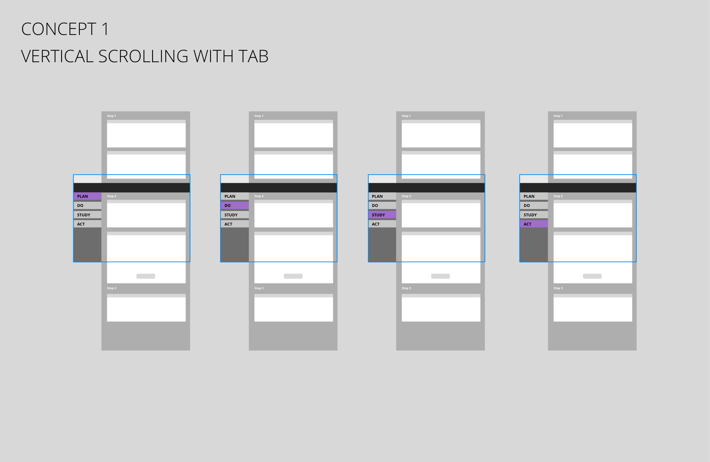
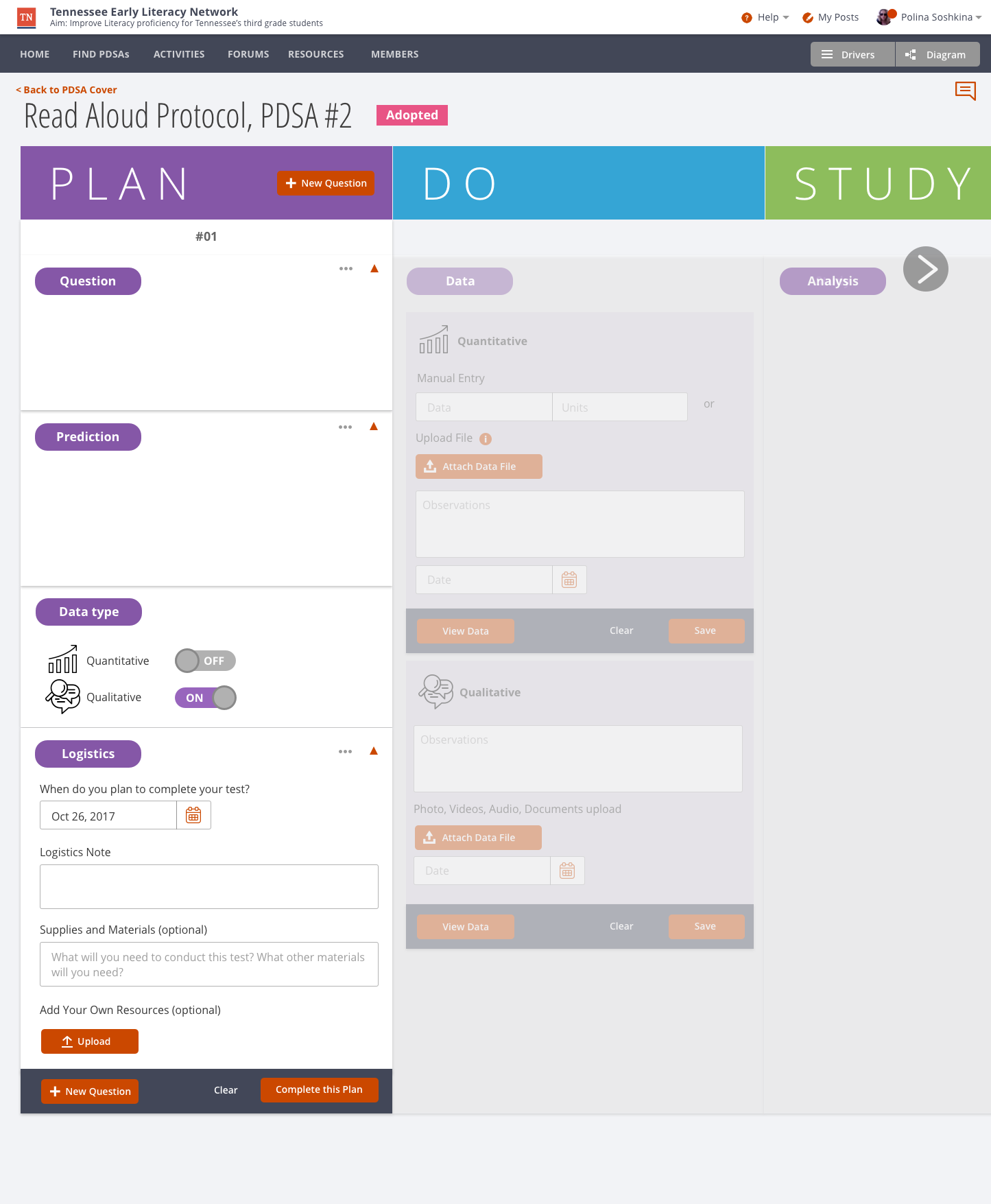
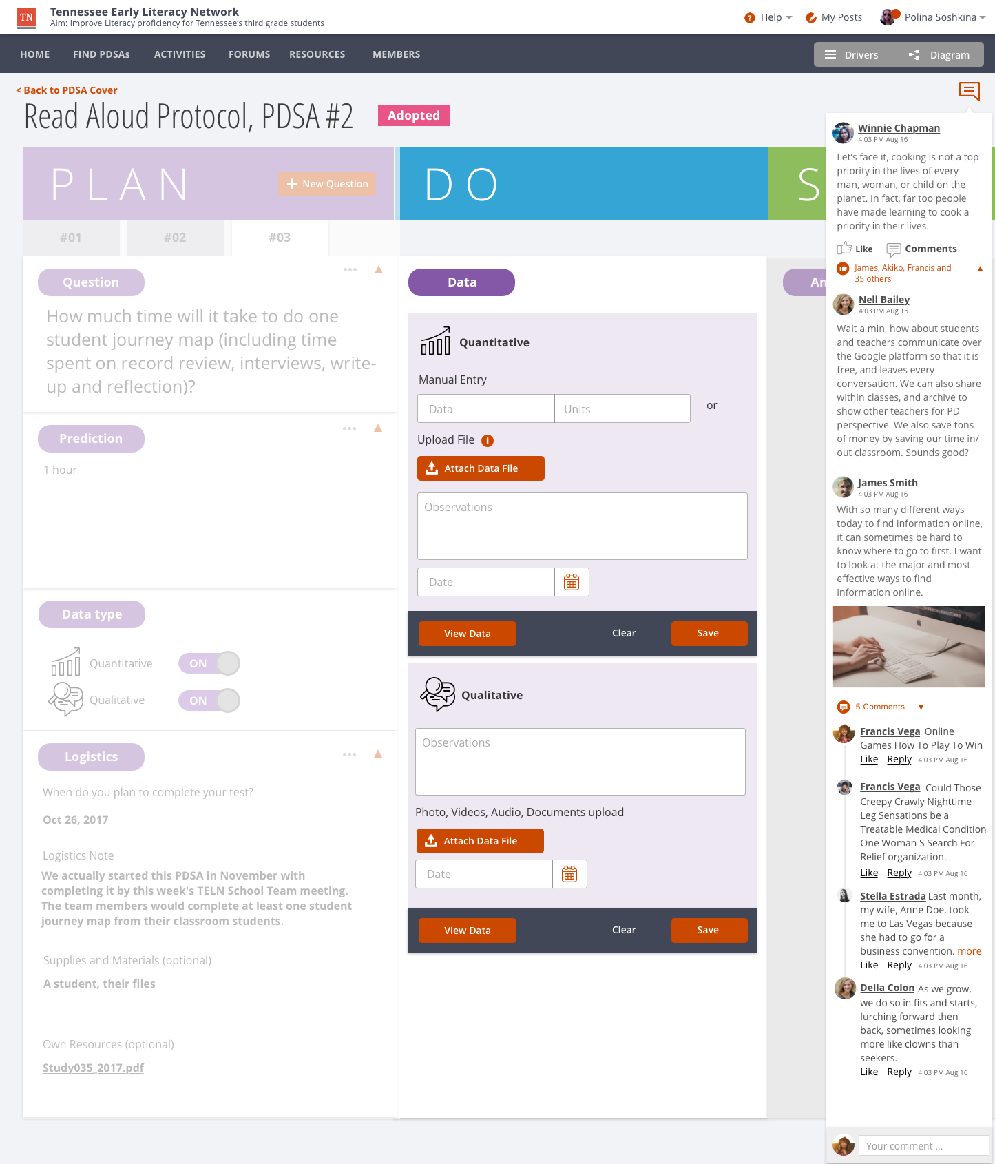
I tested two interaction concepts — vertical scrolling versus horizontal scrolling — to determine which pattern users found most intuitive for multi-step PDSA workflows. User testing validated vertical scrolling as the most familiar and least disorienting approach. From there, I redesigned the PLAN and DO phases with step-by-step guidance, progress indicators, and collaborative features. Each phase received clear instructions, document attachment capabilities, and commenting tools. The goal was to make the PDSA cycle feel like a guided conversation rather than a form to fill out.
Tools & Methods
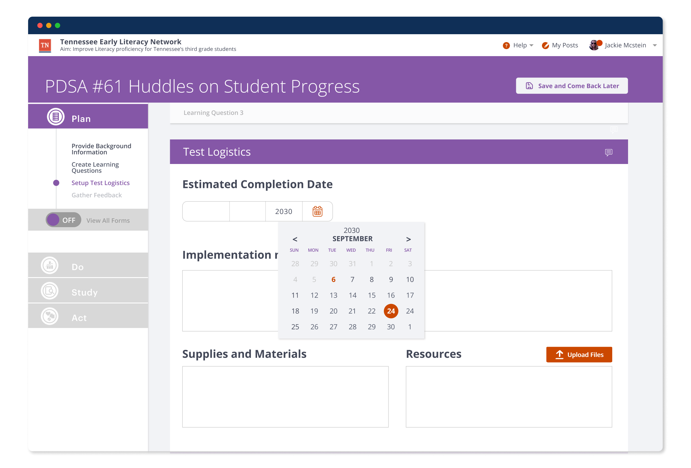
01 — Redesign the PLAN: Step-by-step guidance with clear data input areas, progress indicators, and collaborative features.
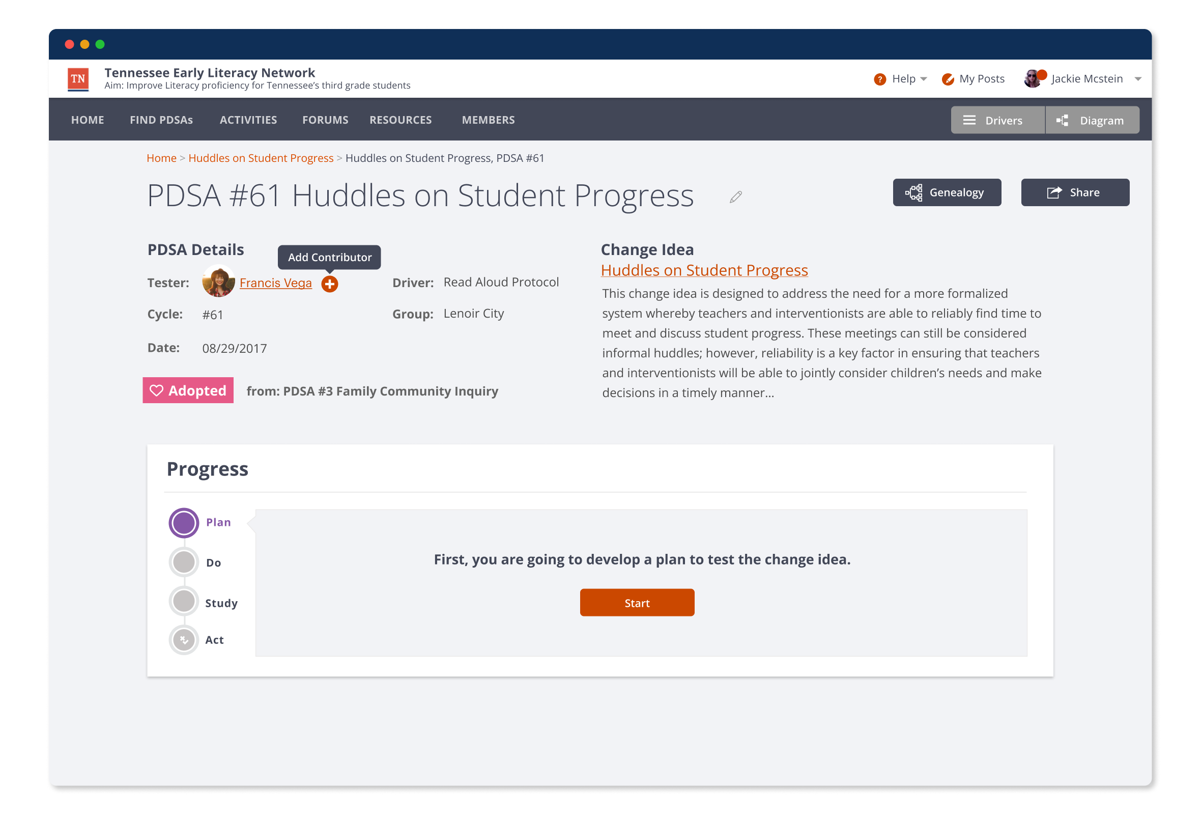
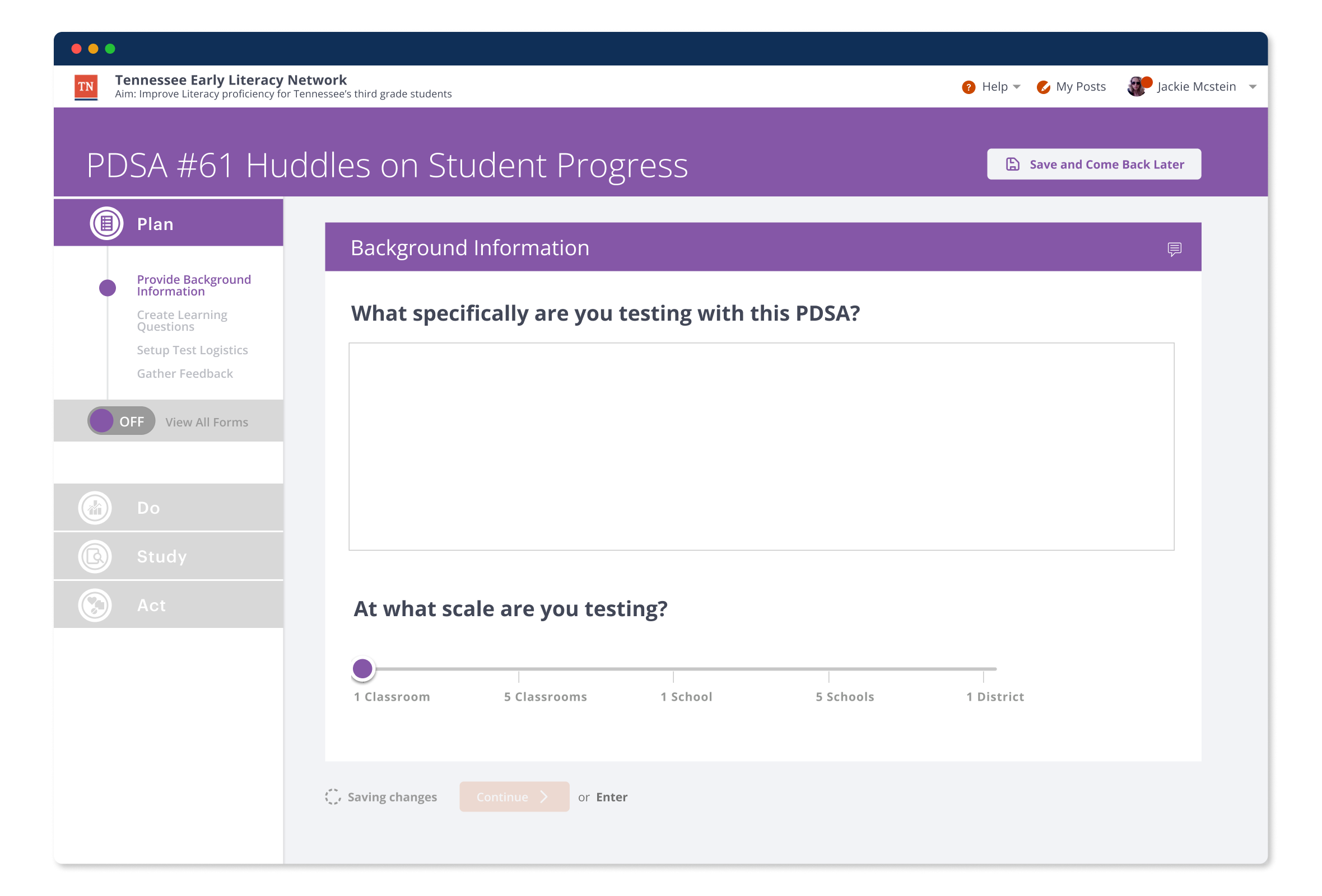
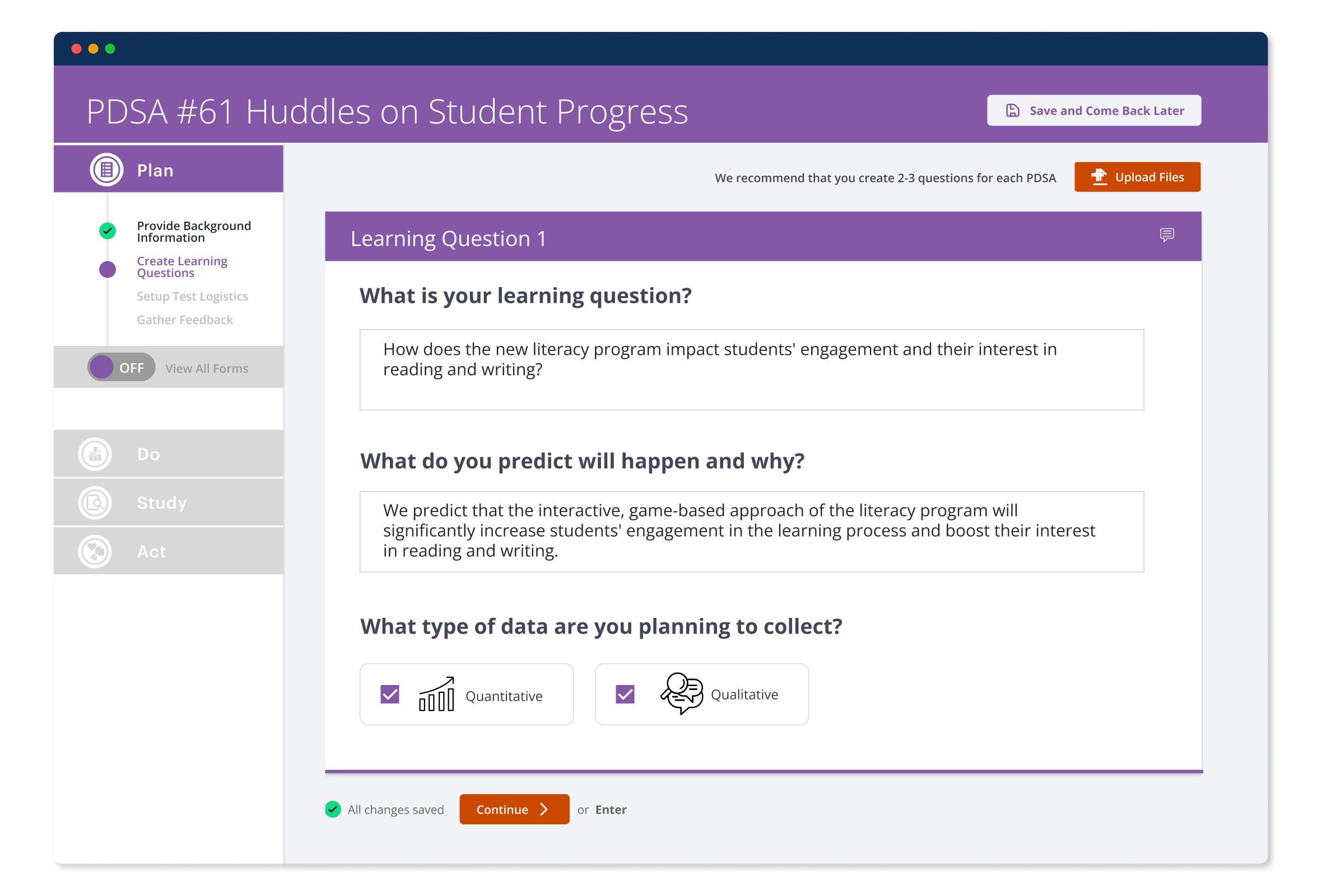
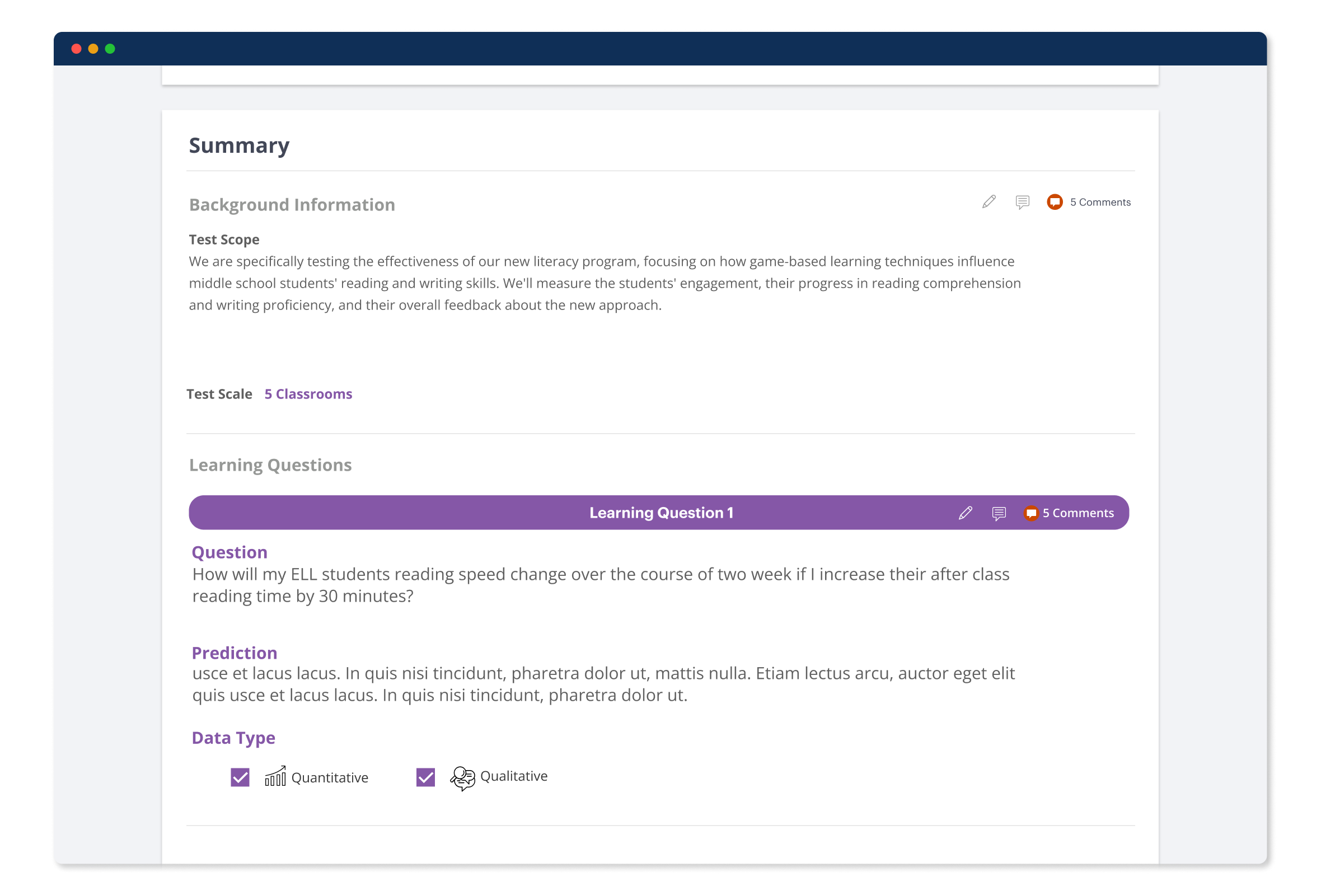
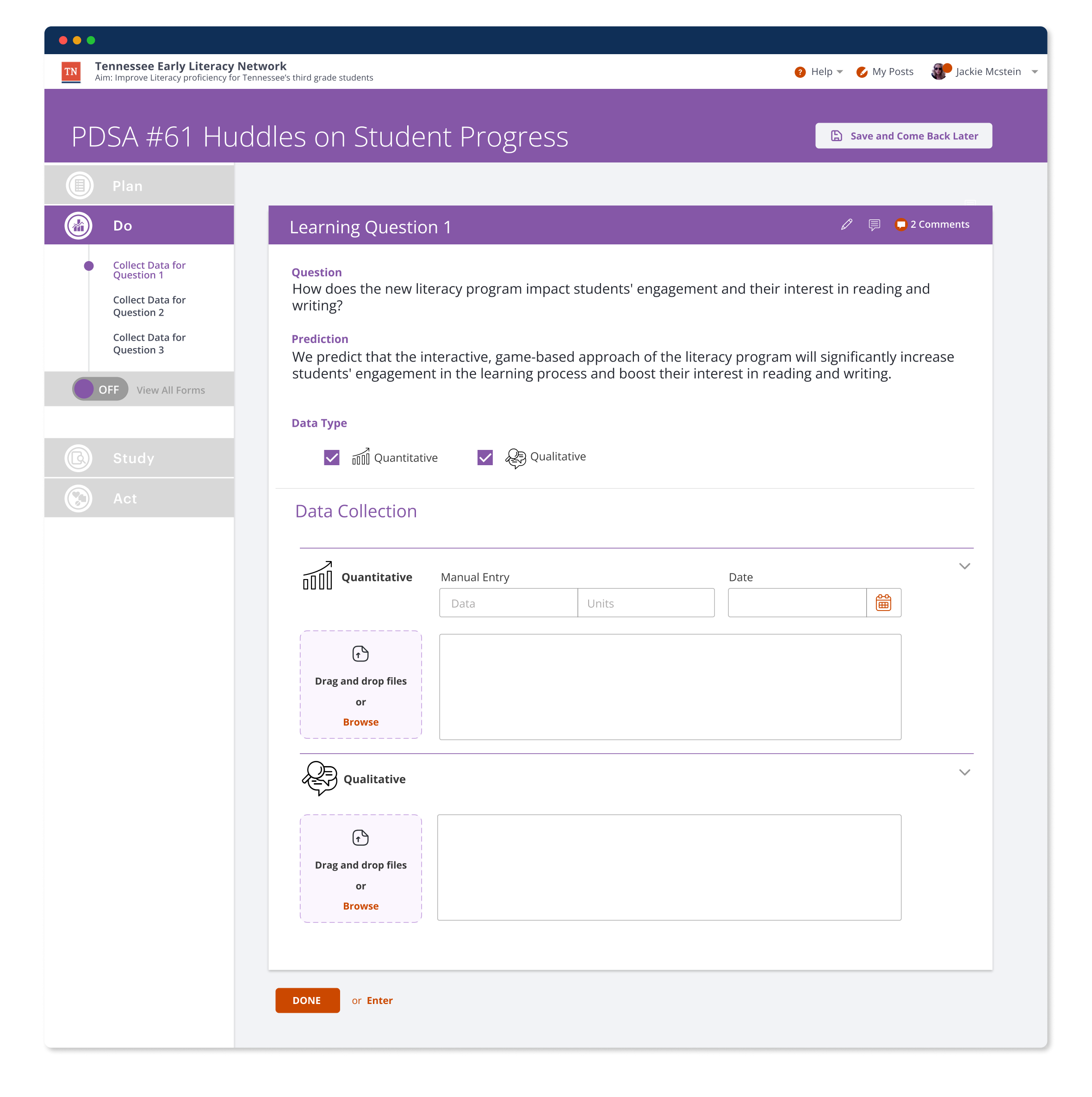
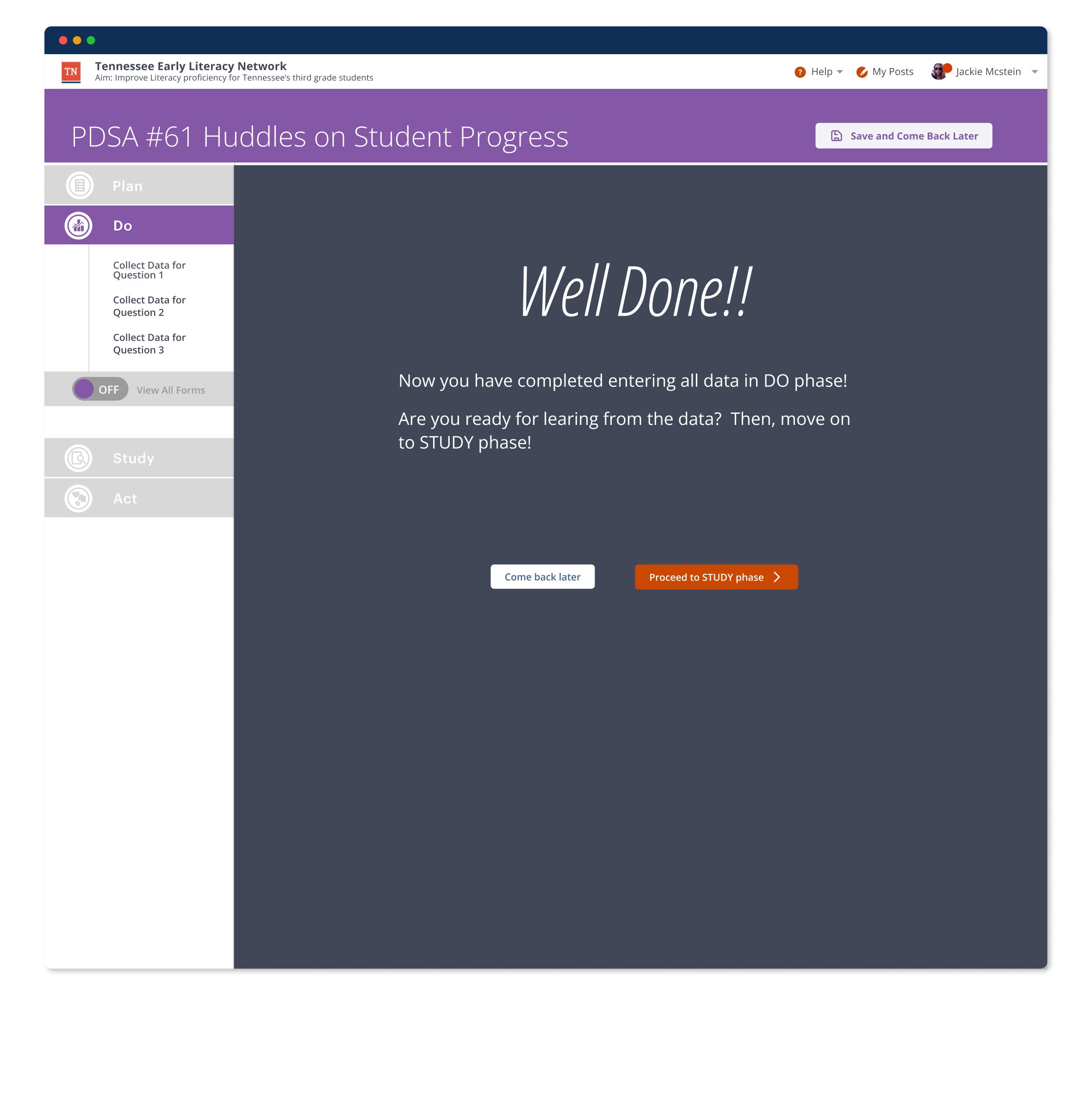
02 — Redesign the DO: Clear instructions with progress indicators, document attachment, and collaborative commenting.
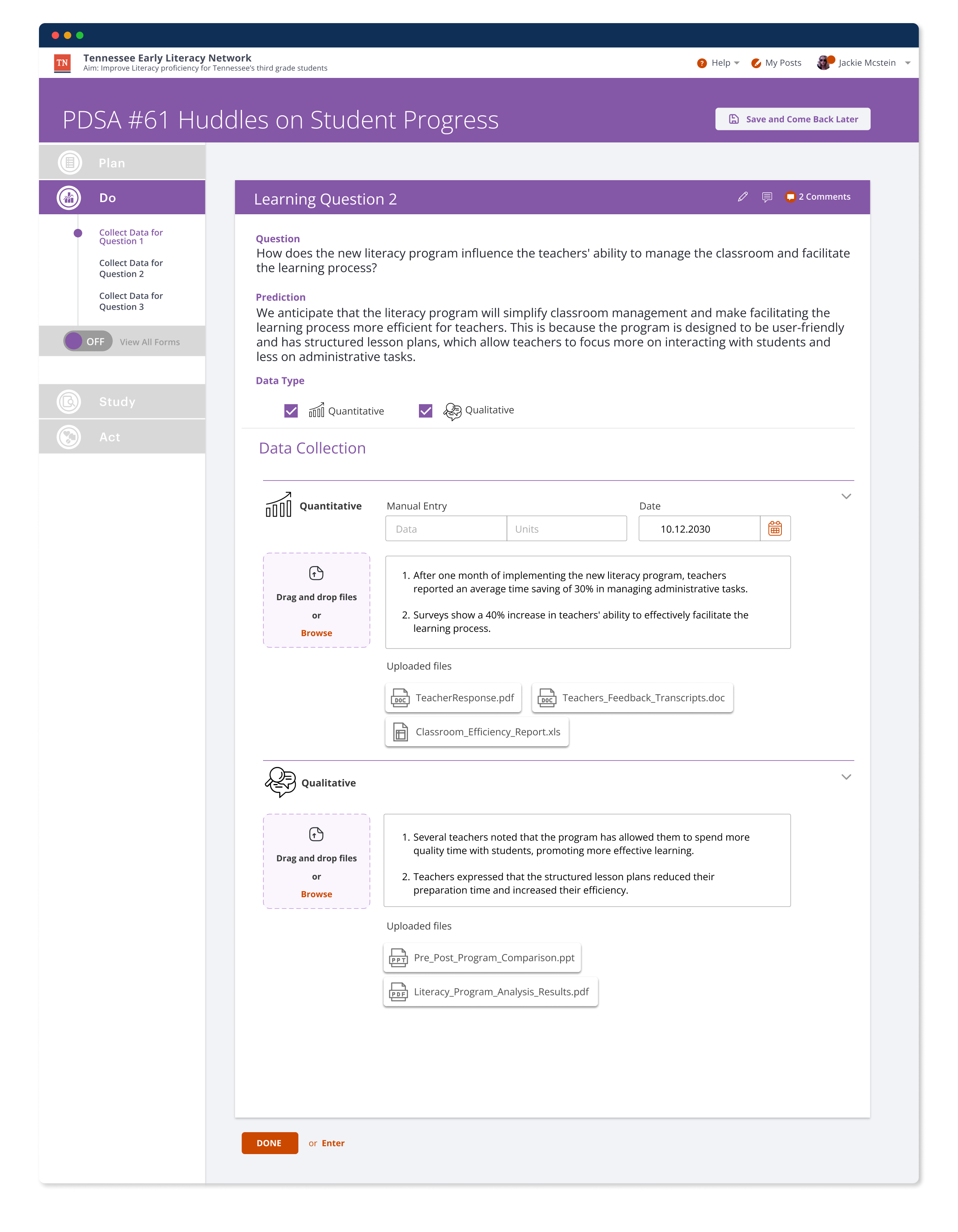
03 — Design Process: Concept testing — vertical vs horizontal scrolling compared for multi-step PDSA workflows.
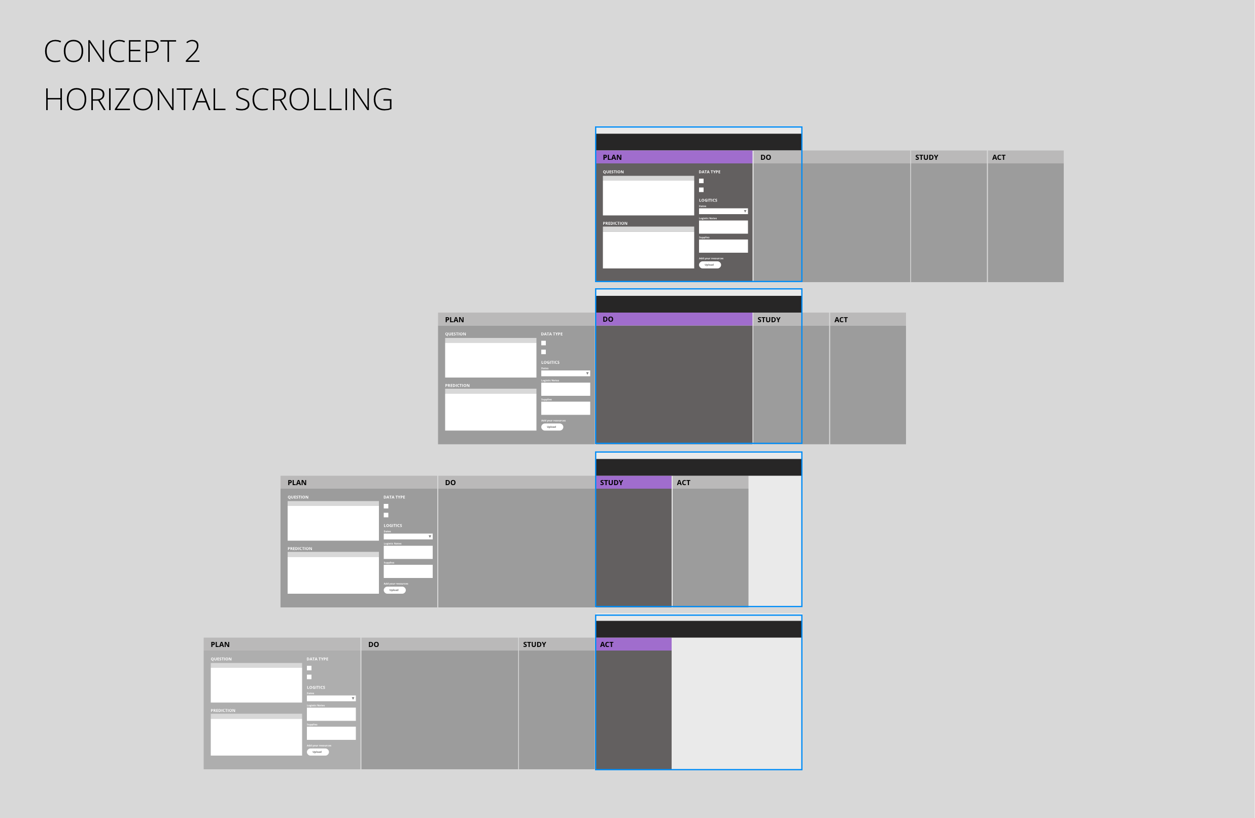
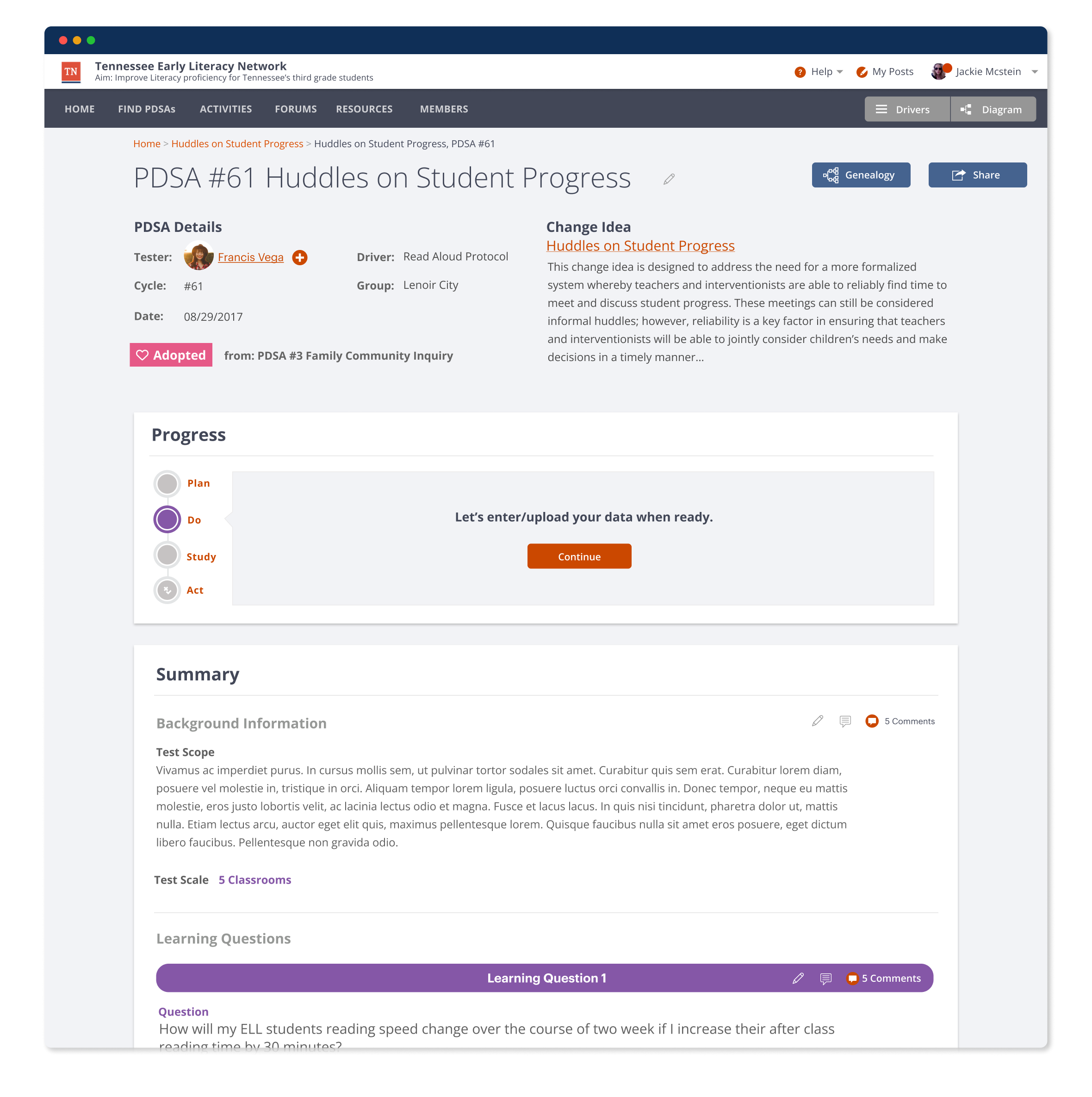
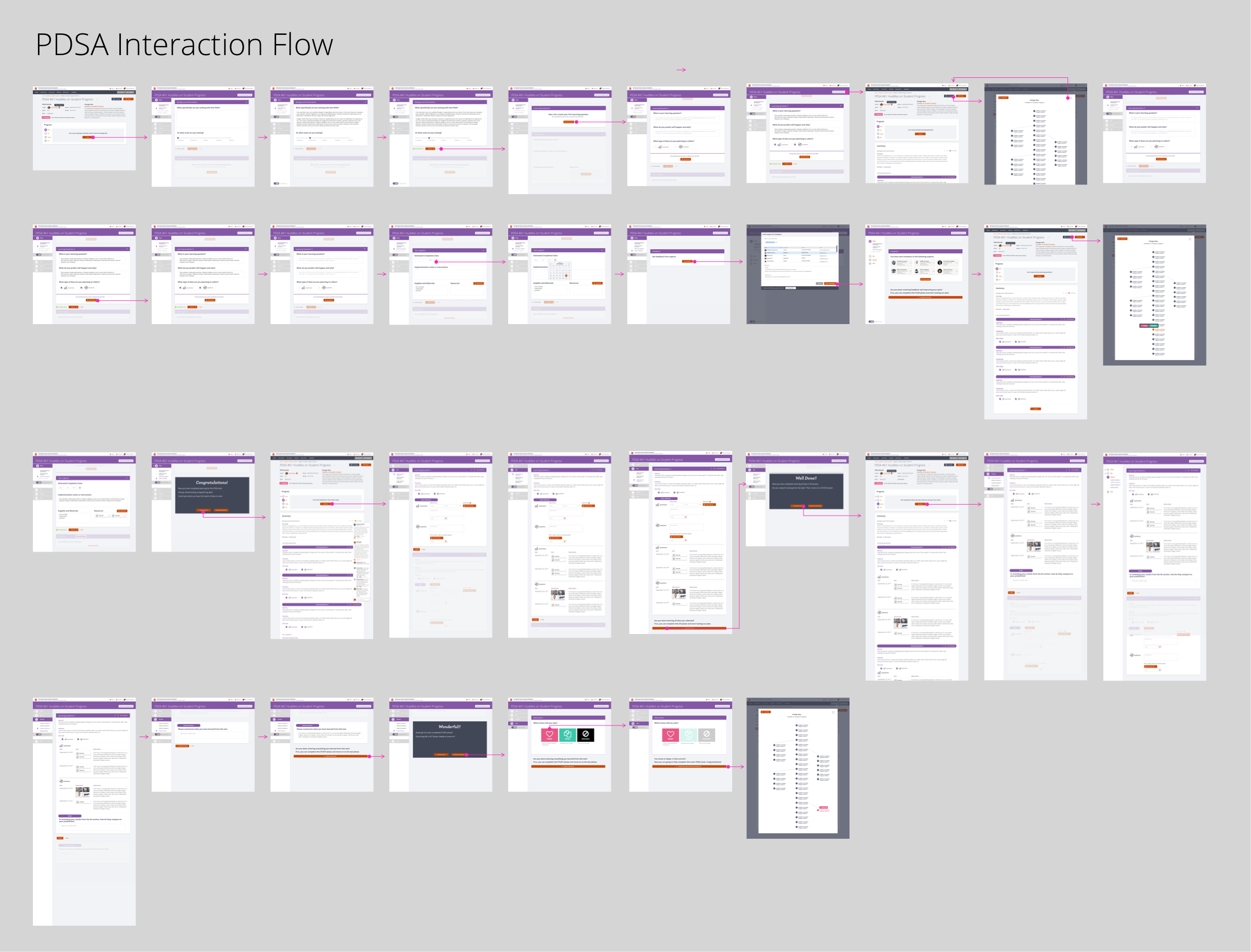
04 — Design Process: Interaction flow mapping the full PDSA cycle based on the validated vertical concept.
05 — Design Process: Horizontal flow exploration — the alternative pattern tested before vertical scrolling was validated.
Deliverables
- Technology & UX Research
- UX Strategy
- Interaction Flow Development
- Wireframing & Prototyping
- UI Design
Methods
- A/B Concept Testing
- User Testing
- Customer Journey Mapping
- Iterative Prototyping
Team
- Lead Product Designer
- UI Designer
- UX Designer