The Tension
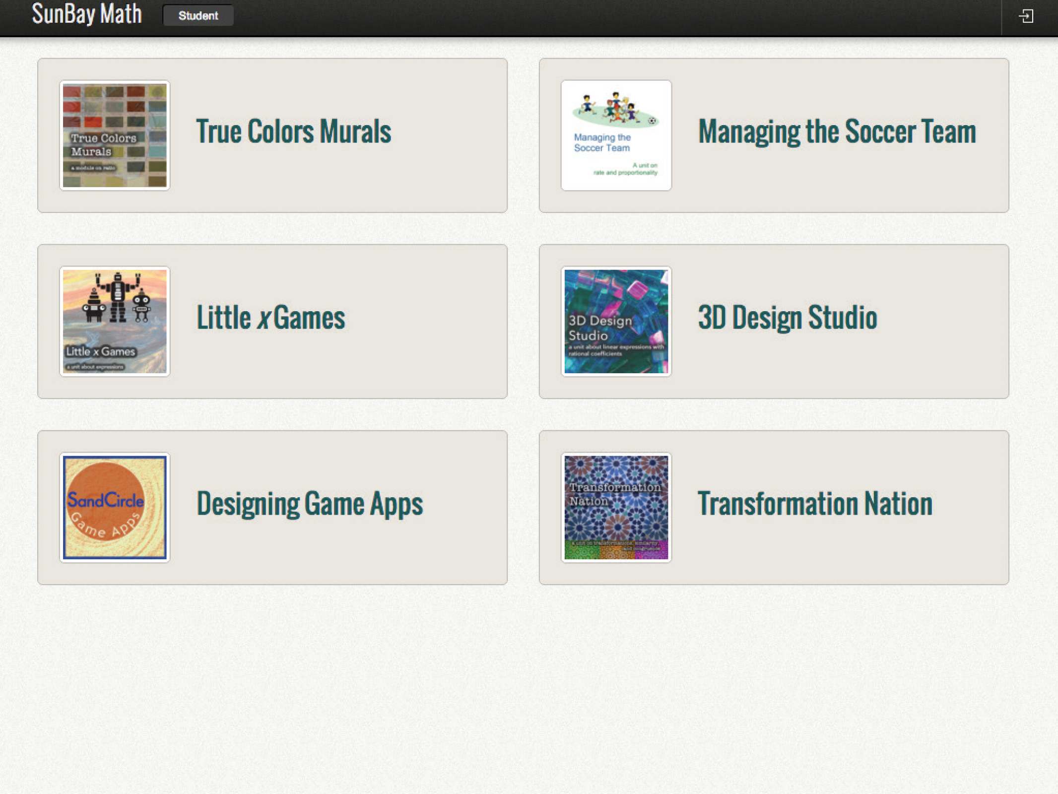
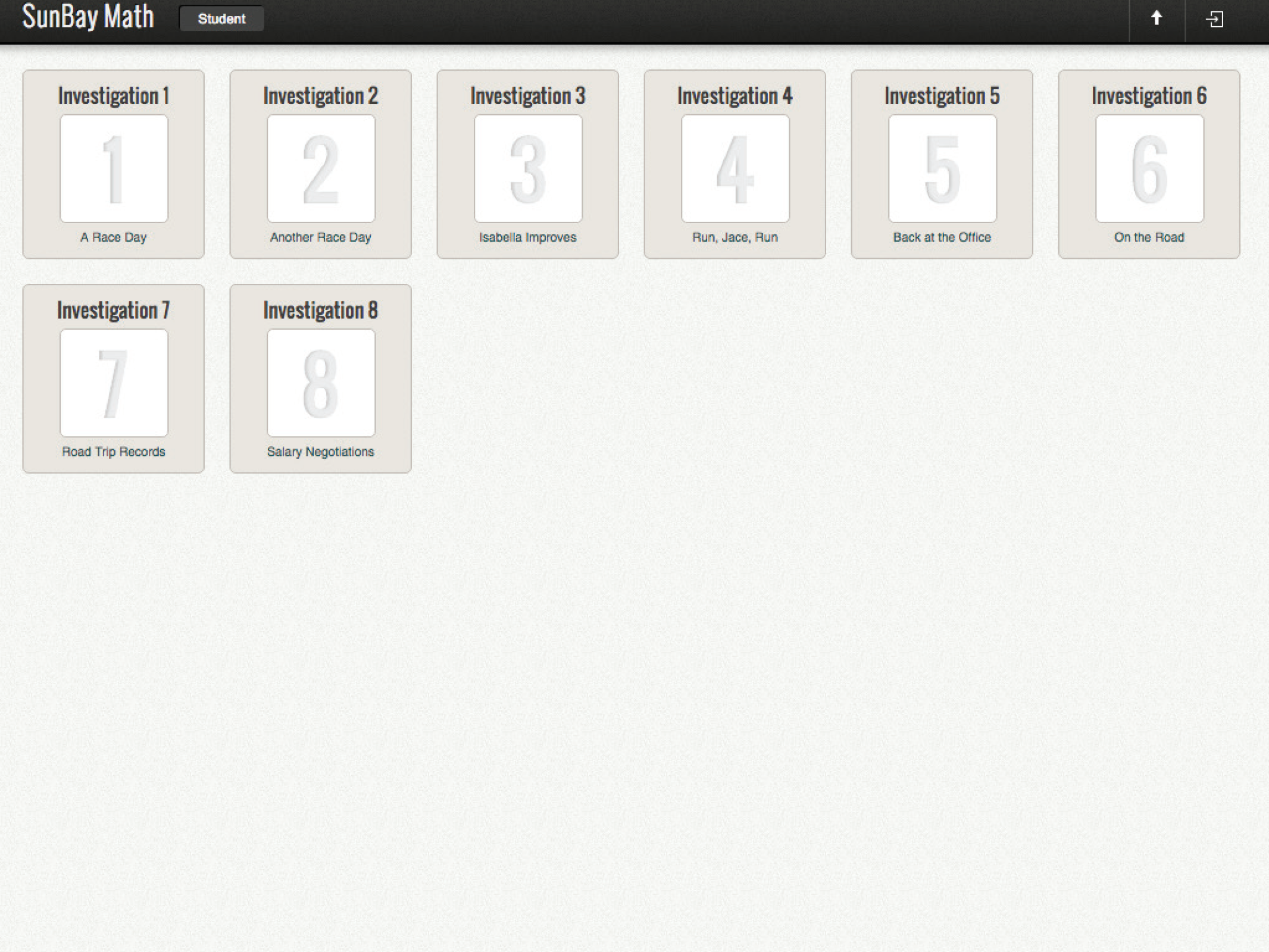
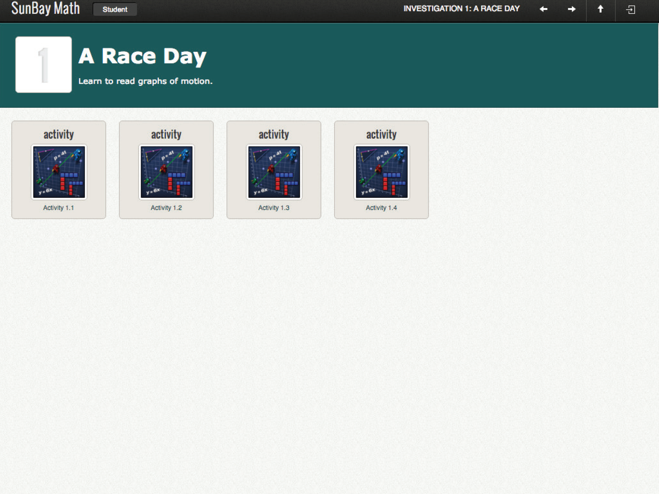
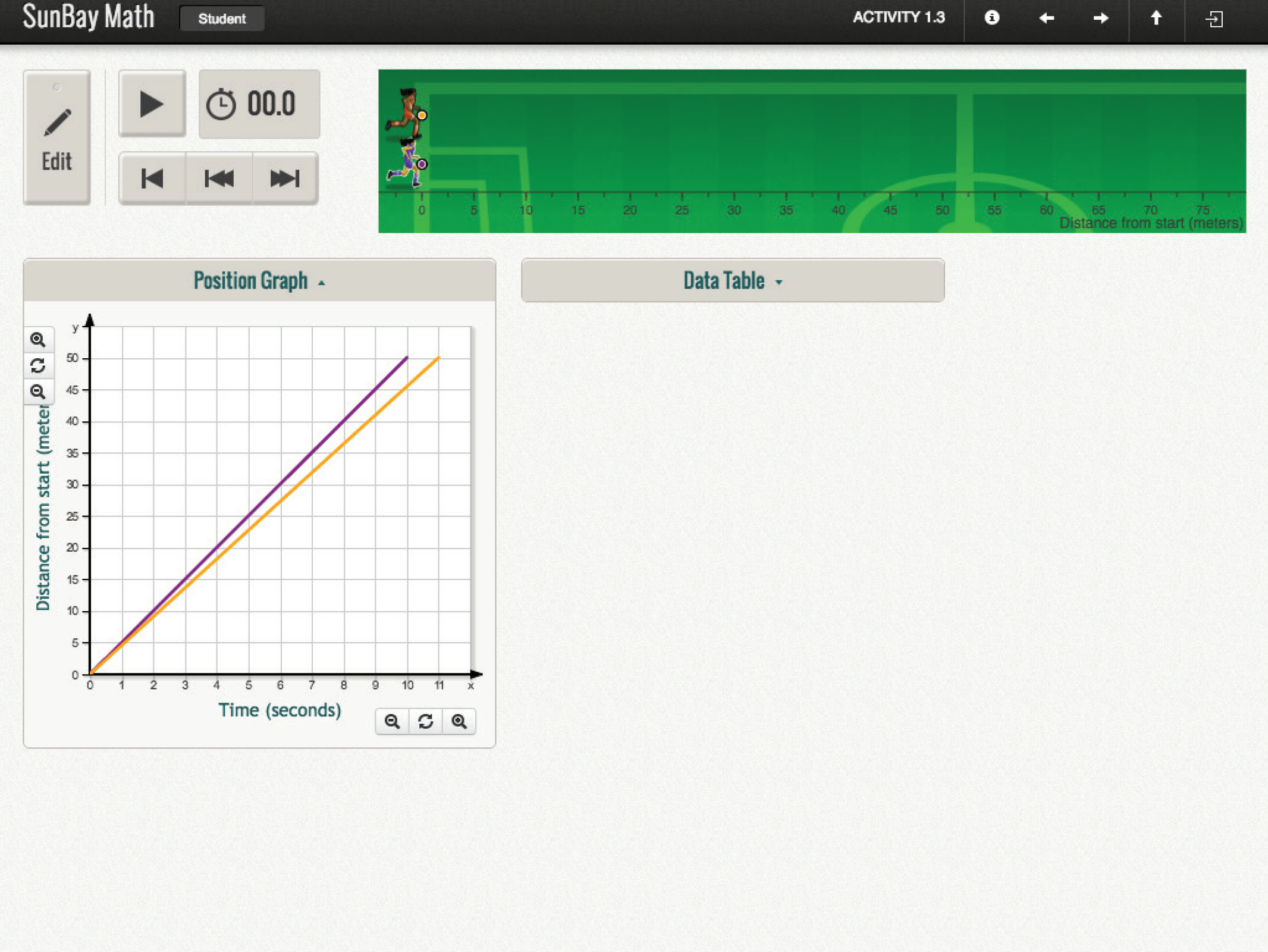
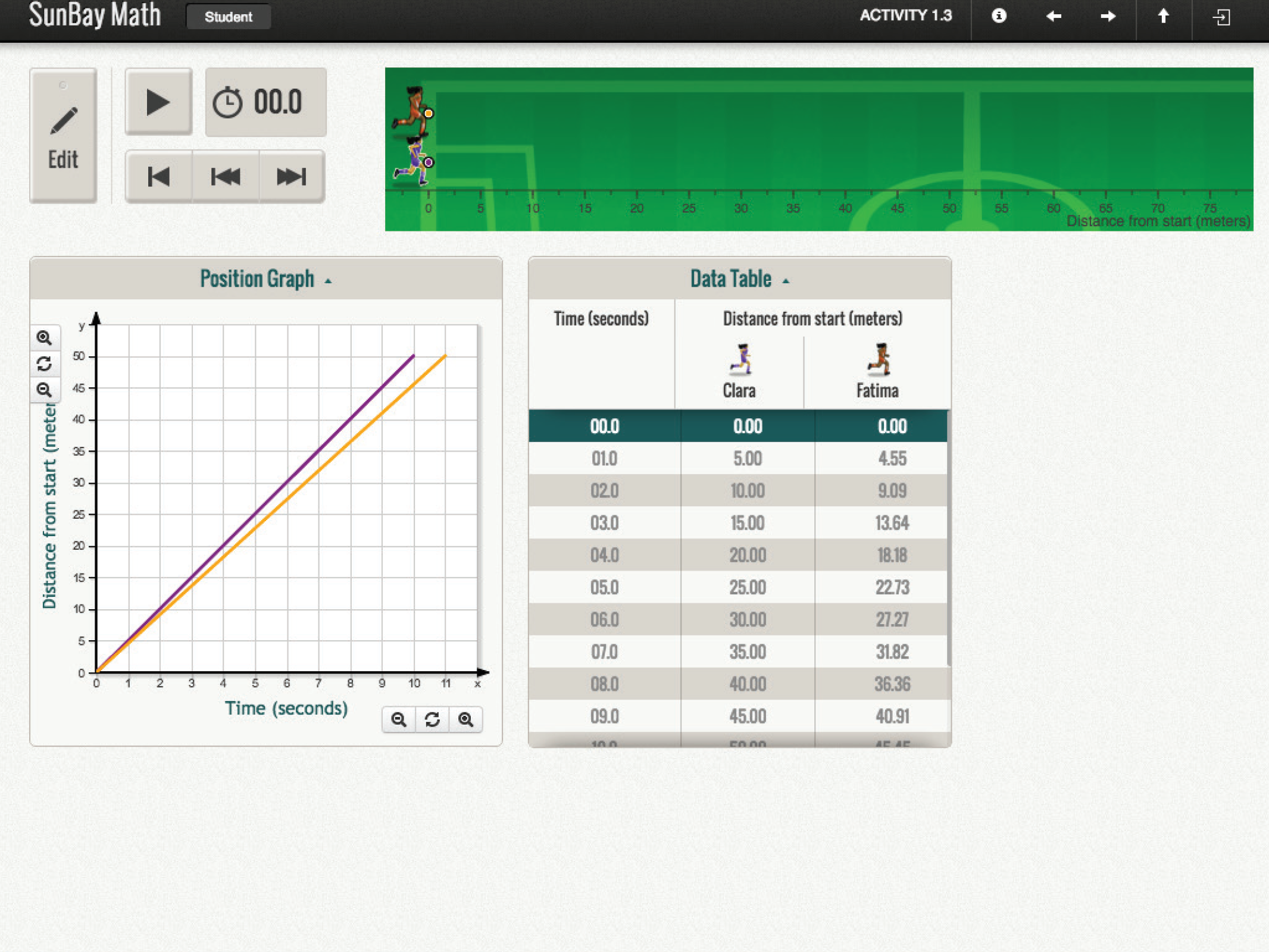
Menlo Math (built and shipped as SunBay Math) taught rate, proportionality, and other pre-algebra concepts through interactive simulations — but the surrounding app gave students little reason to care. Every unit looked the same: a plain list of titles, a grid of numbered gray tiles for investigations, and a repeating thumbnail for every activity. The underlying math tools — position graphs, data tables, editable function panels — were solid, but nothing in the interface signaled which unit was a soccer-team budgeting problem and which was a 3D-printing challenge. Students couldn't tell one activity from the next until they opened it.
My Approach
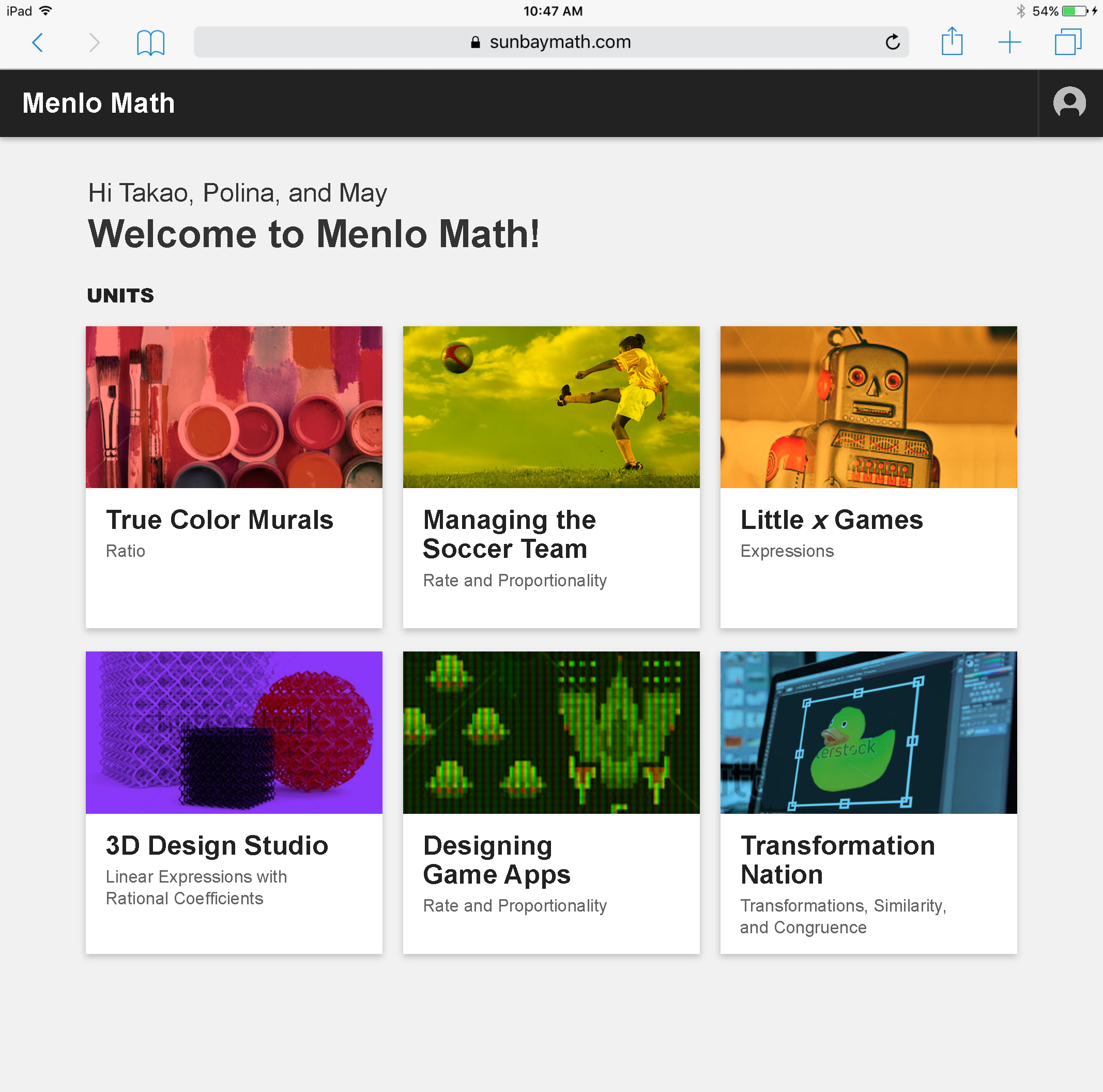
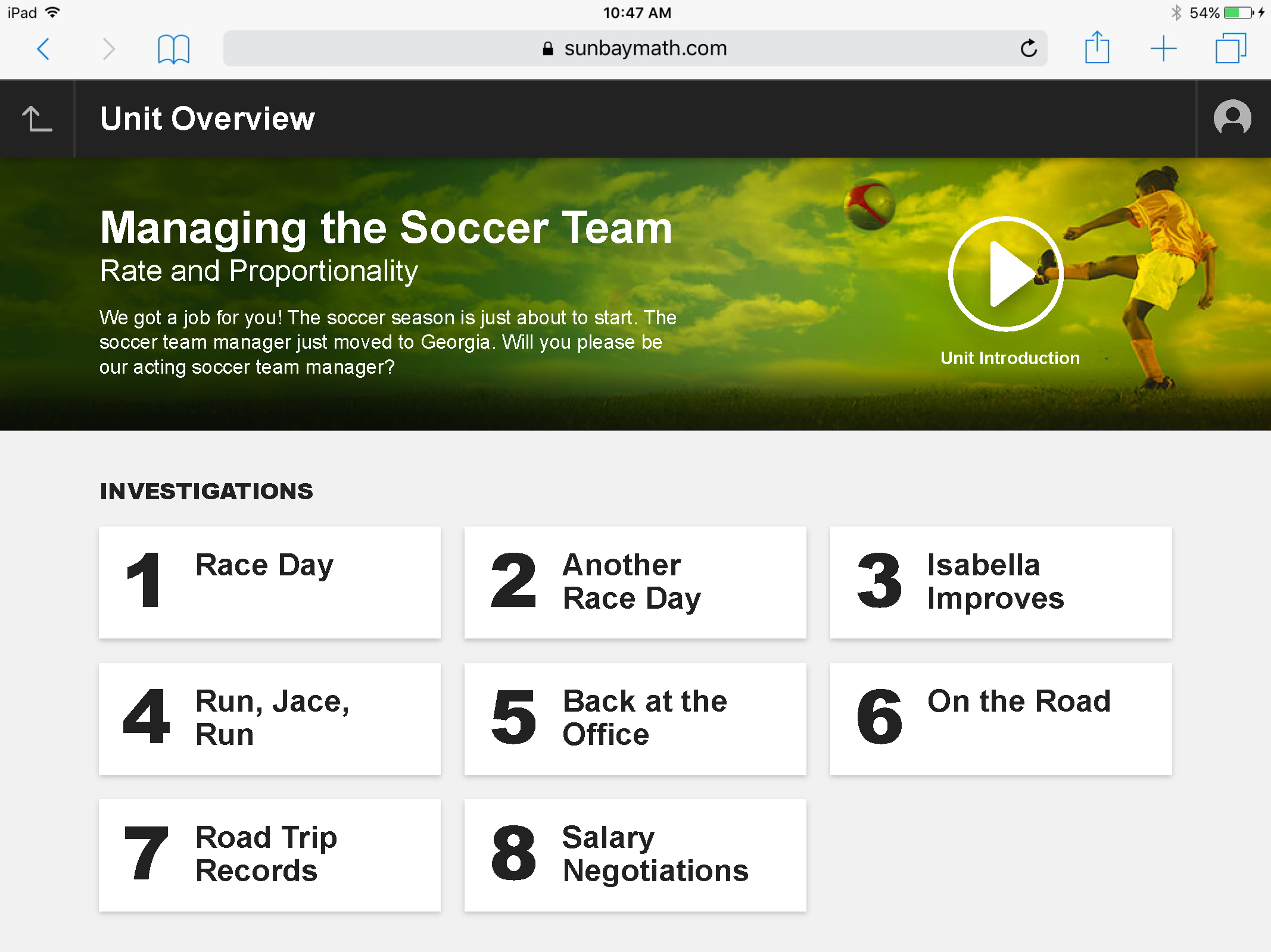
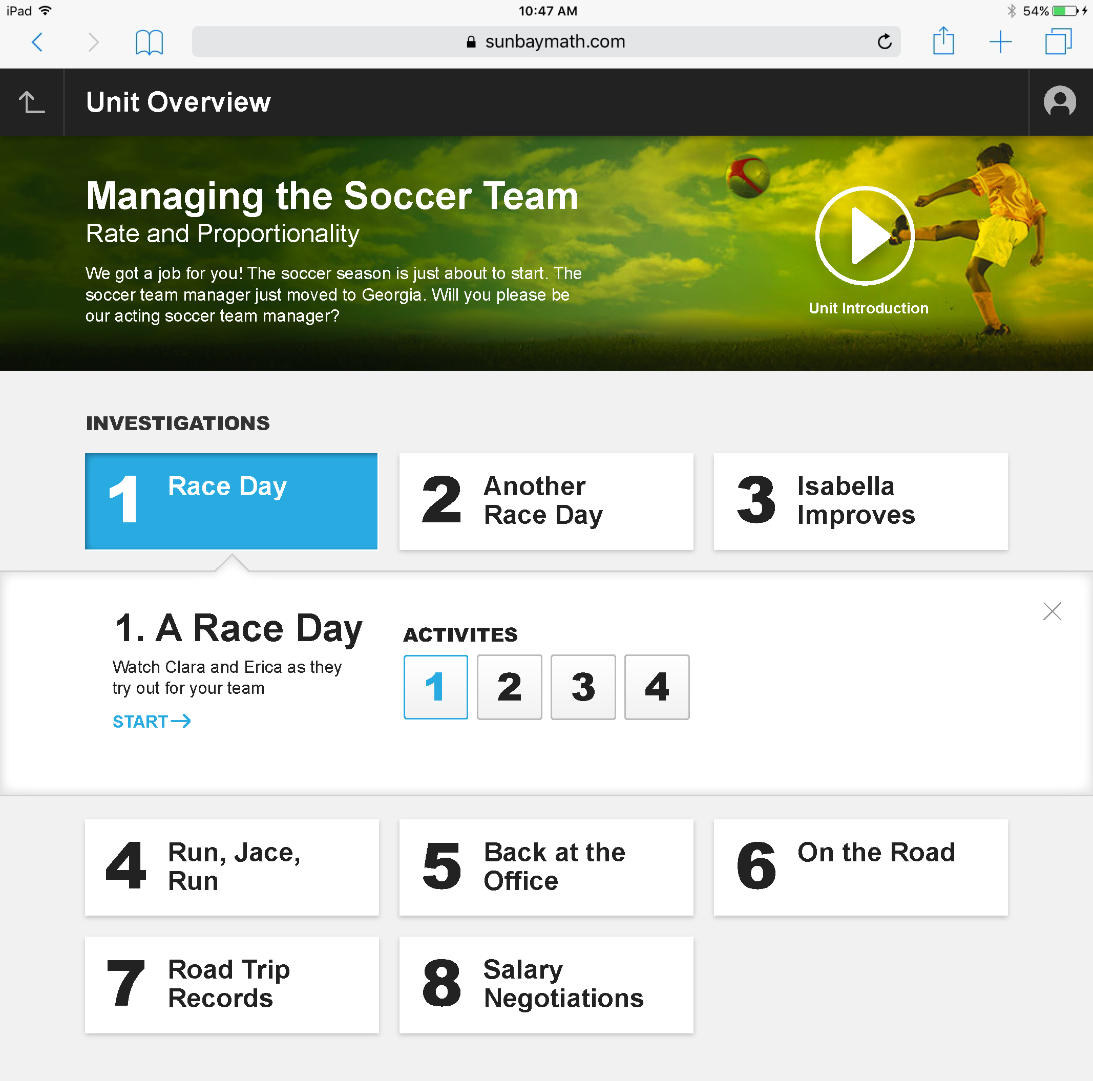
I redesigned the app's navigation and information architecture around its strongest asset: the real-world scenarios each unit was already built on. The home screen became a photographic card grid with plain-language subtitles — "Ratio" became "True Color Murals," "Rate and Proportionality" became "Managing the Soccer Team." Unit overviews adopted a narrative framing ("We got a job for you!") with investigations laid out as discoverable cards instead of a numbered grid, and activity screens kept the same simulation, graph, and data-table tools but set them inside a themed scene — a soccer field instead of an abstract line — so the math stayed connected to its story from first tap to last.
Tools & Methods
01 — Before & After: The same underlying curriculum tools, rebuilt around theme, story, and navigation.
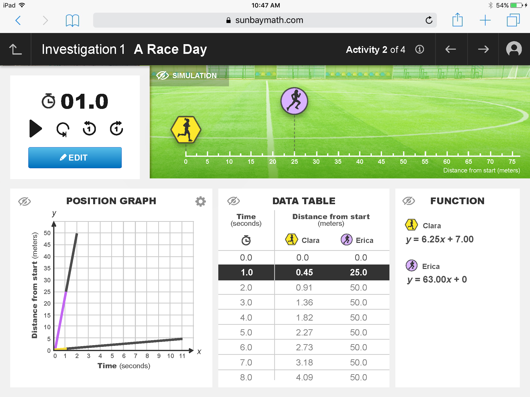
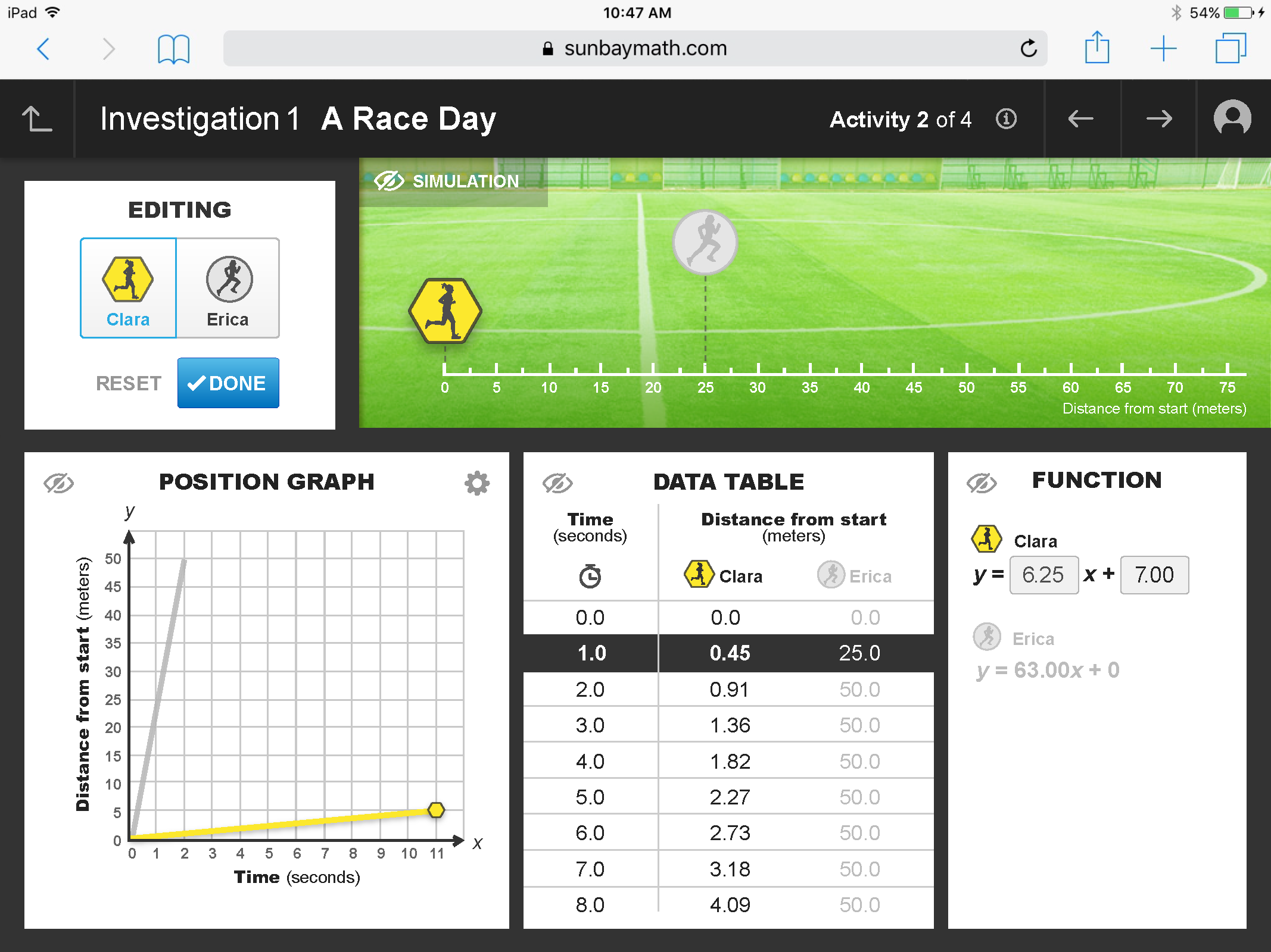
02 — The Redesigned App: Additional interface states from the rebuilt activity tool.
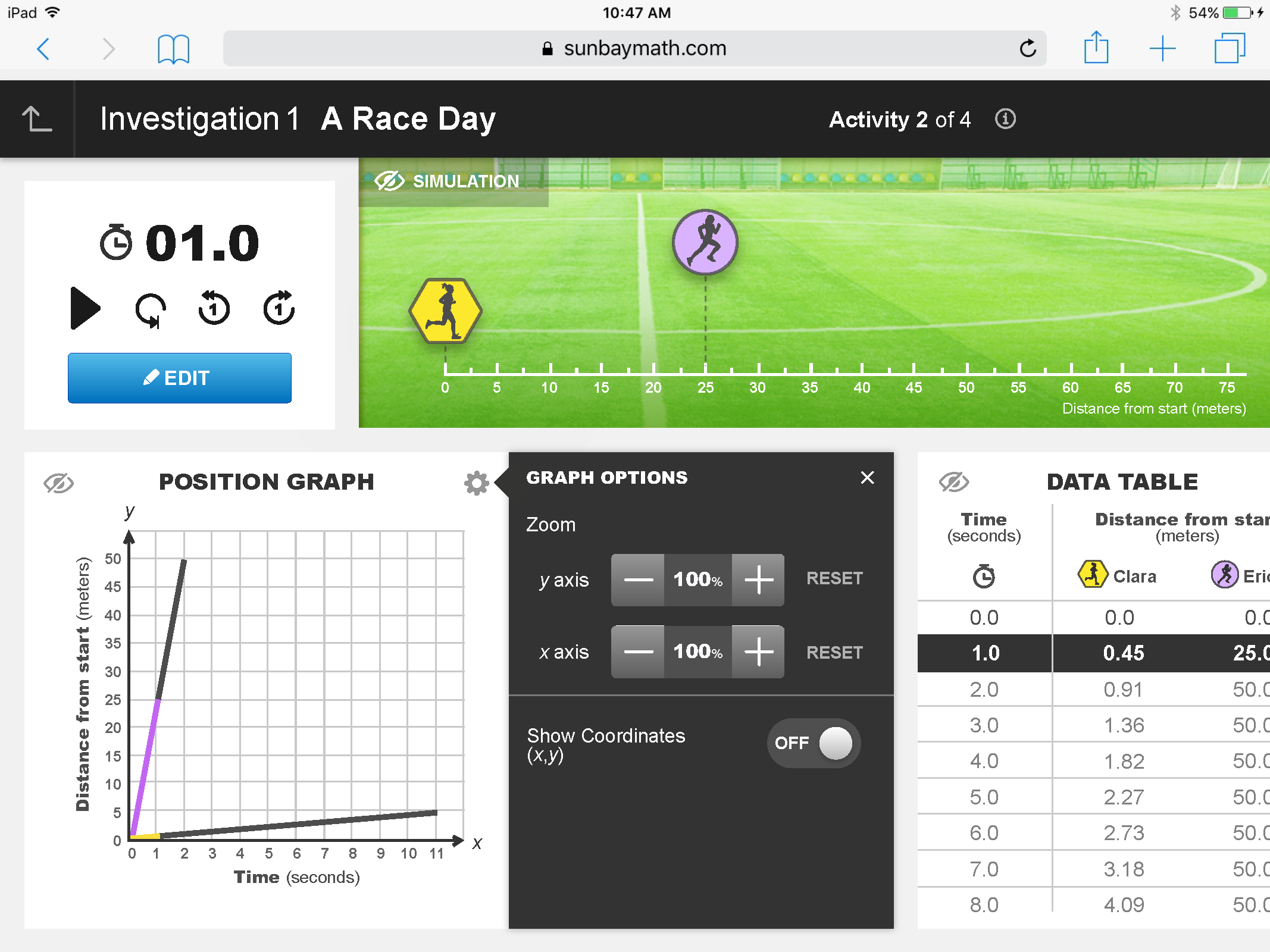
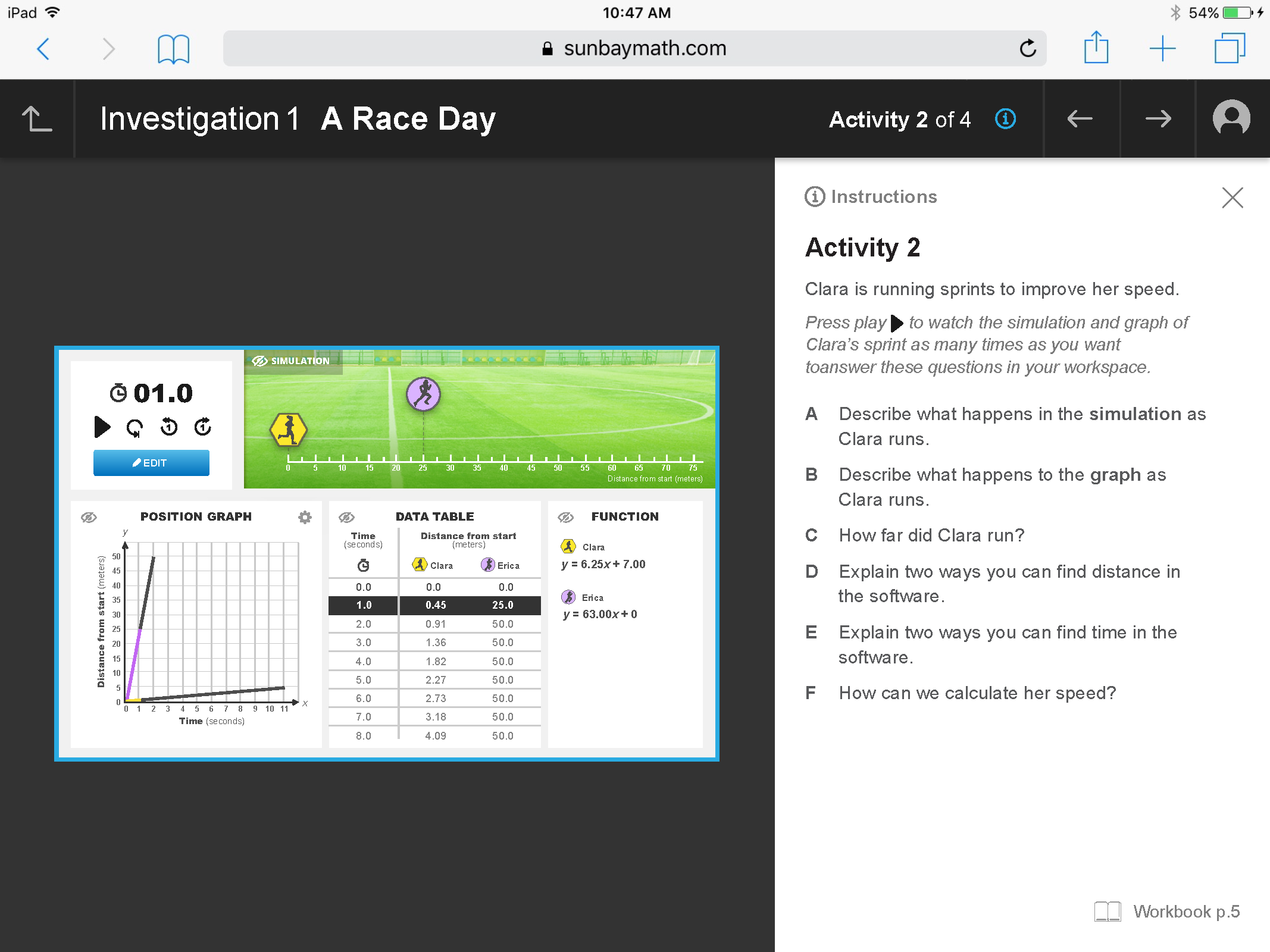
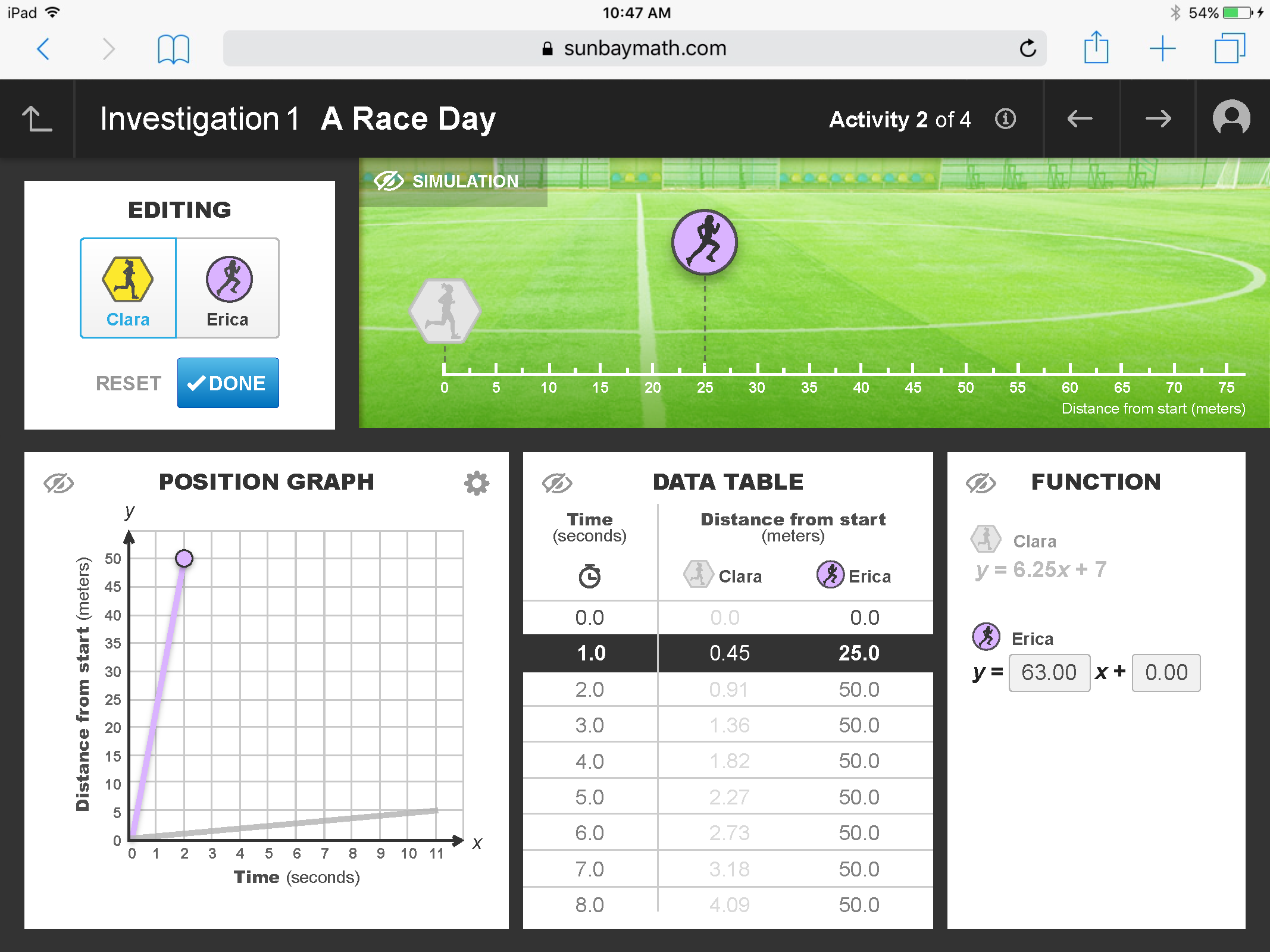
03 — Walkthrough
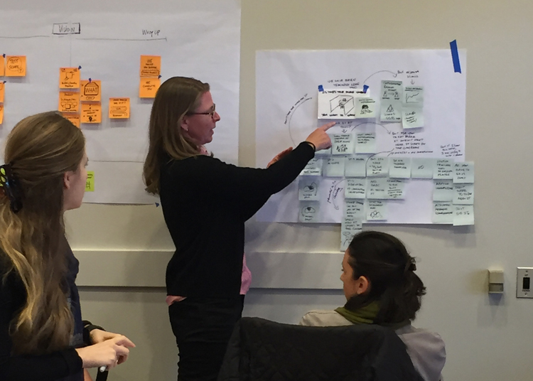
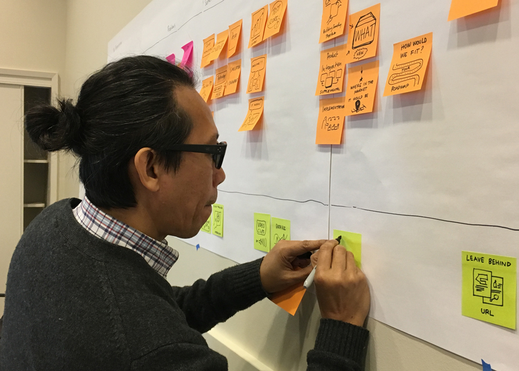
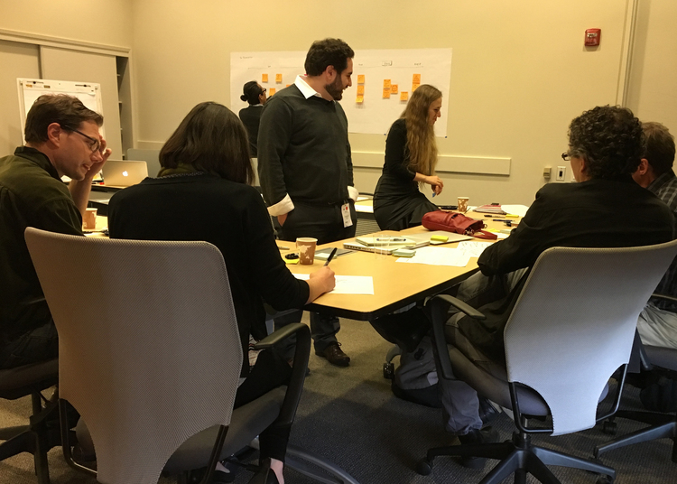
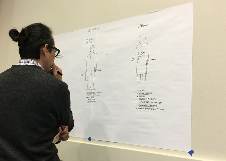
04 — Process: Workshopping the redesign with the curriculum and stakeholder team.
Deliverables
- UX Research & Redesign Strategy
- Information Architecture
- Visual Design (Card System)
- UI Design (iPad)
Methods
- Design Workshops
- Stakeholder Persona Mapping
- Concept Sketching
Team
- Curriculum Team (SunBay Math)
- Product Stakeholders
- Developer