The Tension
The portal had been built incrementally over years — features layered on top of features without a unifying structure. The same account information appeared in multiple places with different interaction patterns. Users couldn't complete basic tasks like making a payment without navigating through redundant screens. Service call volume was climbing because users couldn't self-serve.
My Approach
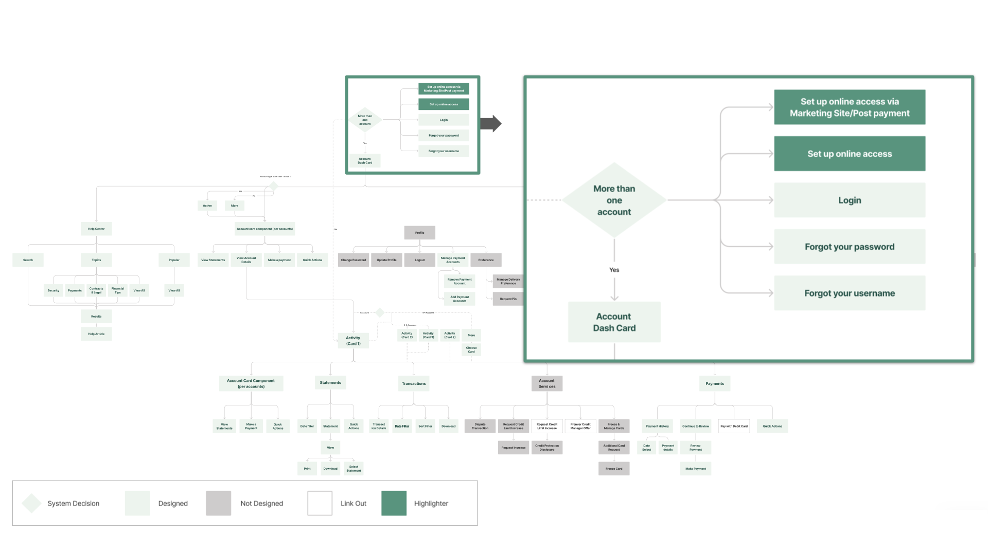
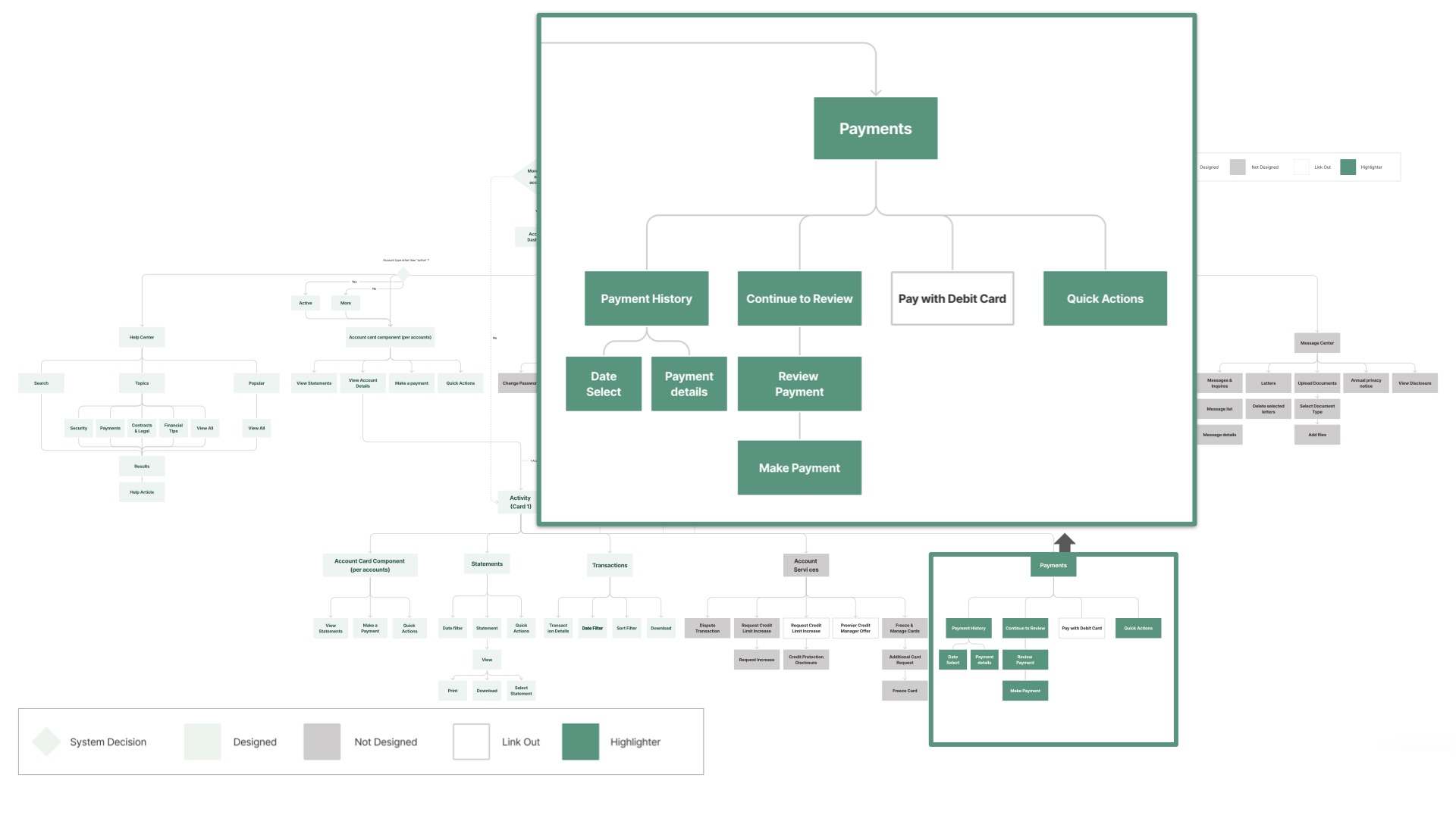
I led a discovery audit to find the structural root cause — not to catalog every problem. The insight: the portal's issues weren't cosmetic. They stemmed from a complete absence of design infrastructure. Each feature had been designed in isolation, with no shared components. The fix had to work at two levels: rebuild critical flows for immediate impact, and create a system to prevent recurrence. I prioritized 4 of 10 flows based on frequency × pain severity — account setup, login, summary, and payments.
Tools & Methods
Outcome
The redesign modernized the customer experience and reduced customer service call volume by removing the friction that drove most support requests. The 125+ component design system set the visual and interaction precedent later adopted across the bank's other digital products.
What changed
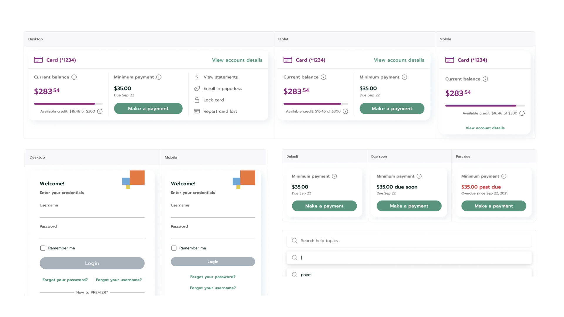
Priority Flows — The 4 That Mattered Most
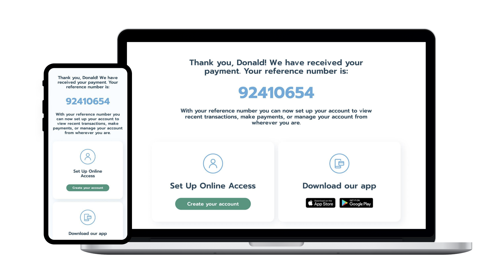
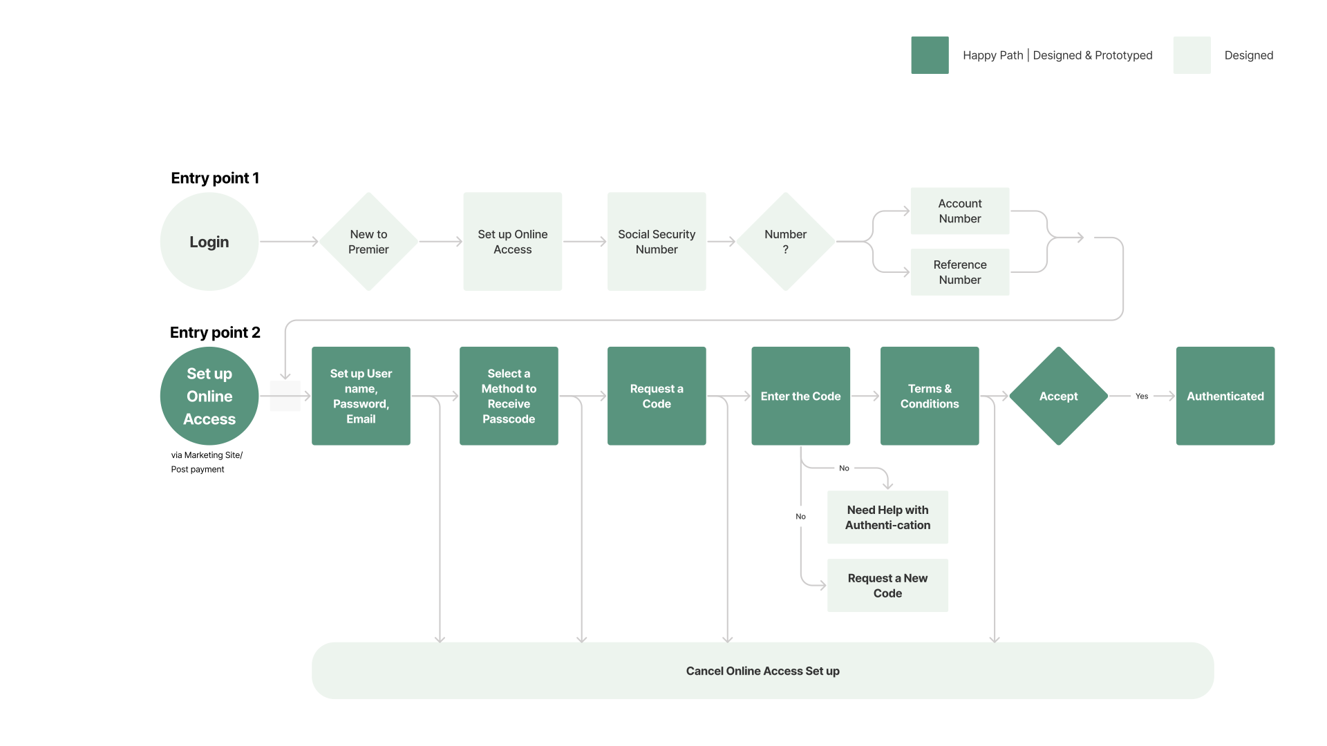
01 — Set Up Online Access: First contact with the portal. Reduced from a multi-page form to a streamlined onboarding.
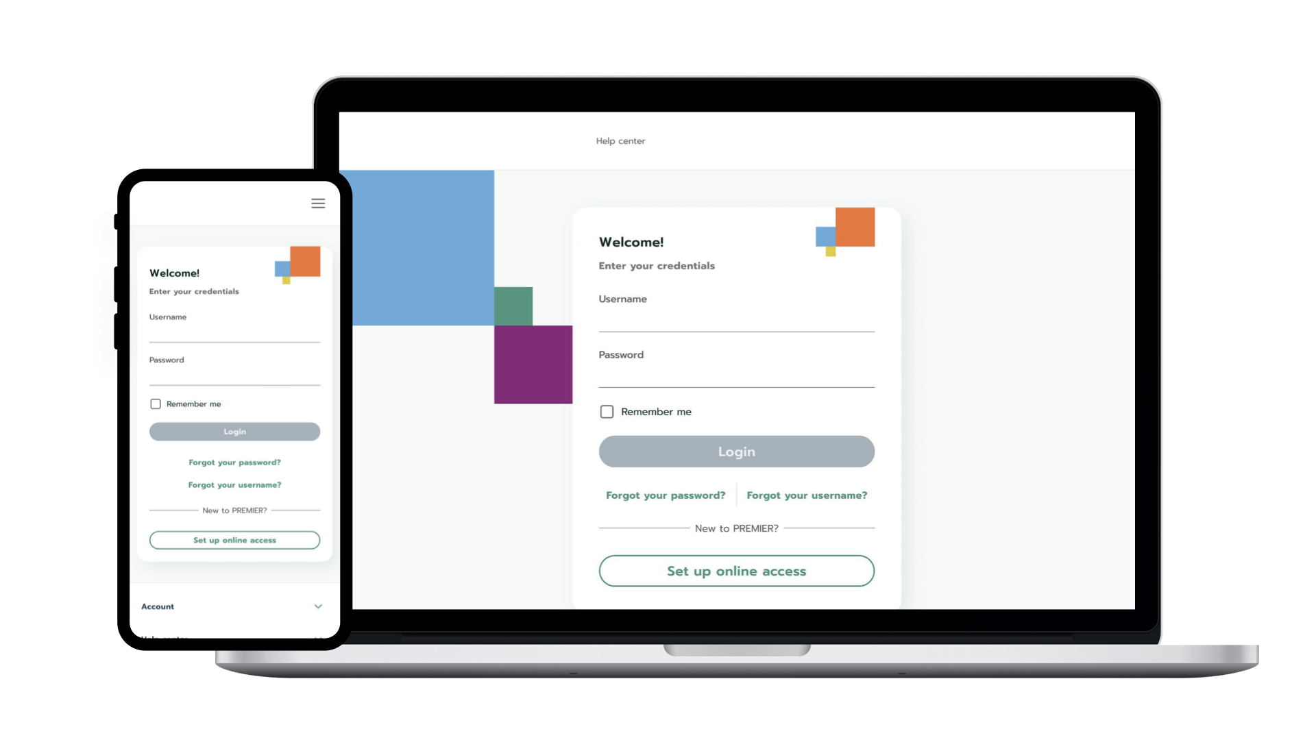
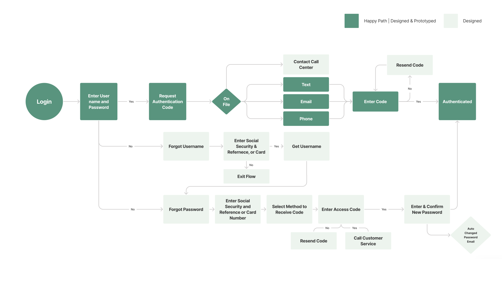
02 — Login & Authentication: Simplified credential recovery, clearer error states.
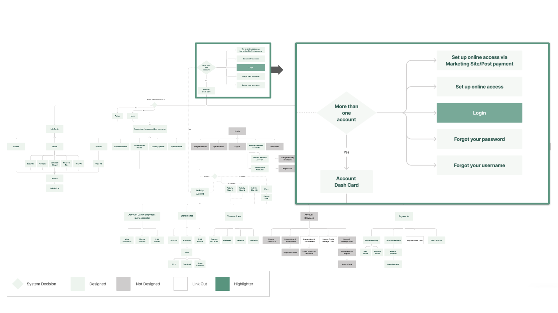
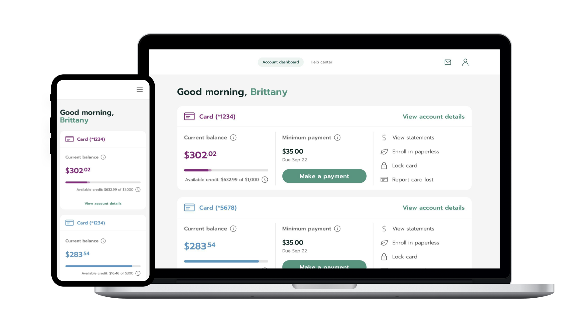
03 — Account Summary: The highest-traffic screen. Consolidated balance, recent transactions, and quick actions into a single view.
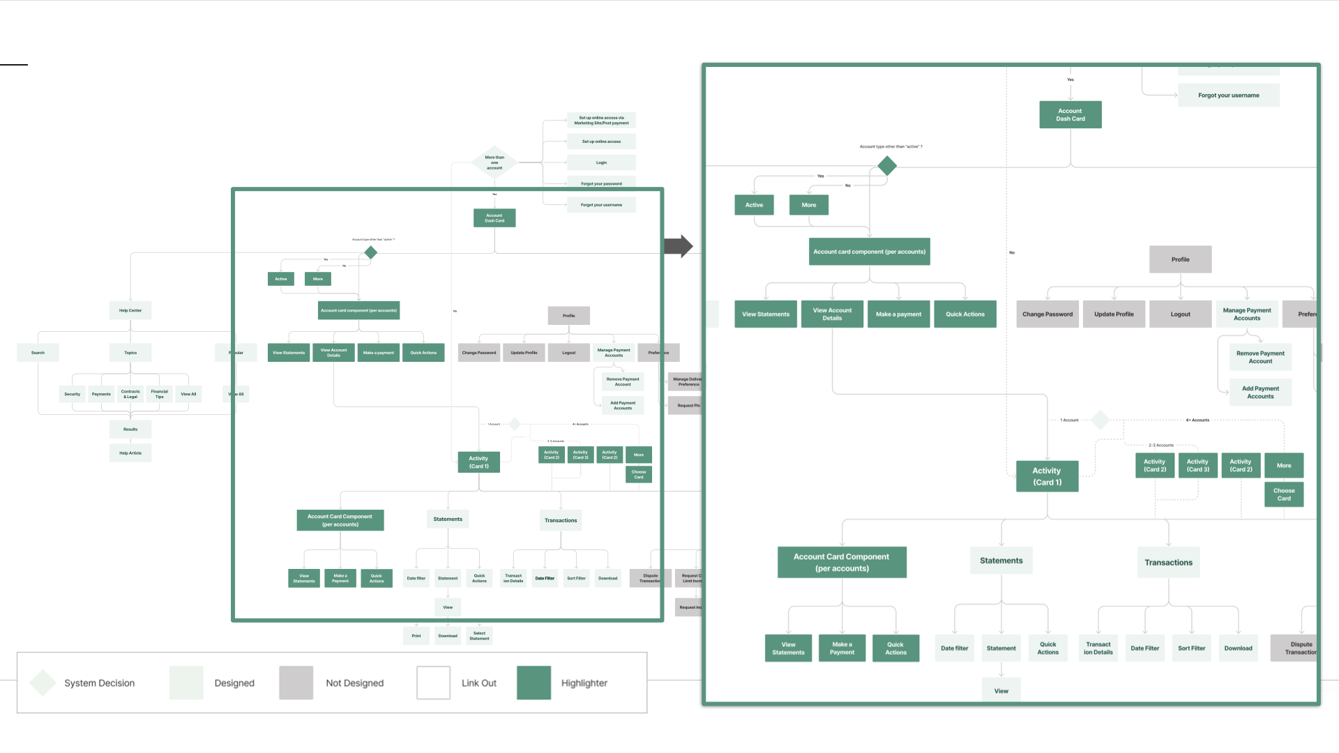
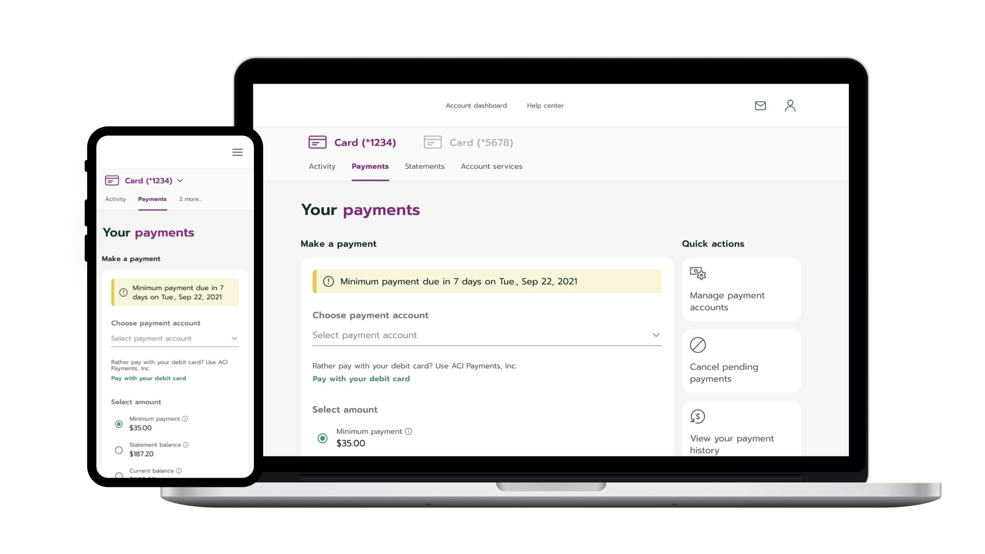
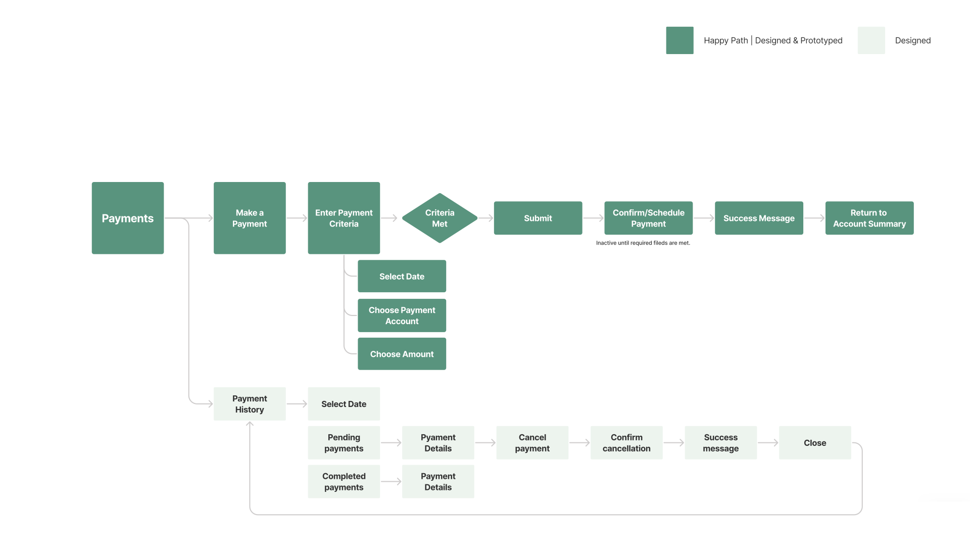
04 — Make a Payment: The #1 driver of service calls. A three-step flow replaced a five-screen process.
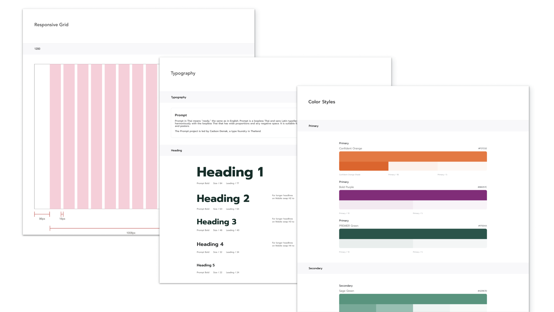
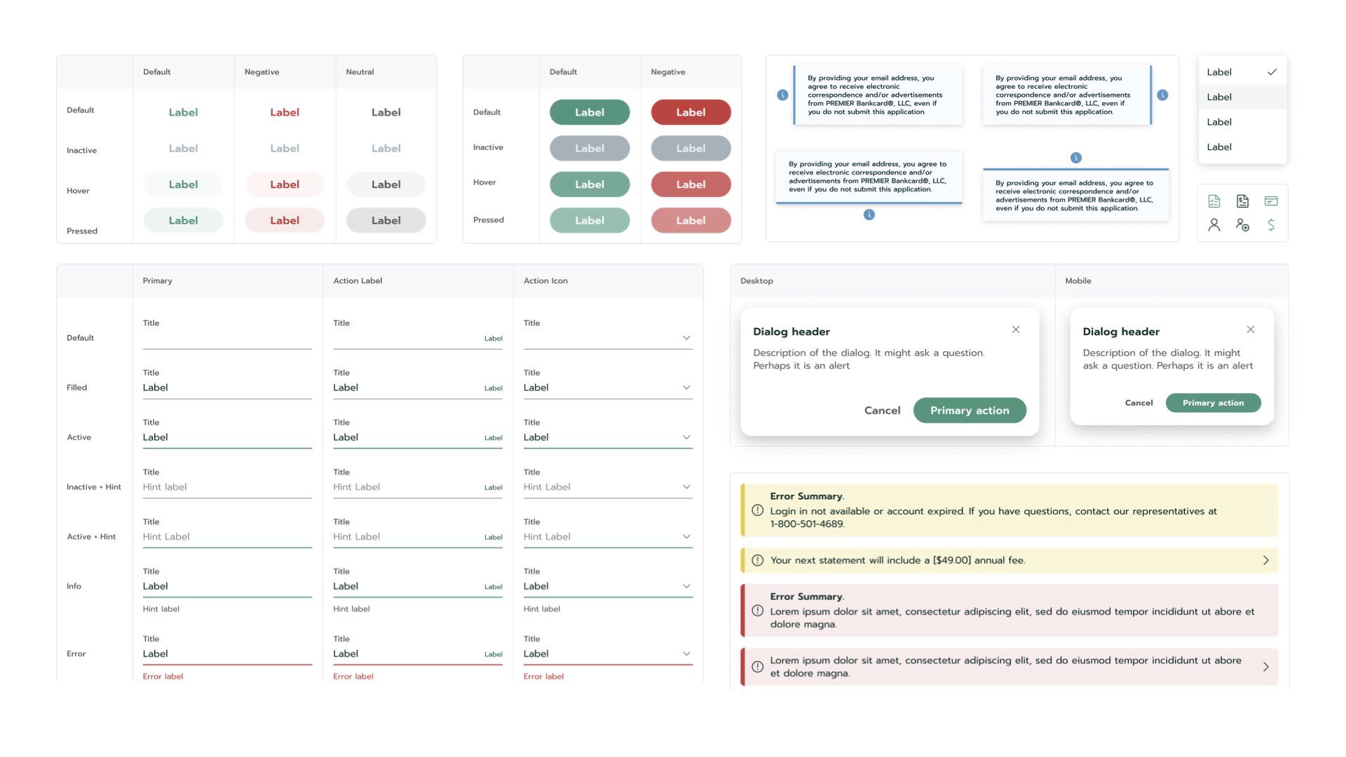
Design System — 125+ Components in 3 Layers
- Color tokens (primary / neutral / semantic)
- Typography scale (7 levels)
- Spacing system (4px base grid)
- Grid system (12-column)
- Elevation & shadow tokens
- Form elements (inputs, selects, validation)
- Navigation (tabs, breadcrumbs, menus)
- Data display (tables, cards, charts)
- Feedback (alerts, toasts, modals)
- Actions (buttons, links, CTAs)
- Authentication flows
- Transaction patterns
- Account management
- Error recovery sequences
- Onboarding templates
Design System Documentation — Style Guide & Component Library
The Shift — From Portal Fix to Organization Standard
Deliverables
- User Research & Insight Generation
- UX Strategy & Customer Journey Maps
- Wireframing & Prototyping (14 prototypes)
- UI Design (105 hi-fi screens)
- Design System (125+ components)
Methods
- Discovery Audit
- Stakeholder Interviews
- Concept Testing
- Iterative Prototyping
Organization
Concentrix Catalyst — engaged as the bank's design partner. I led design direction, system architecture, and screen delivery across the full engagement.