CLI Studios · Product Design · 2024

Five usability problems. One root cause. A redesign that started with structure.

CLI Studios' dance-education app had collapsed under its own modals — users couldn't tell content types apart, navigate confidently, or recover from wrong turns. I rebuilt the information architecture first, then the surface: a unified design system projected to cut development time by 25%.

App Design Design System Mobile UX
Client CLI Studios
Role Lead Product Designer
Year 2024

Watch the shift

Before & after, side by side.

Before
After
Where it started

An app eaten by its modals

Five distinct usability problems all traced back to one root cause: an over-reliance on modal views had collapsed the information architecture. Users couldn't distinguish content types, navigate confidently, or recover from wrong turns.

Modal overload Broken IA No way back
What it became

A structure users can trust

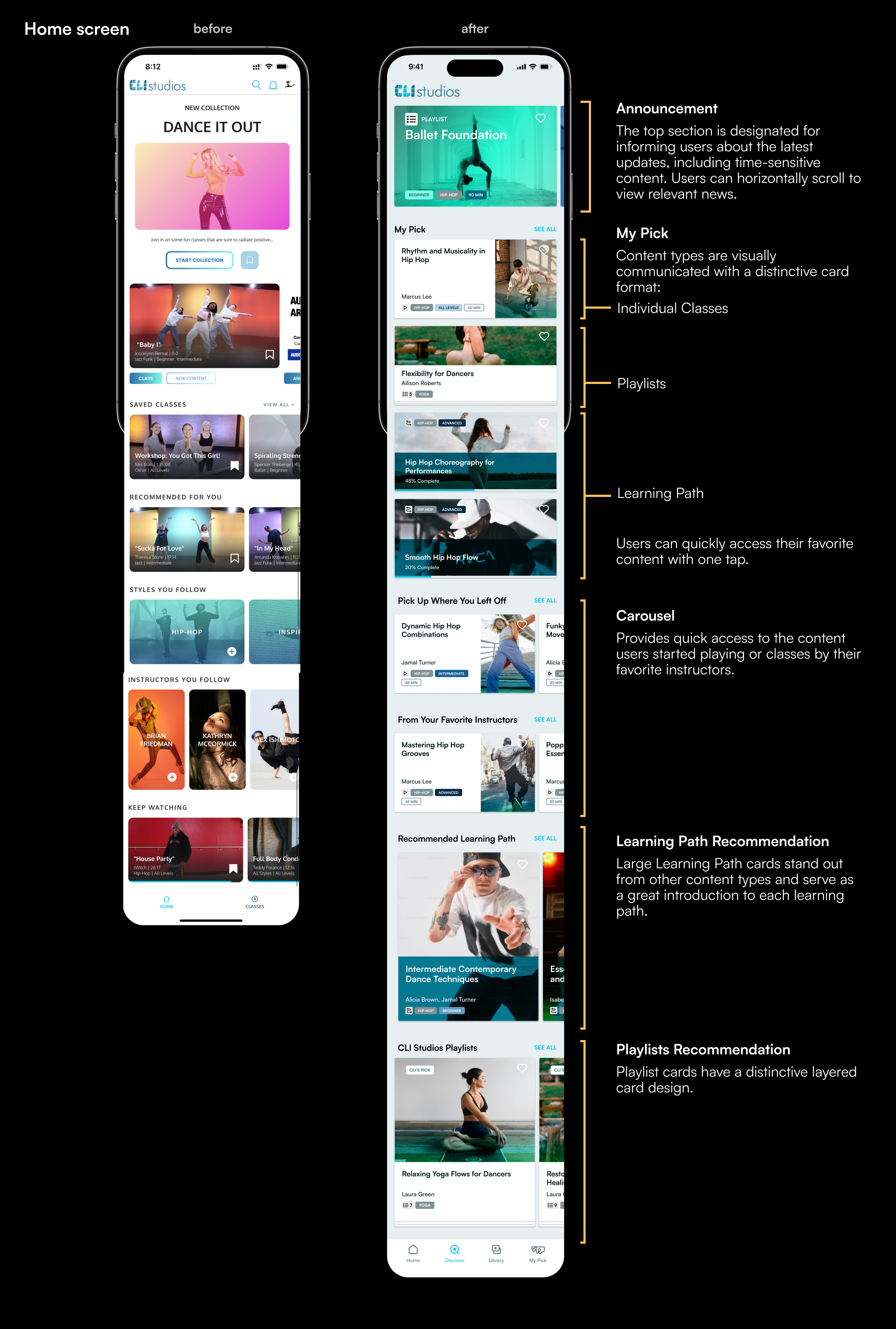
Four clear sections. Full-page views instead of modals. Consistent back navigation throughout. Distinct card designs per content type — a structural rethink, not a visual refresh.

4 sections Full-page views Design system

My approach

Structure first, then surface.

I led with a heuristic evaluation against Nielsen's 10 principles, then user interviews to validate the findings. The key insight: every problem was a symptom of the same architectural flaw. So I made the call to eliminate modals entirely — replacing them with full-page views and consistent back navigation — before touching visual clarity.

The architecture

Five problems. One structure.

The old app had no top level worth navigating — every content type opened another modal on top of the last, so depth replaced structure and there was no reliable way back. The rebuild gave it four peer sections and named them the way users already think.

Before — depth instead of structure
Home
Coursesmodal
Course detailmodal
Video playermodal
Collectionsmodal
Three layers deep, with no consistent way back — and "Courses" and "Collections" looked identical on the way in.
After — four peer sections
Home
Where you left off
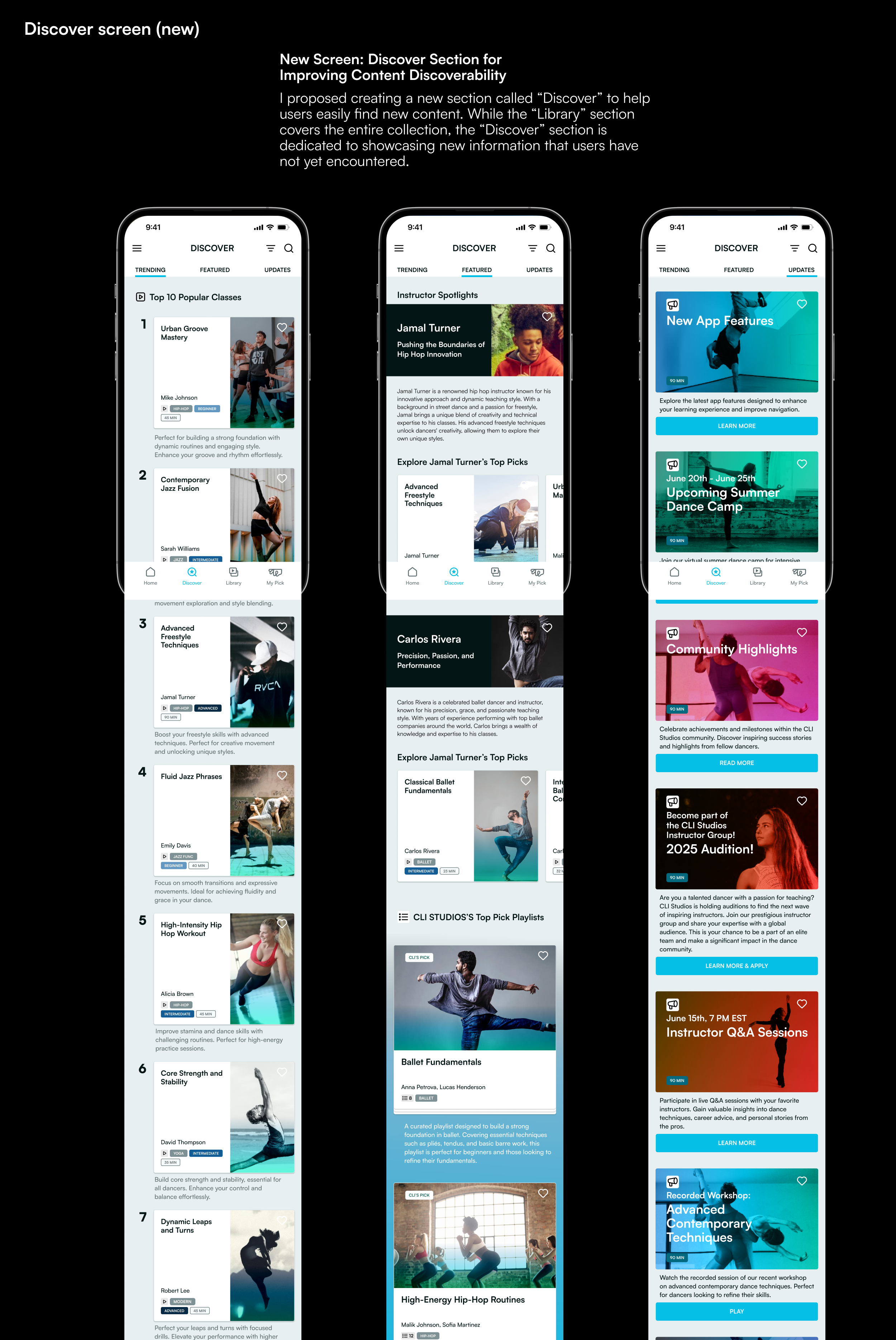
Discover
Browsing, not searching
Library
Learning Paths — sequential
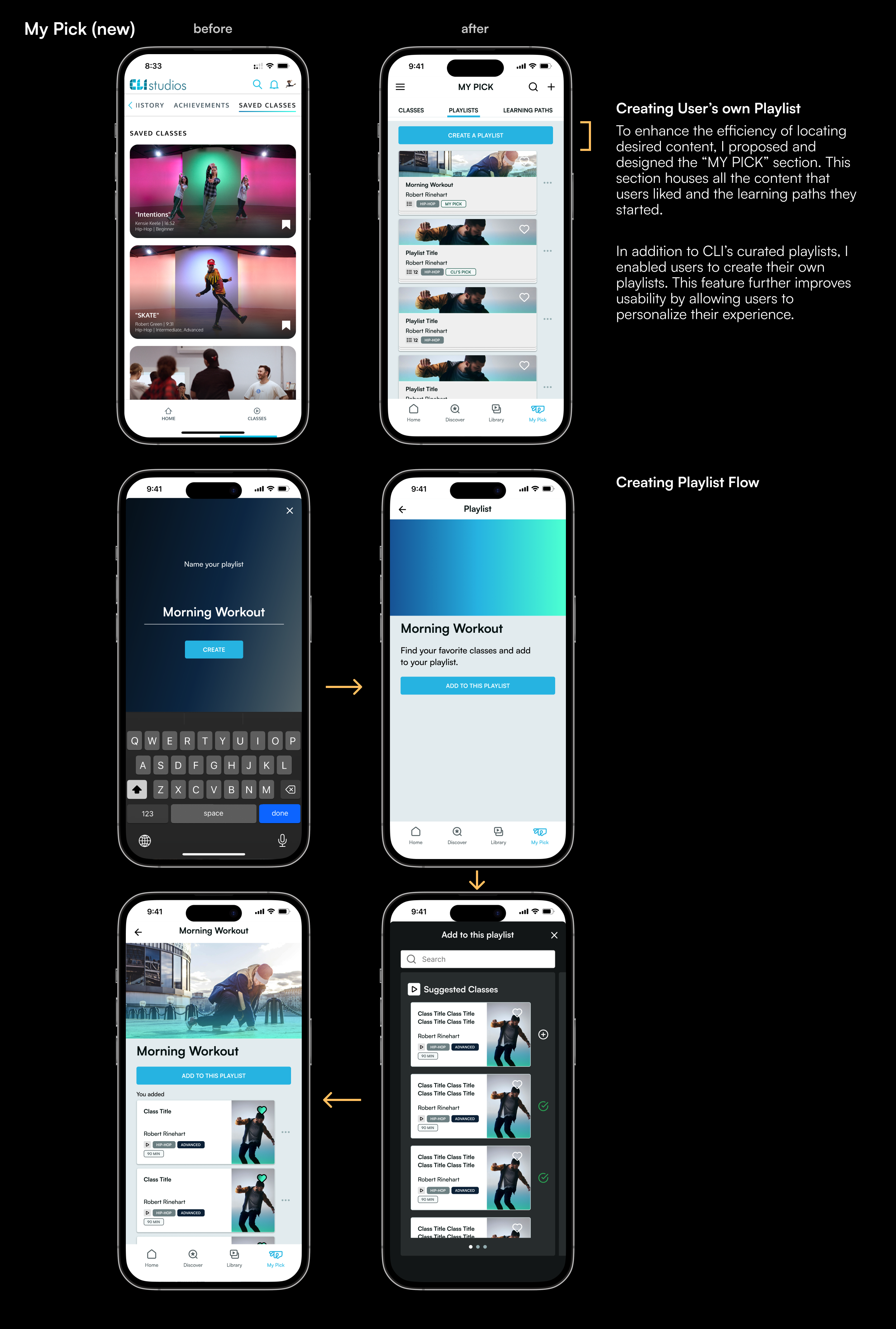
My Pick
Playlists — curated
Full-page views throughout. Every screen has a parent, so back always means something.

Every one of the five problems dissolves out of that single decision — once the architecture held, the rest fell into place.

01
Poor information architecture
4 clear sections: Home, Discover, Library, My Pick
02
Indistinguishable content types
"Courses" → "Learning Path", "Collections" → "Playlists" — renamed to match how users actually think about sequential vs. curated content
03
Confusing navigation
Full-page views replaced modals
04
Poor visual clarity
Distinct card designs per content type
05
Modal overload
Consistent back navigation throughout

Evidence · Research

The diagnosis, on paper.

Heuristic evaluation against Nielsen's 10 principles surfaced the five problems; interaction-flow mapping and wireframe sketches shaped the structural answer.

Heuristic evaluation — issue 2
Heuristic evaluation — issue 4
Heuristic evaluation — issue 5
Heuristic evaluation — issue 10
Heuristic evaluation — issue 7
Heuristic evaluation — issue 6
Interaction flow diagram
Wireframe sketch 1
Wireframe sketch 2

Evidence · Screens

Every core screen, before and after.

Login, Home, Discover, Library, My Pick — the same journey, restructured.
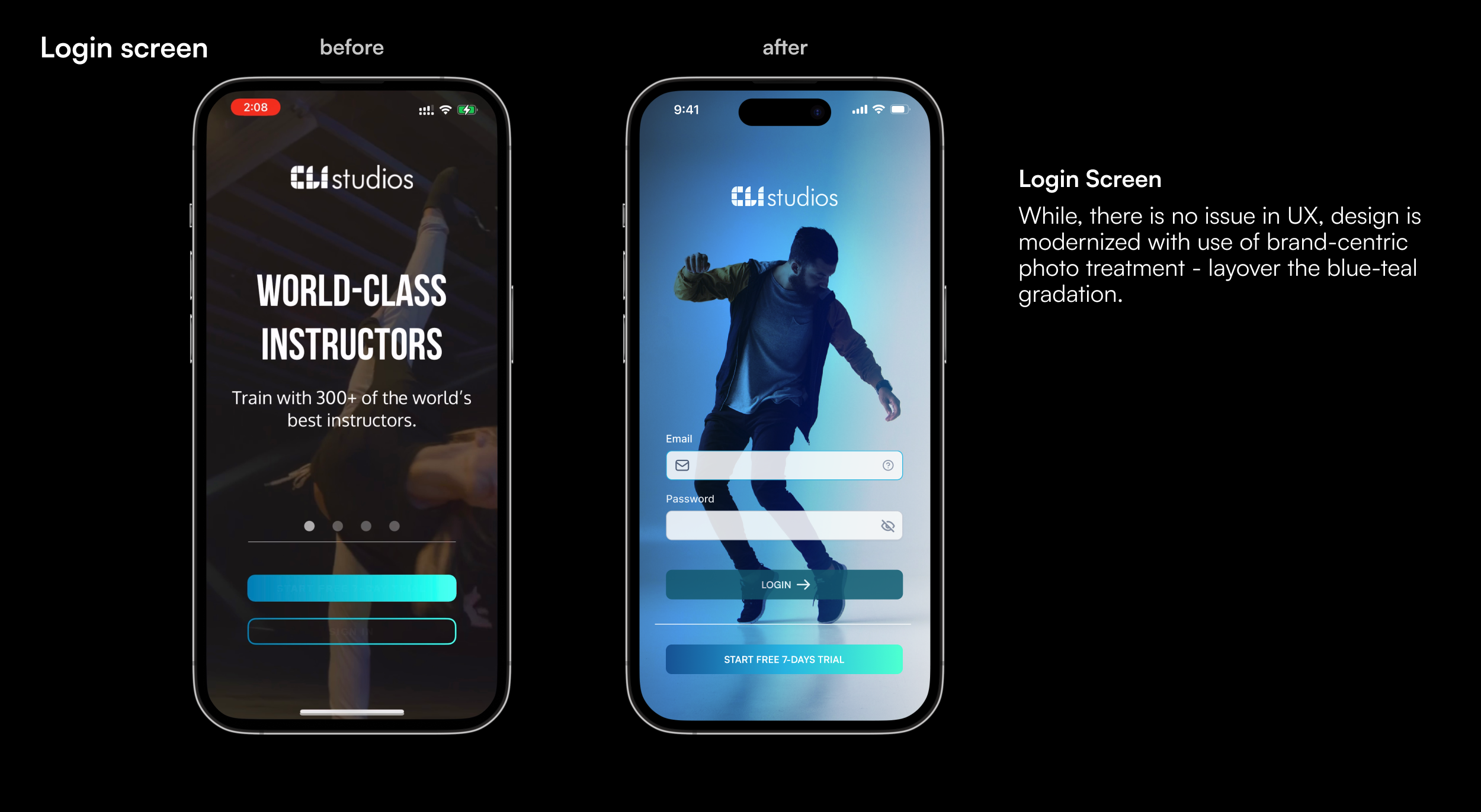
Before and after — Login screen
Before and after — Home screen
Before and after — Discover screen
Before and after — Library screen
Before and after — My Pick screen

Evidence · Design System

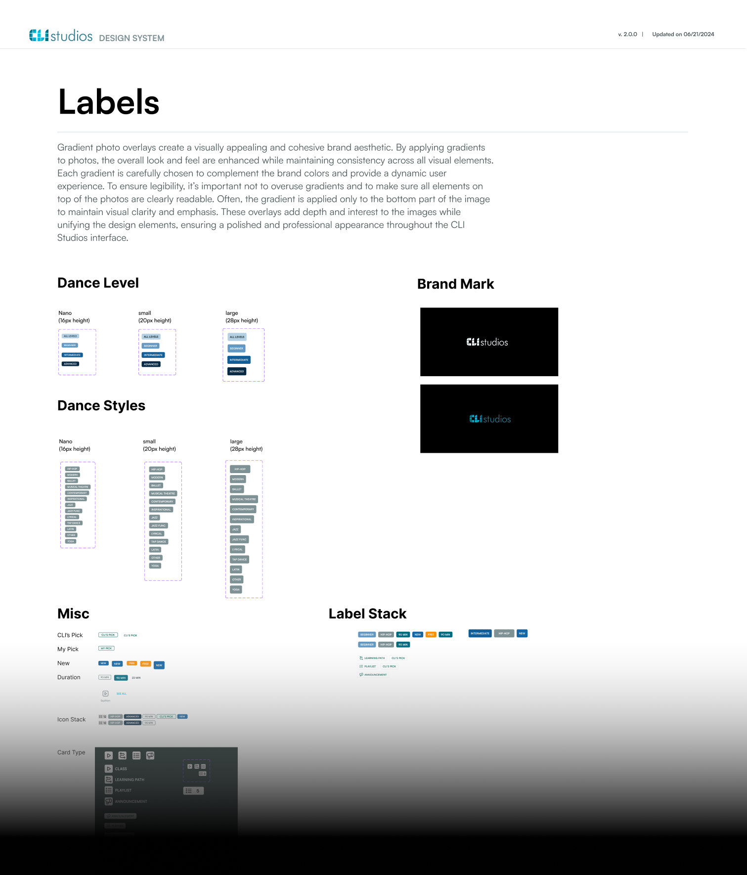
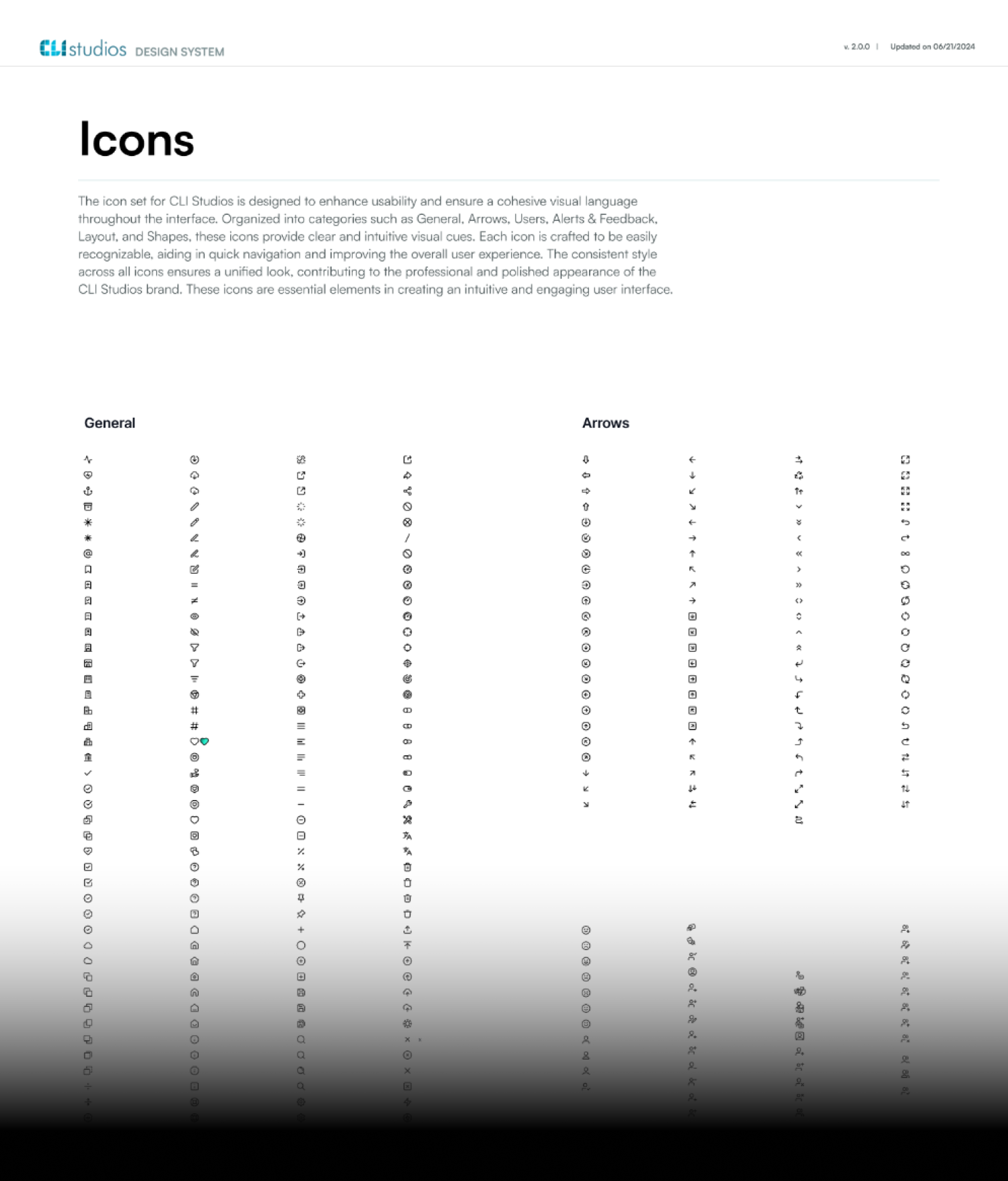
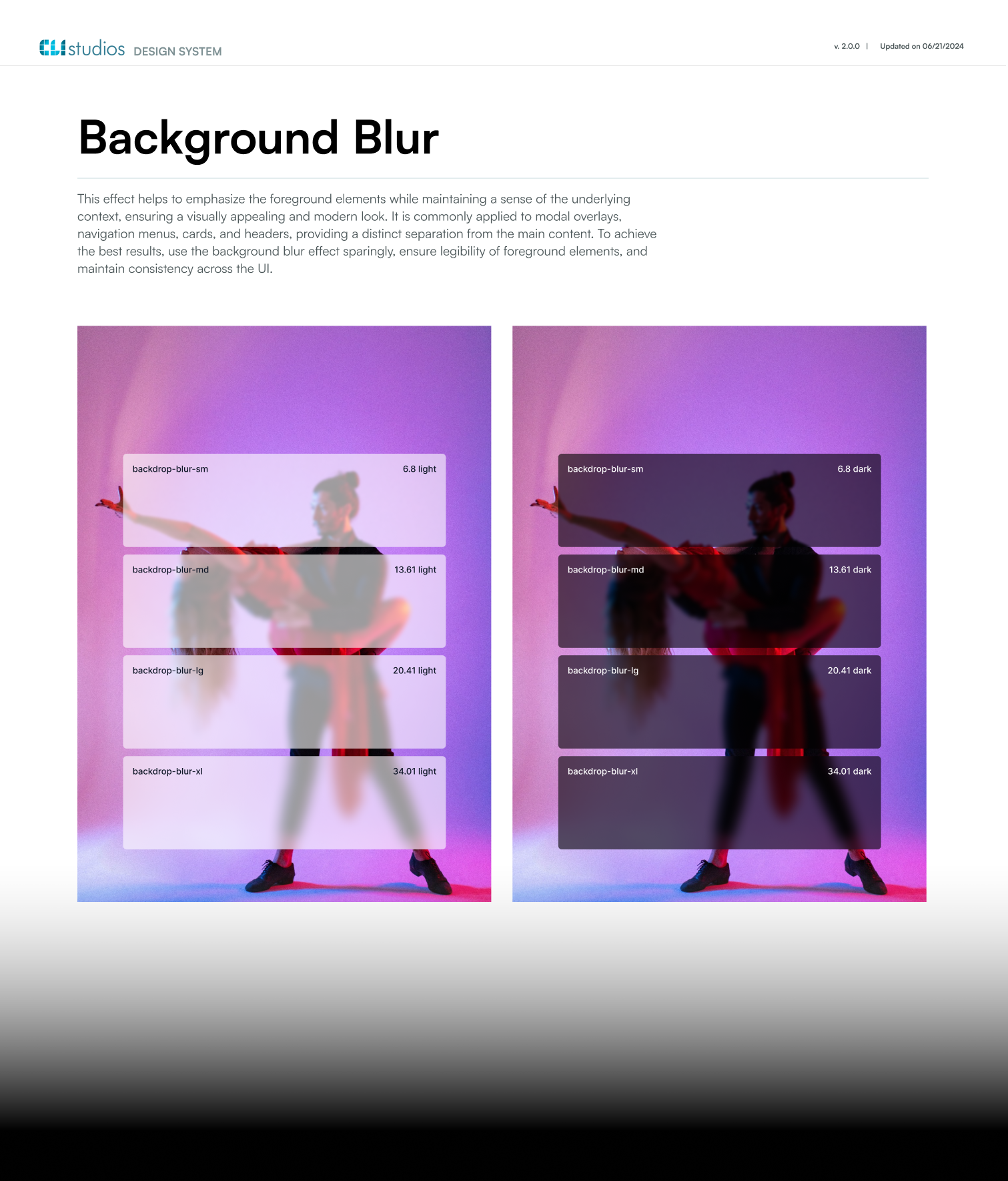
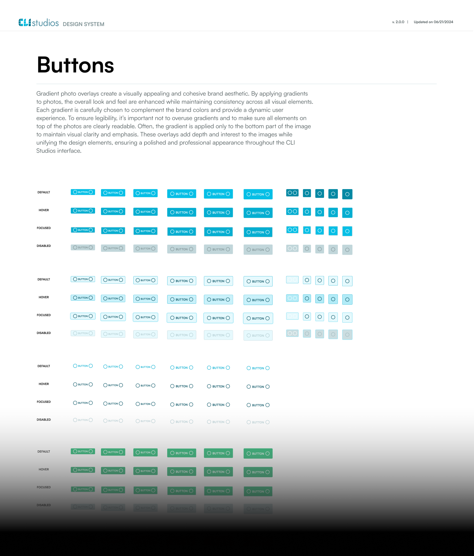
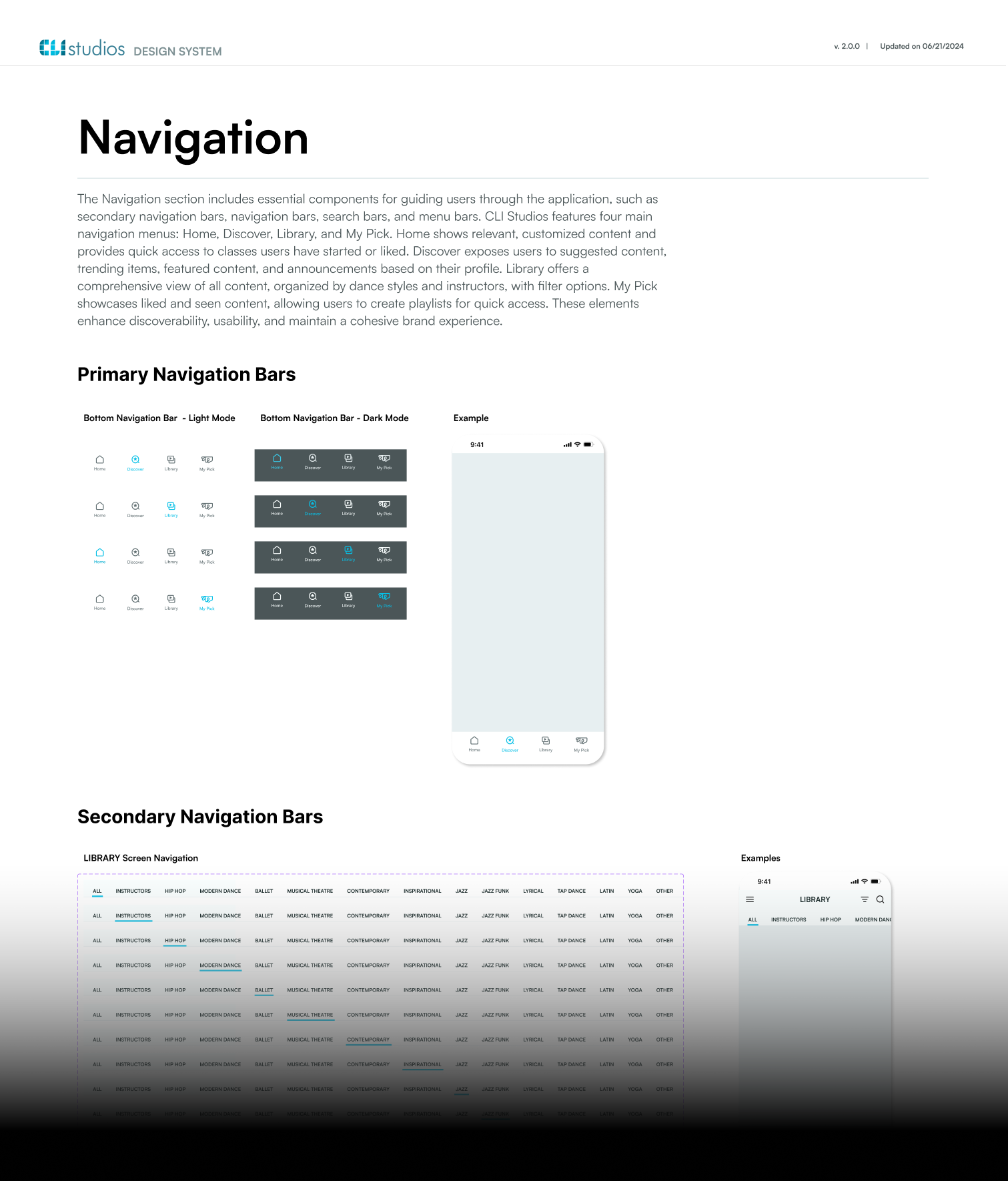
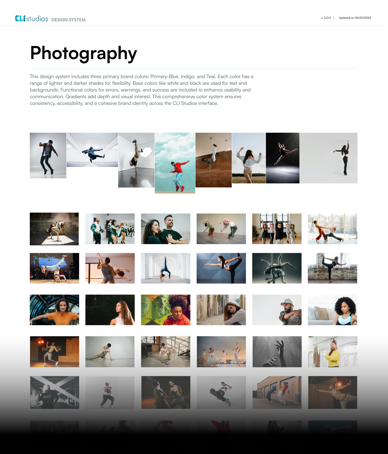
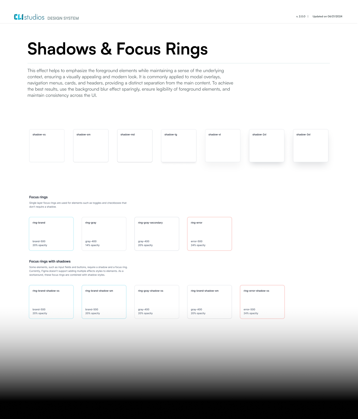
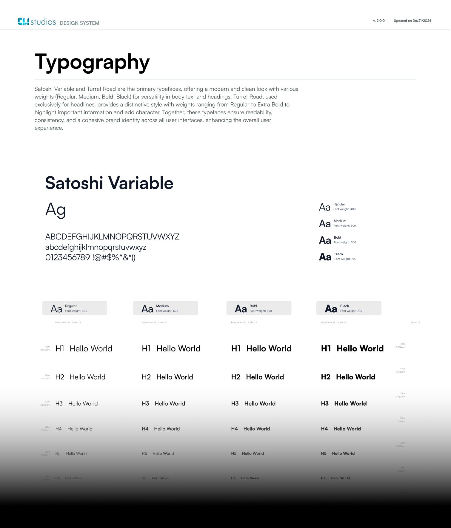
13 pages that outlive the redesign.

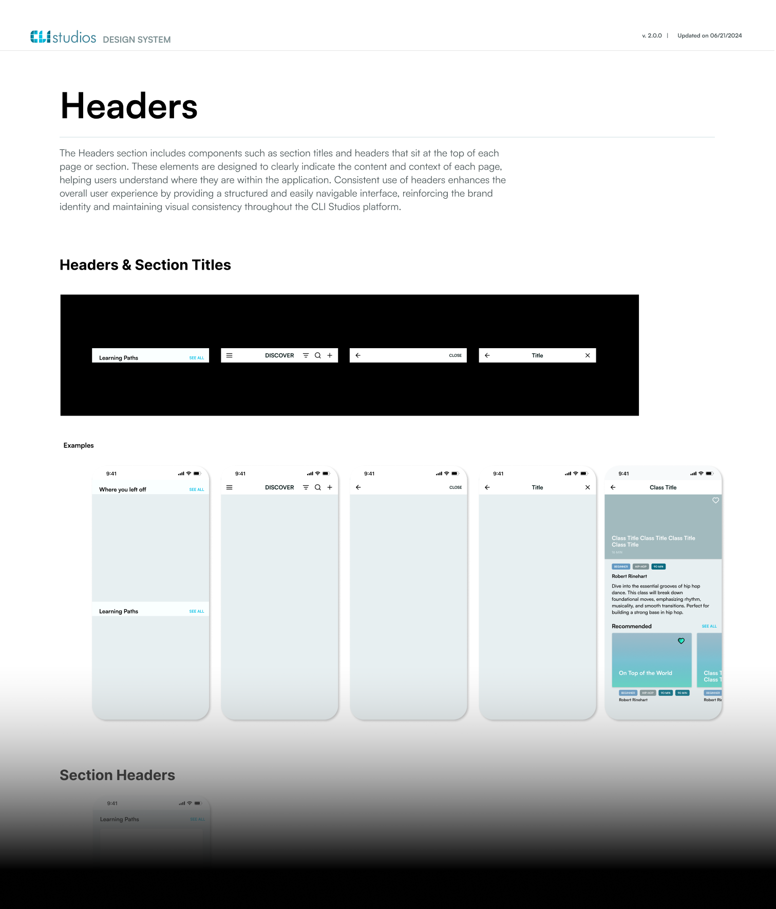
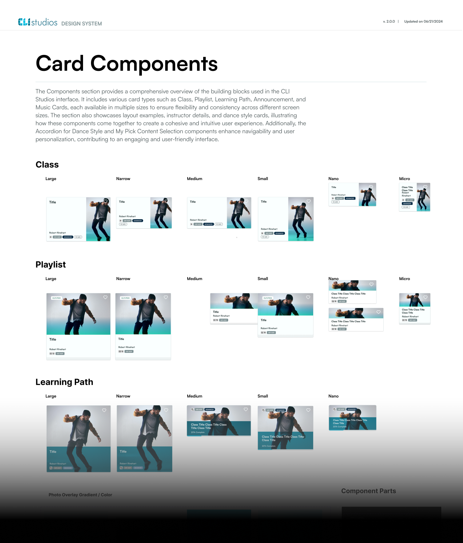
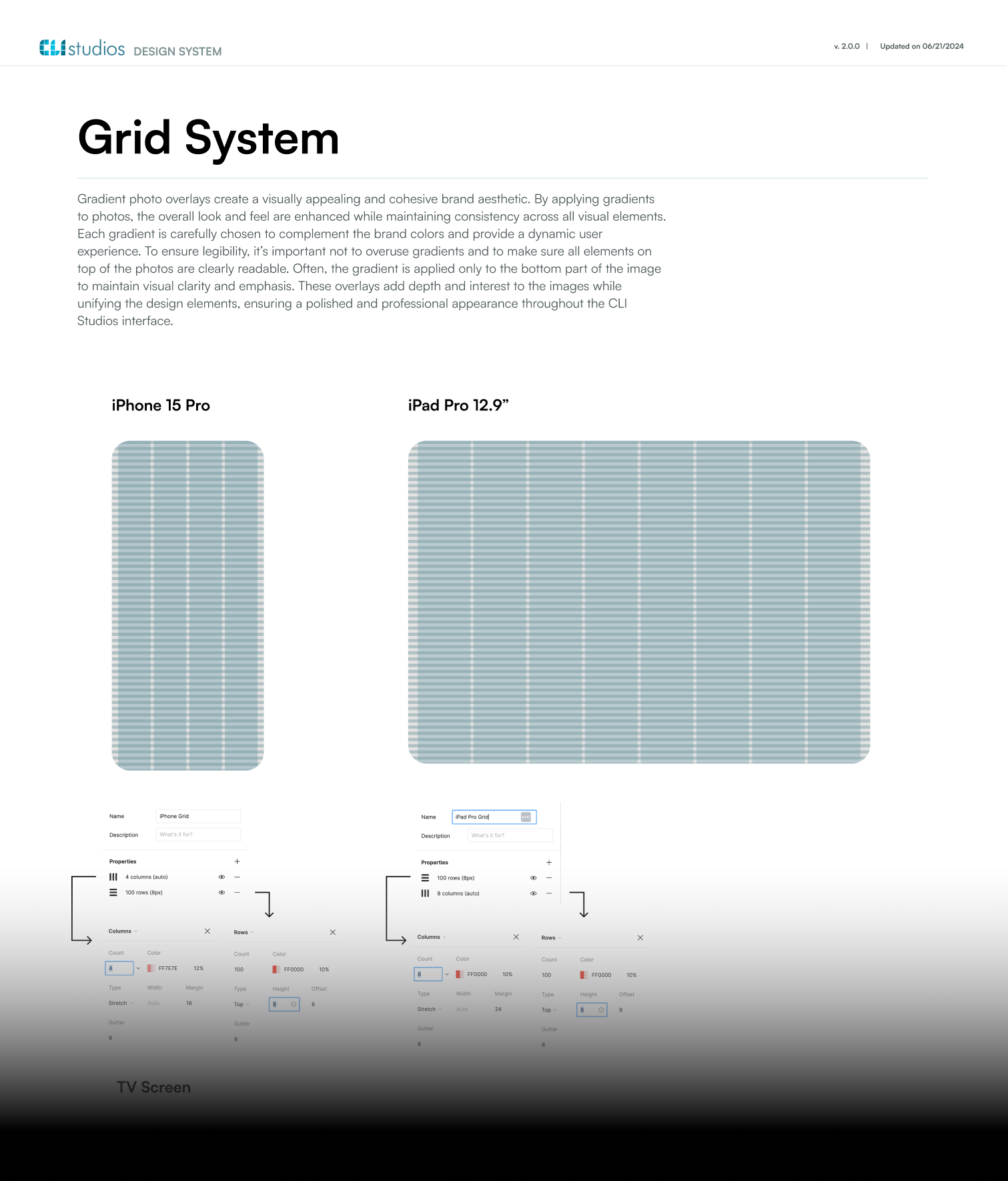
The delivered design system documents 125+ components, interaction patterns, and accessibility specs — so future builds reuse instead of reinvent.
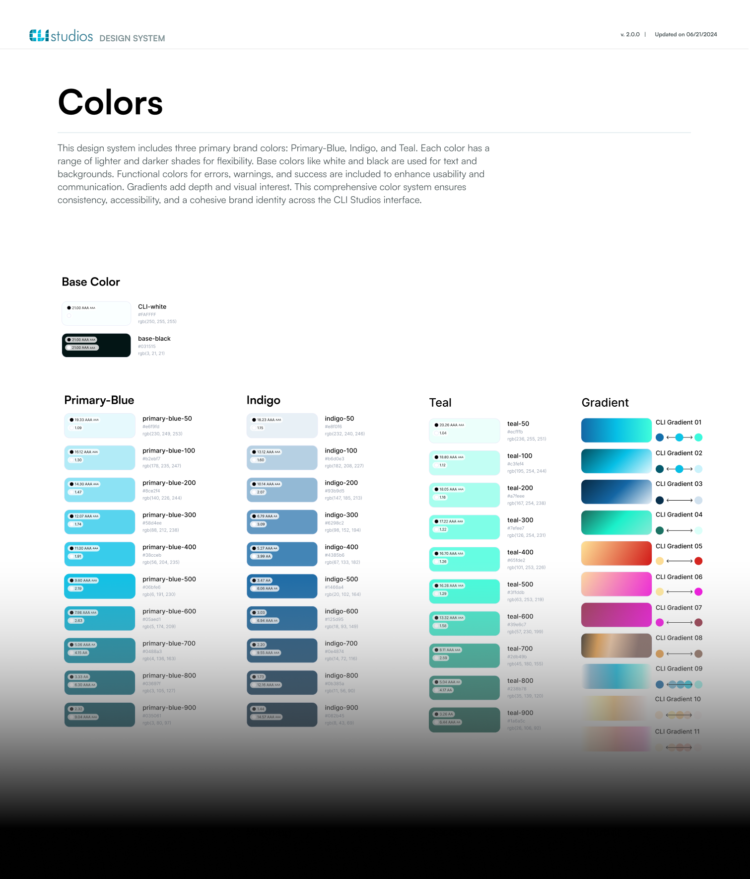
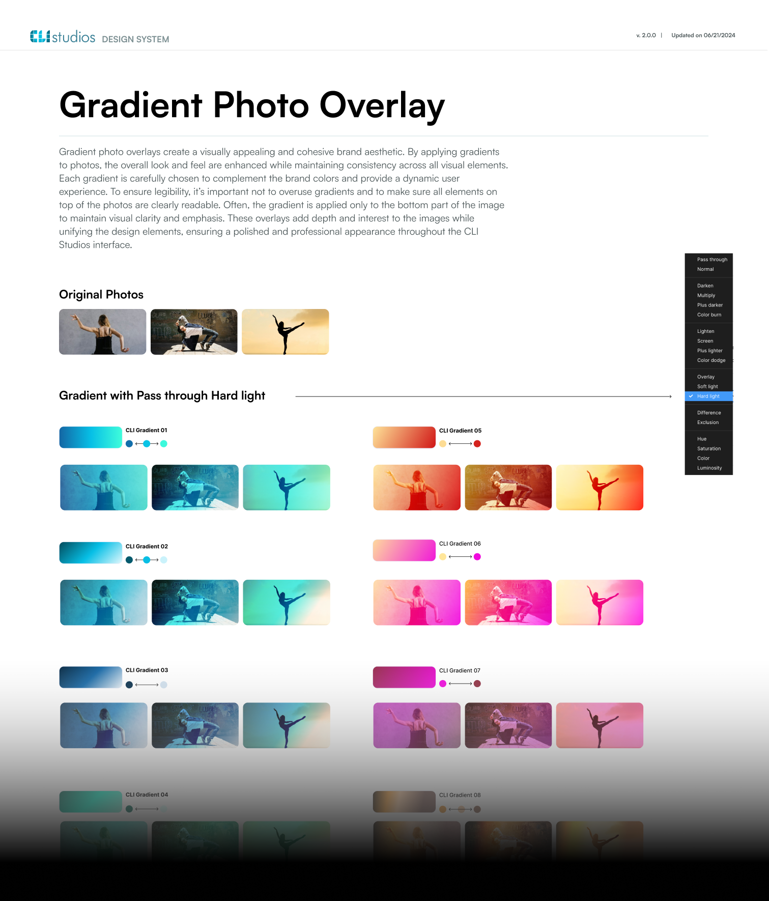
Design System — page 1
Design System — page 2
Design System — page 3
Design System — page 4
Design System — page 5
Design System — page 6
Design System — page 7
Design System — page 8
Design System — page 9
Design System — page 10
Design System — page 11
Design System — page 12
Design System — overview

Craft · 2024

No AI in the room. Just Figma, and reasons.

This was a solo engagement in 2024, before generative tools reached this kind of work. There was no model to generate a hundred directions and no team to argue with, so every decision had to carry its own justification — including the ones I decided not to take. Those are the more useful ones.

Rejected 01
A visual refresh
The fastest route to something that looks like progress. But all five problems traced to the architecture, so a surface pass would have returned every one of them on a different screen.
Rejected 02
Improving the modals
The option that breaks nothing already built. But the modals were the cause, not the symptom — improved modals are still modals, and the depth stays exactly where it was.
Rejected 03
Five problems, five separate fixes
Defensible, and it would have closed every ticket. It would also have produced five unrelated patches — no single decision running through them, and no design system at the end of it.

Outcomes

Structure paid for itself.

25%
Projected reduction in dev time — the design system enables component reuse across future builds
5
Root structural problems solved — IA rebuilt, modals eliminated, navigation simplified
13 pg
Design system documentation — 125+ components, interaction patterns, and accessibility specs
Figma Prototyping Design System Heuristic Evaluation User Interviews

Retrospective

What I'd still argue with.

Three things this project did not settle. They don't belong in the outcomes column, which is exactly why they're worth writing down.

01
The 25% is still a projection.
A design system's return only becomes a measurement once the next build actually runs against it. I'm showing a projected number in an outcomes column, and I know what that's worth compared to a measured one.
02
Structure-first gives you nothing to look at, early.
Rebuilding the architecture before touching the surface means weeks with no screens to show. This engagement had room for that. I don't yet have a good answer for how to win the same argument somewhere that doesn't.
03
A system only becomes a system when someone uses it.
Thirteen pages and 125+ components are a document until the next build reaches for them. Adoption happens after handoff, which is where it leaves my hands — and designing for that handoff is a separate problem I'd take more seriously now.

The takeaway

Fix the structure, and the surface follows.

← T-Mobile BOPIS Next: Web3 Wallet →
1 / 1