Odell EducationOdell Education
Brand and website for a free, open high-school literacy curriculum.無料で公開されている高校国語カリキュラムの、ブランドとウェブサイト。
Challenge課題
Odell Education publishes a free, open high-school English curriculum: four grades and dozens of units, from The Great Gatsby to Things Fall Apart. That much open content needed one credible identity — modern and rigorous, still approachable in a classroom. Even the typeface mattered: a paid font would contradict the mission.Odell Education は、高校英語のカリキュラムを無料で公開している。4 学年、数十のユニット、『グレート・ギャツビー』から『崩れゆく絆』まで。これだけのオープン教材に、信頼できるひとつの顔が必要だった。現代的で骨太、それでいて教室でとっつきやすい顔。書体でさえ問題になる。有料フォントを選べば、理念と矛盾する。
Solution解決
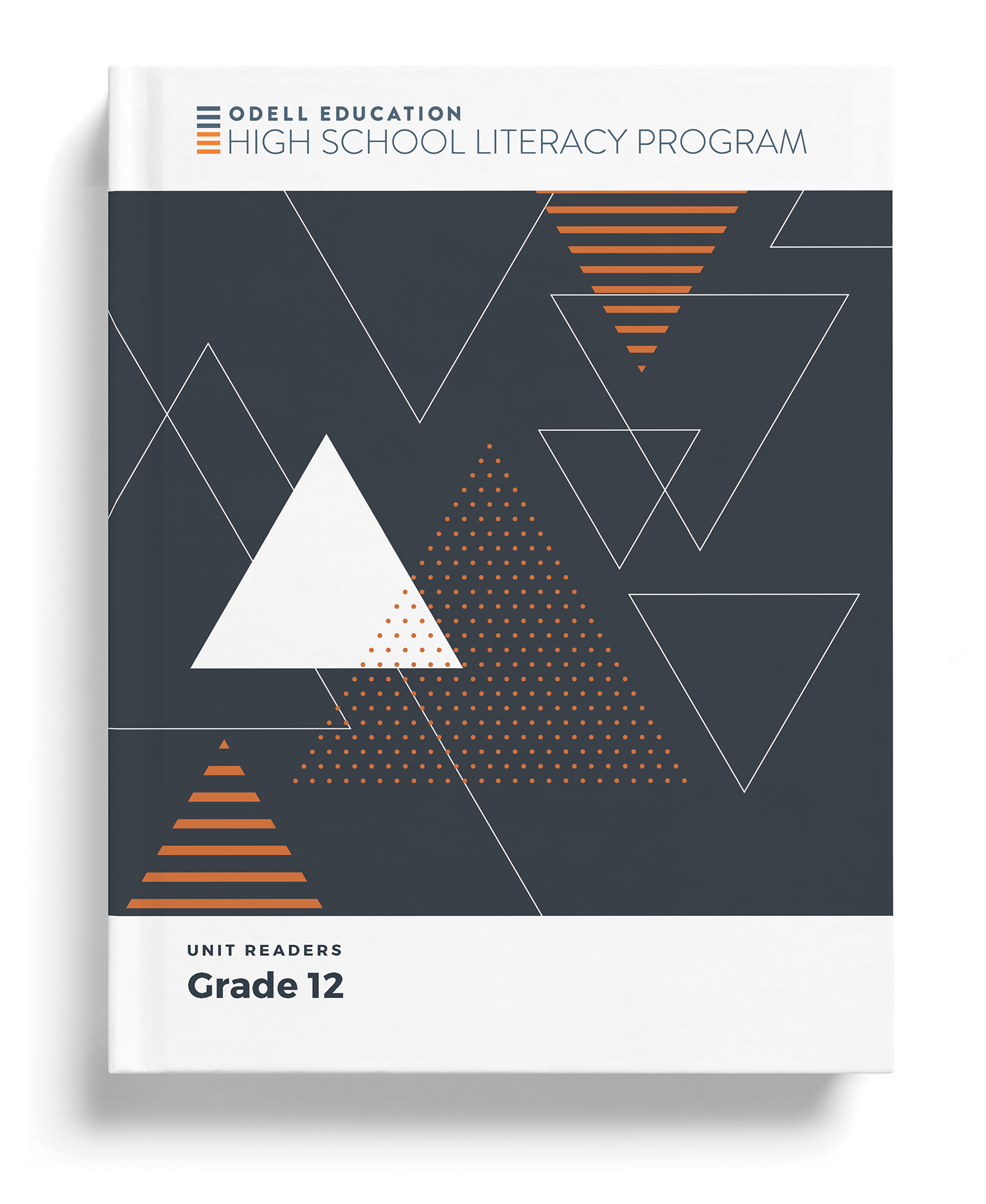
I led brand and product design for the whole program: a navy-and-orange geometric language — dotted grids, circles, arcs, triangles — that flexes across four grades, with a brighter palette for unit covers. The decisive move was choosing Montserrat, a free font, so the open program stays open in print and on screen. The same system carries the program website.プログラム全体のブランドとプロダクトデザインを主導した。点のグリッド、円、弧、三角でつくるネイビーとオレンジの幾何学の言語を 4 学年に展開し、ユニットの表紙にはより明るい色を用意した。決め手は、無料の書体 Montserrat を選んだこと。紙でも画面でも、オープンな教材がオープンなままでいられる。同じ仕組みがウェブサイトまで通っている。
Impactインパクト
I led brand and product design for Odell’s multi-grade geometric language across the program.Odell の学年横断ジオメトリック言語のブランドとプロダクトを主導した。
What I handled担当フェーズ
- Researchリサーチ
- Business / Strategyビジネス/戦略
- Conceptコンセプト
- UX / UIUX/UI
- Design Systemデザインシステム
- Prototypeプロトタイプ
- Build実装
- Launch / Growthローンチ/グロース
One shape language, four grades ひとつの図形の言葉で、4 学年を
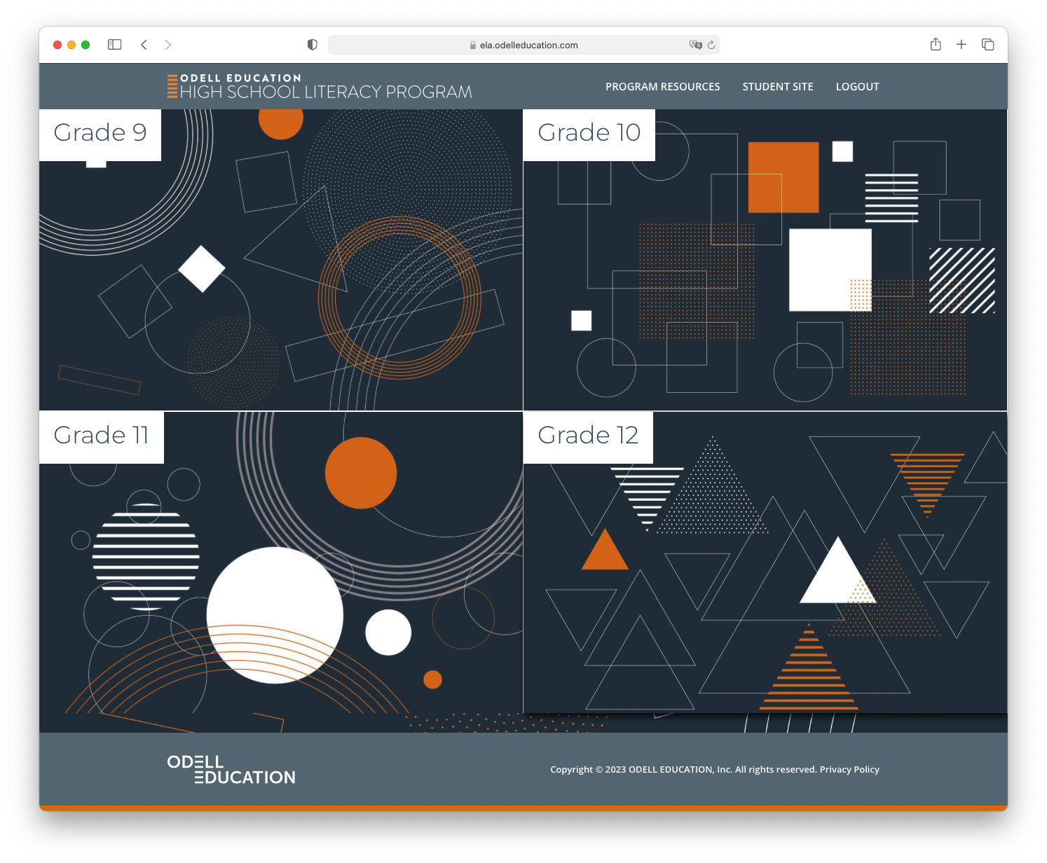
The identity is a navy-and-orange geometric vocabulary — dotted grids, circles, arcs, triangles, dashed line-work. Each grade gets its own composition of the same shapes, so Grade 9 through Grade 12 feel distinct and still clearly one family. Montserrat carries the type, chosen partly because it is a free Google font that works in print and on screen: an open curriculum should not depend on a font people have to pay for. ブランドの軸は、ネイビーとオレンジの幾何学の語彙。点のグリッド、円、弧、三角、破線。学年ごとに同じ図形を別の構成で組むので、9 年生から 12 年生まで、それぞれ違って見えて、ひと目で同じ家族だと分かる。書体は Montserrat。無料の Google フォントで、紙にも画面にも向くことが選んだ理由のひとつだ。オープンな教材が、お金を払う書体に頼るわけにはいかない。
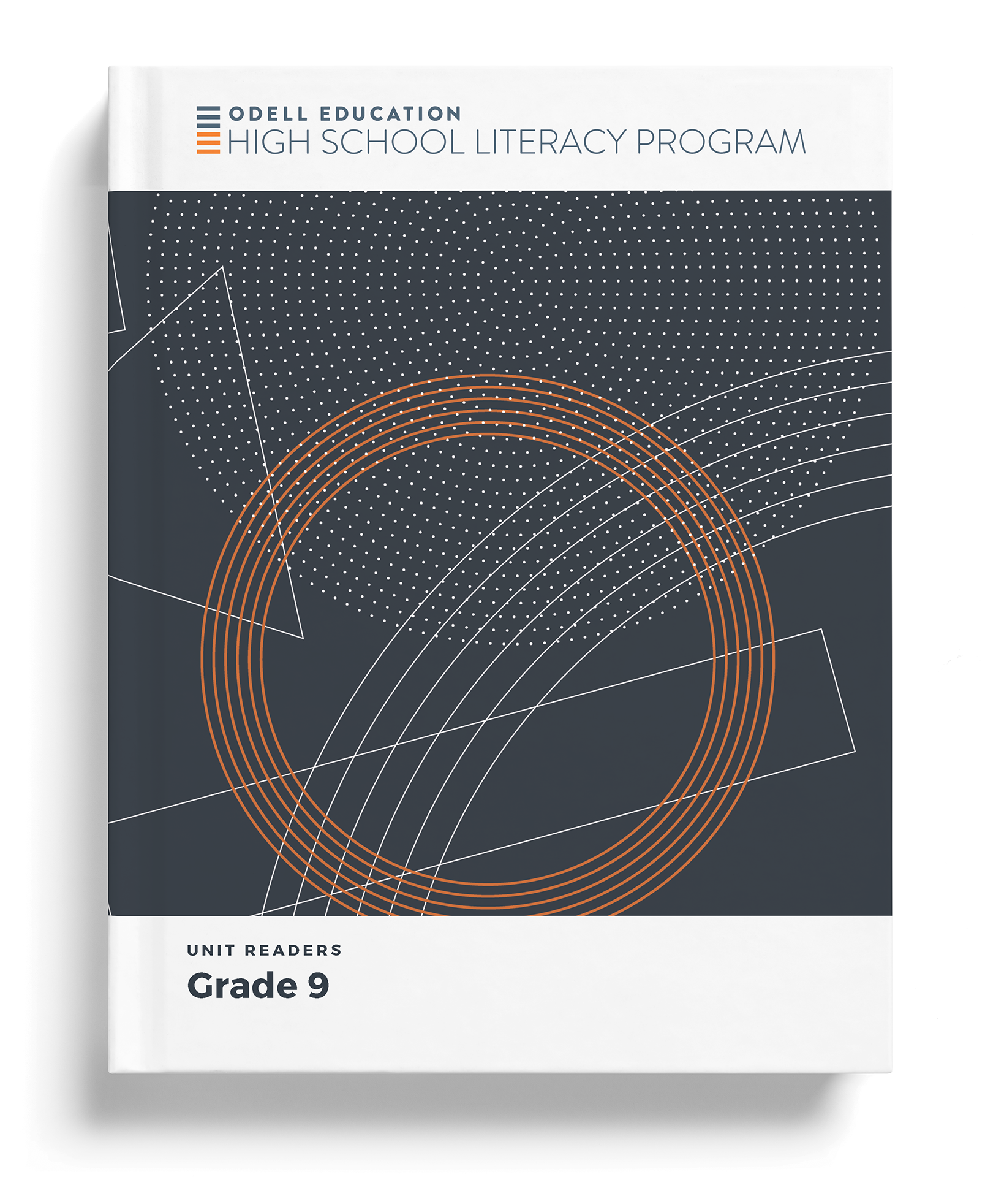
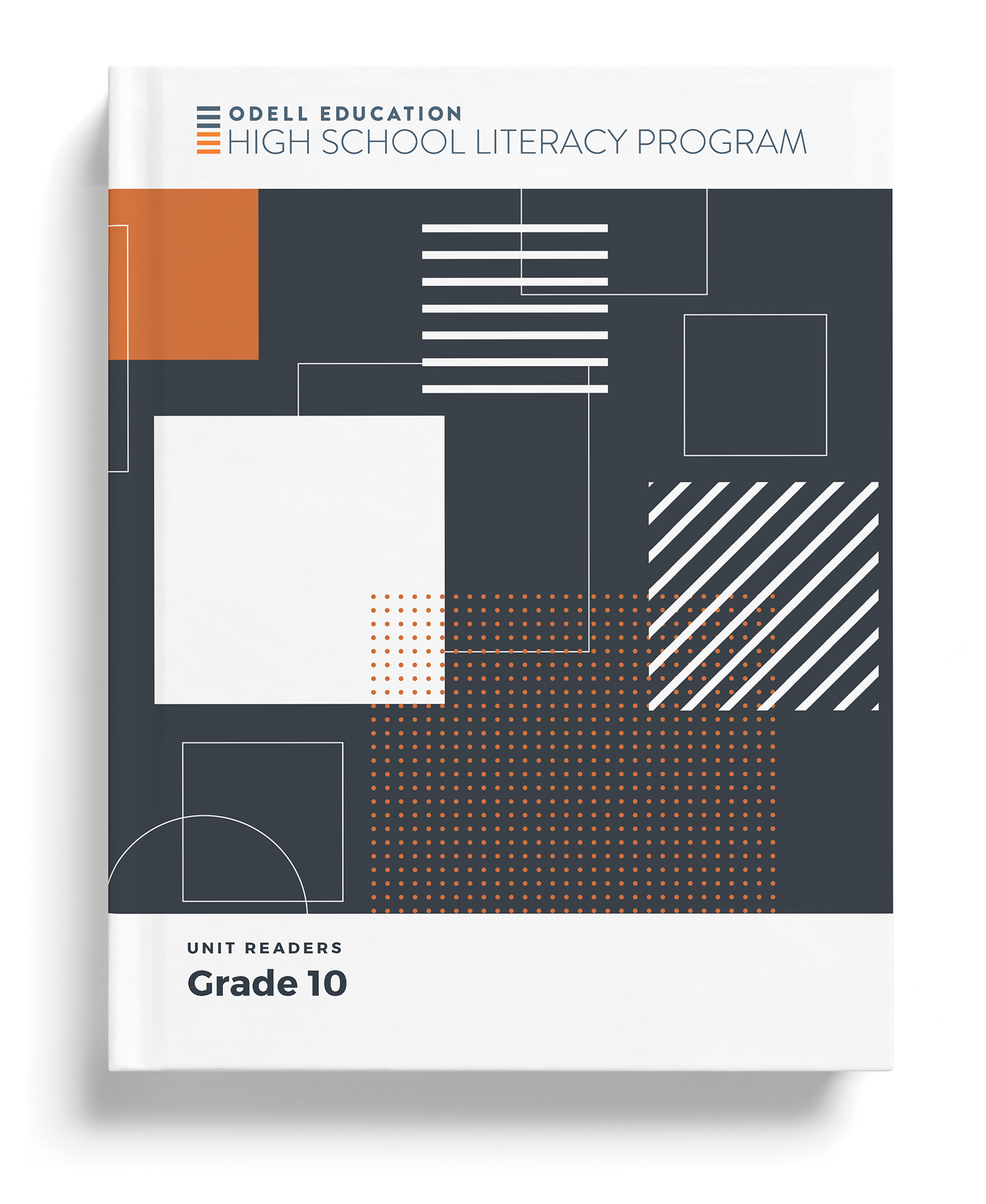
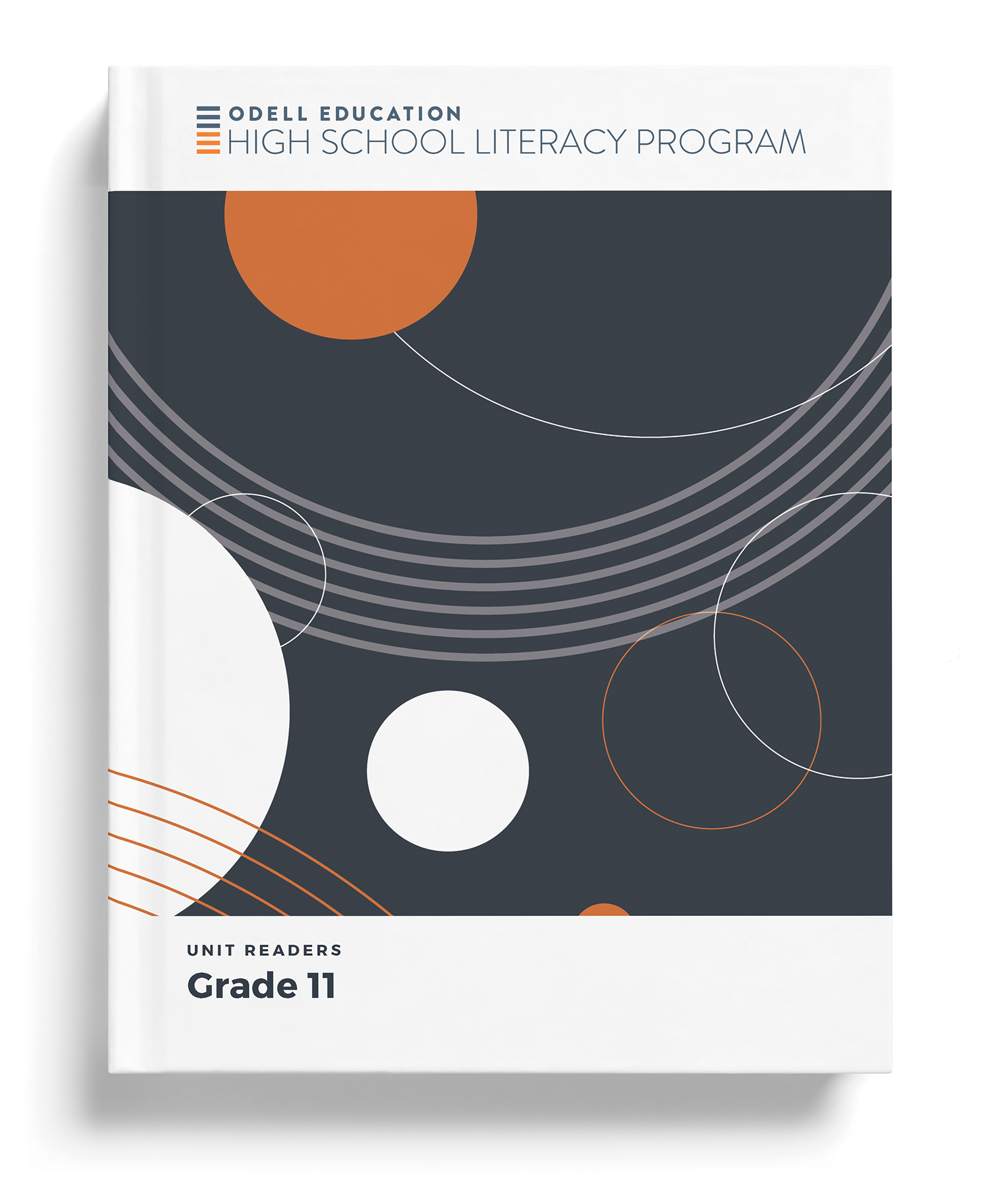
A brighter palette for each text 作品ごとに、明るい色を
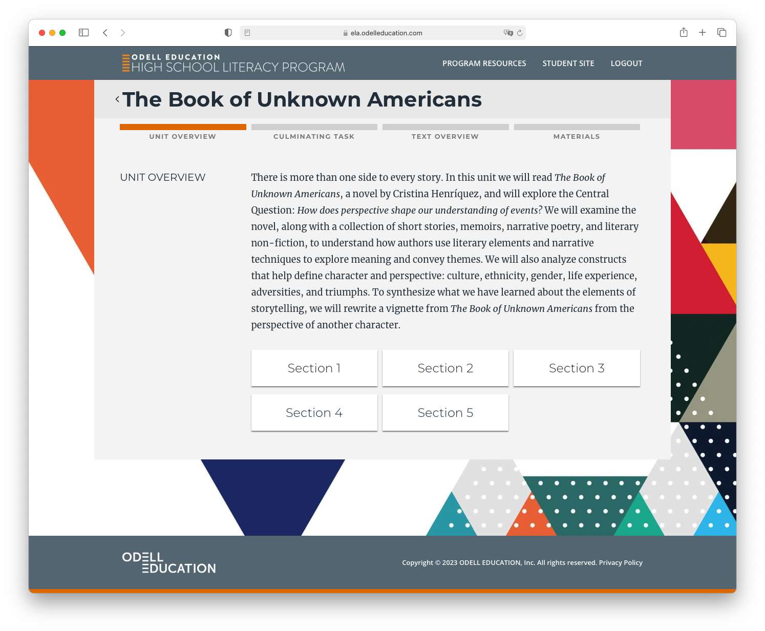
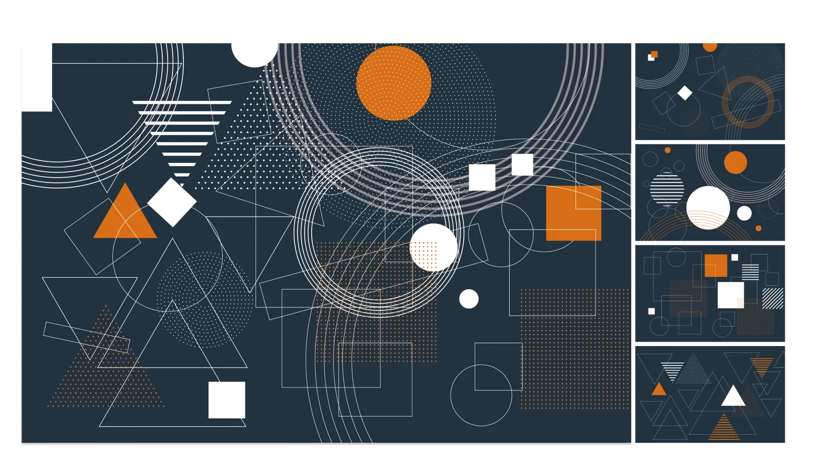
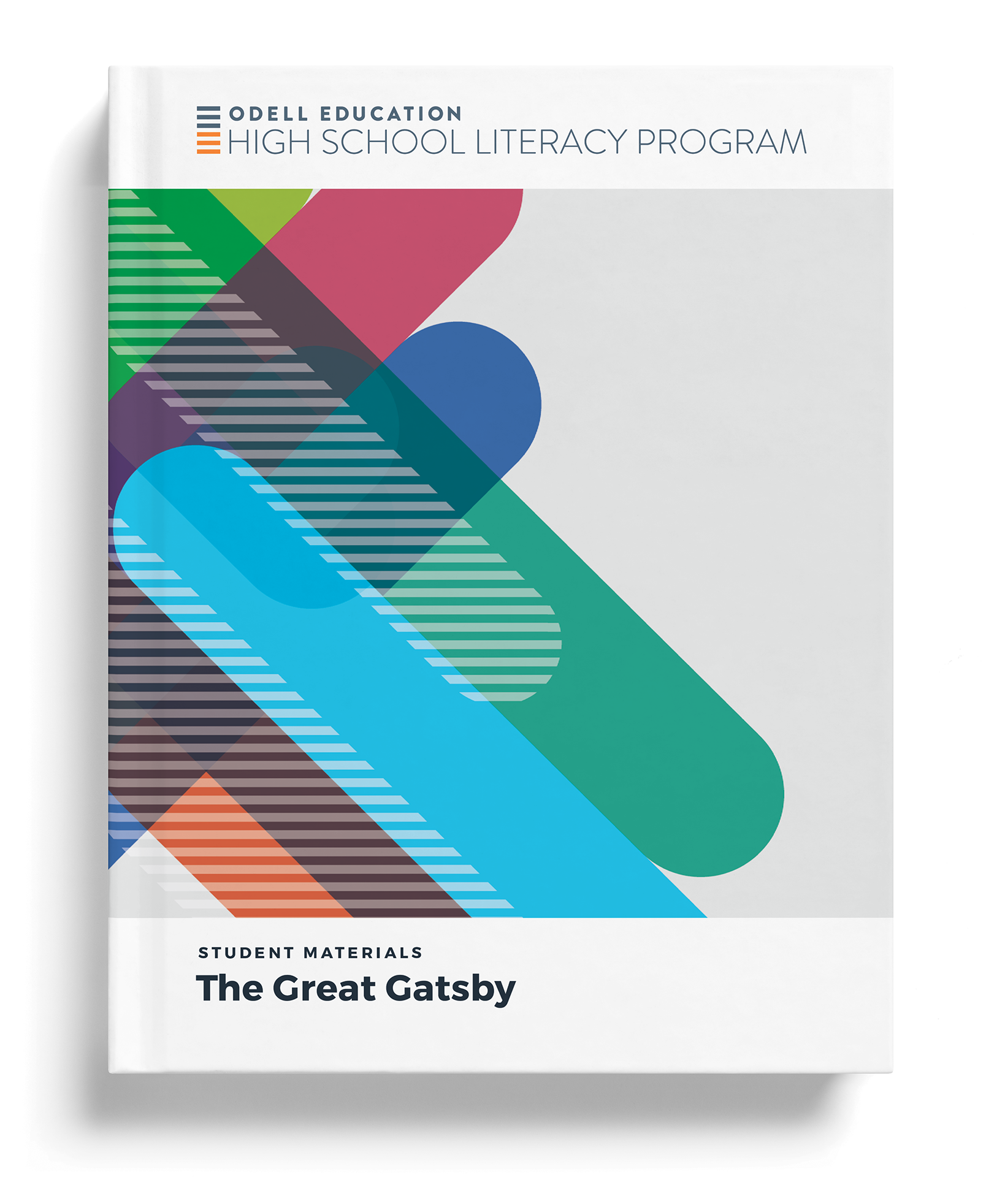
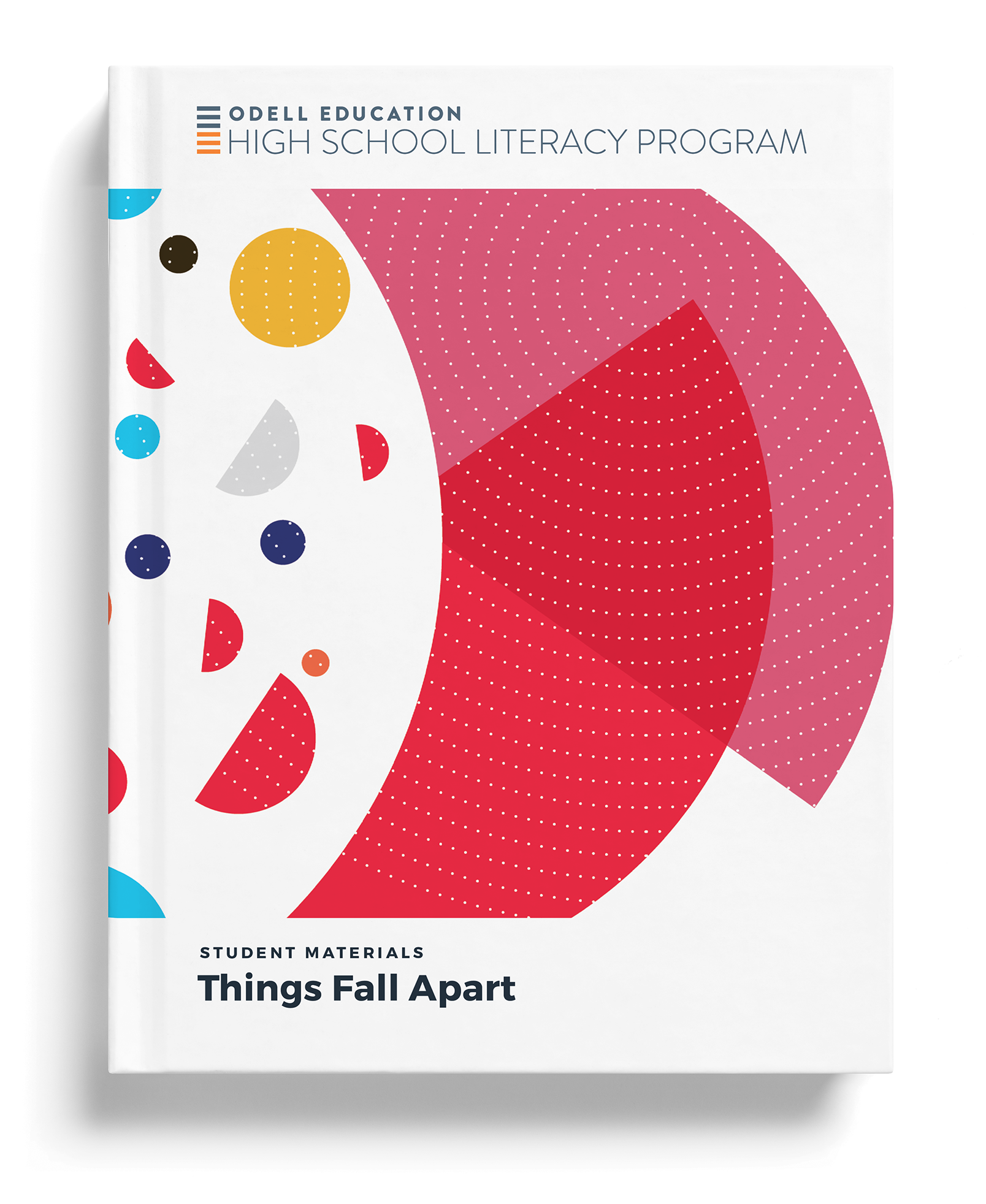
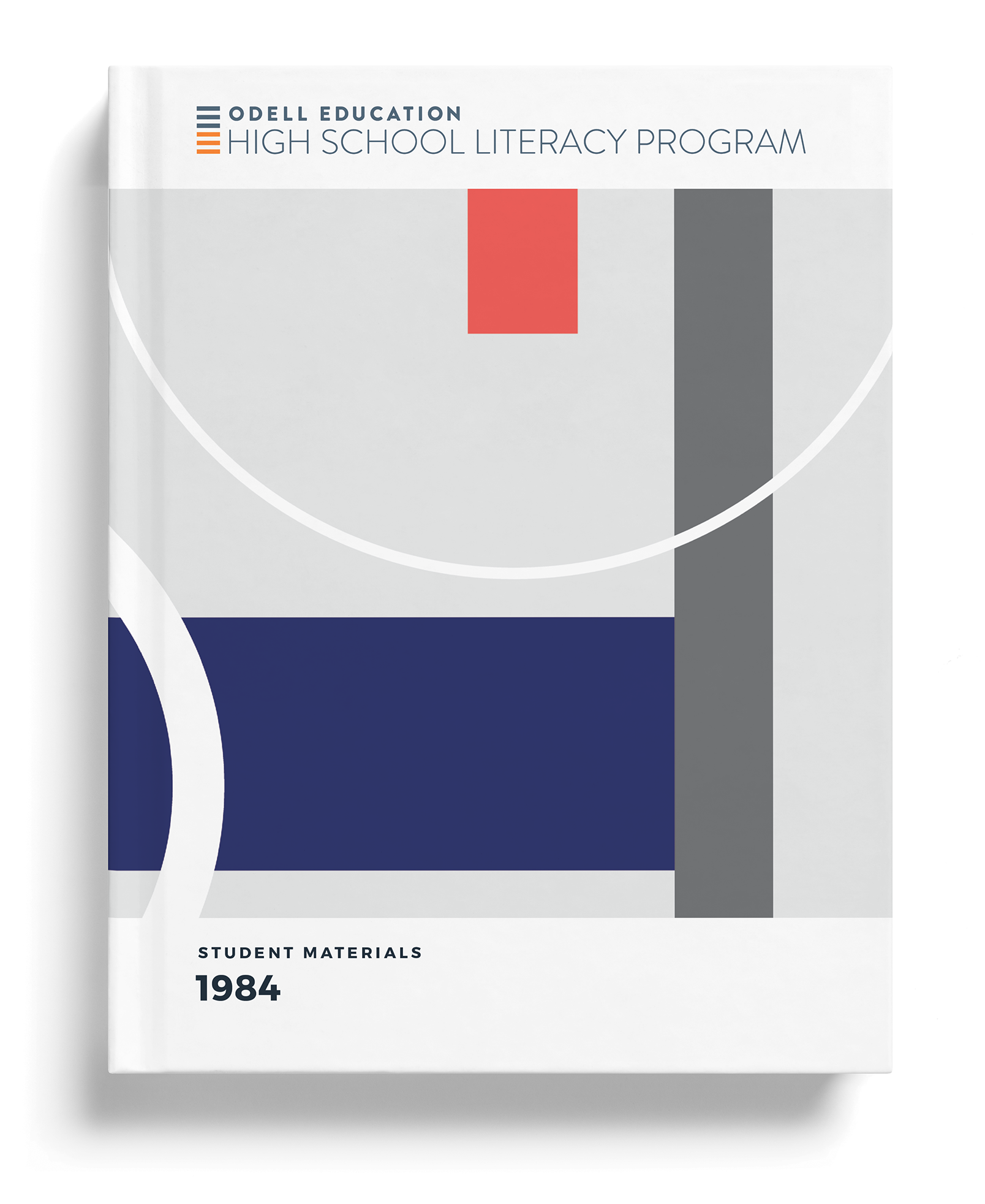
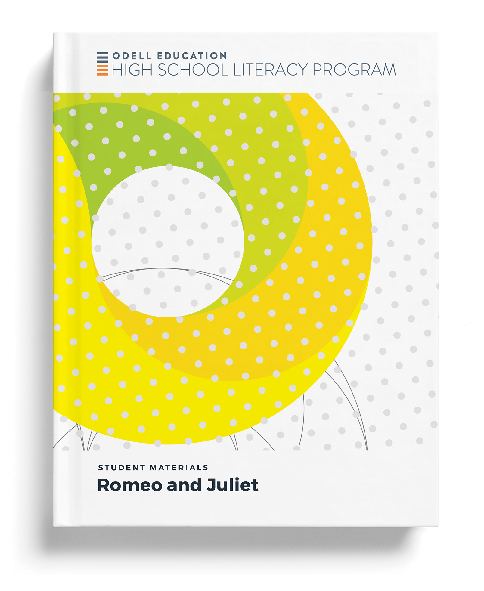
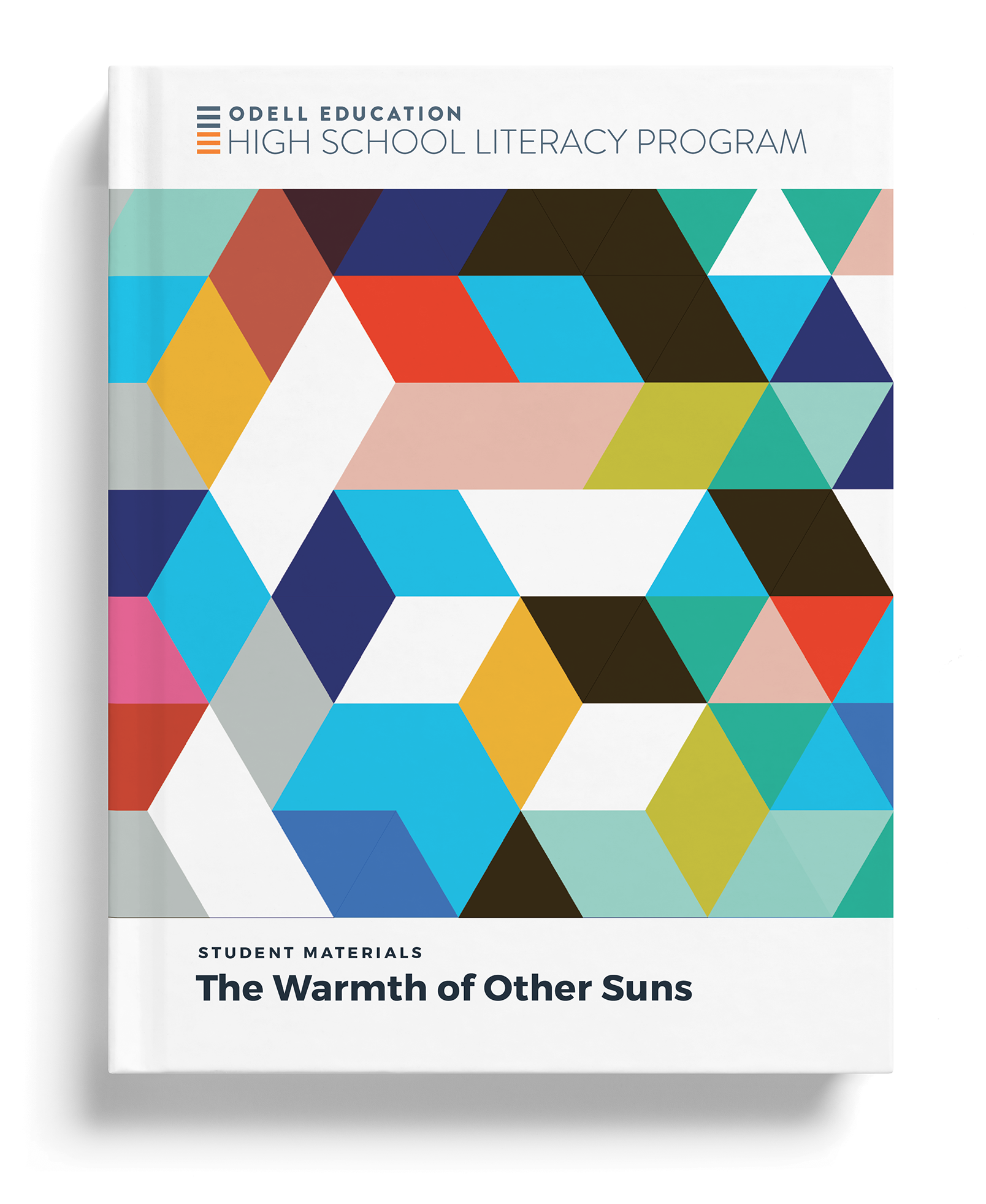
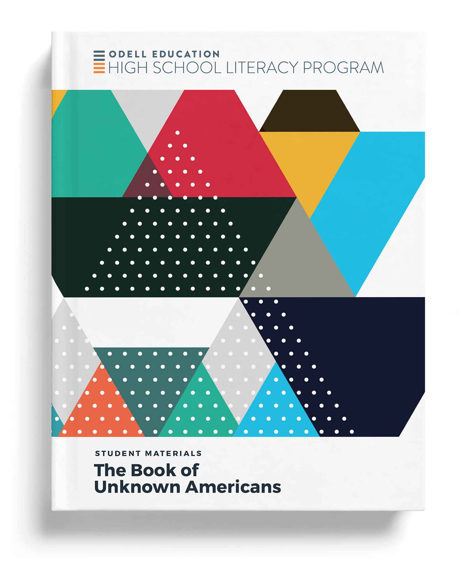
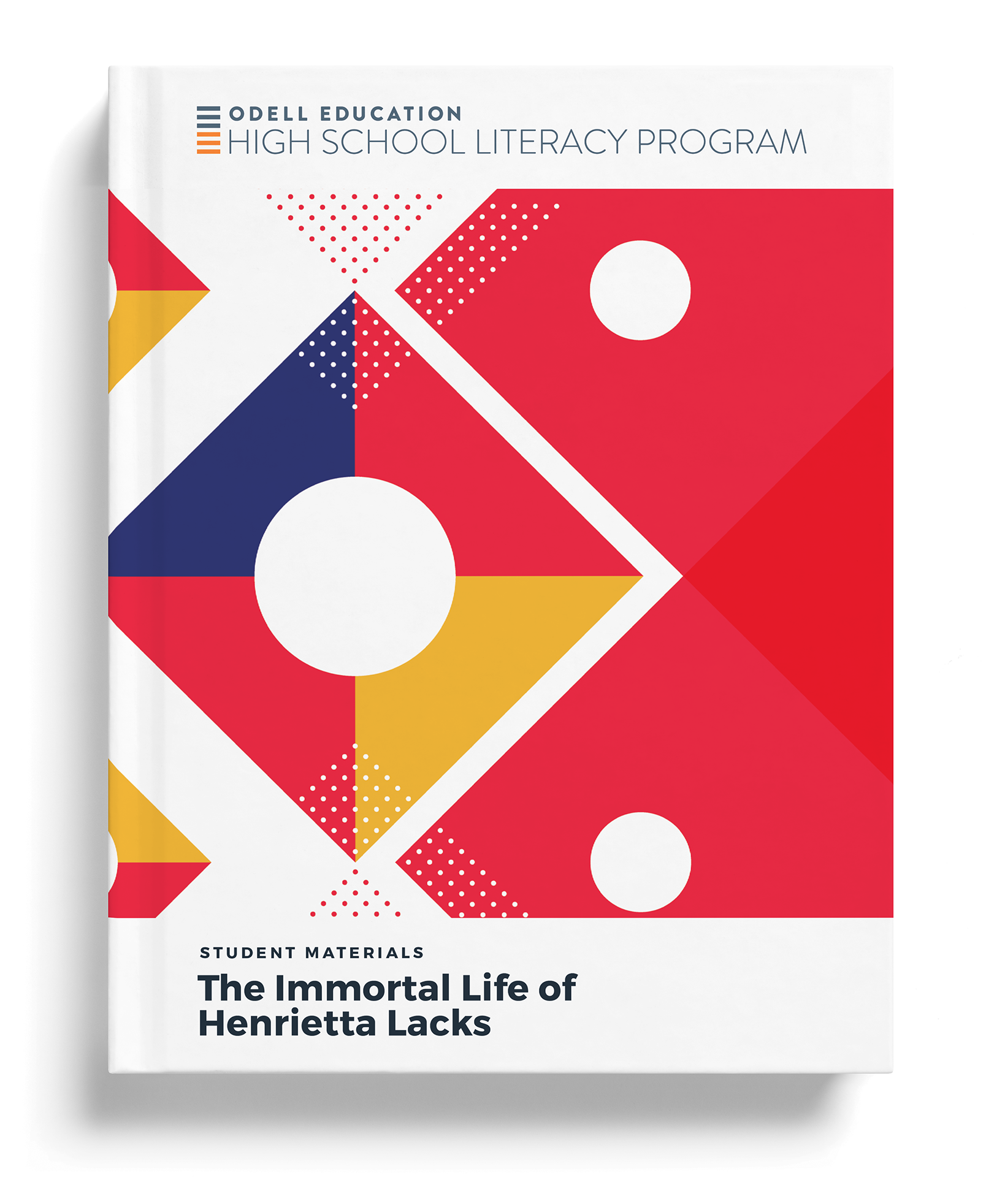
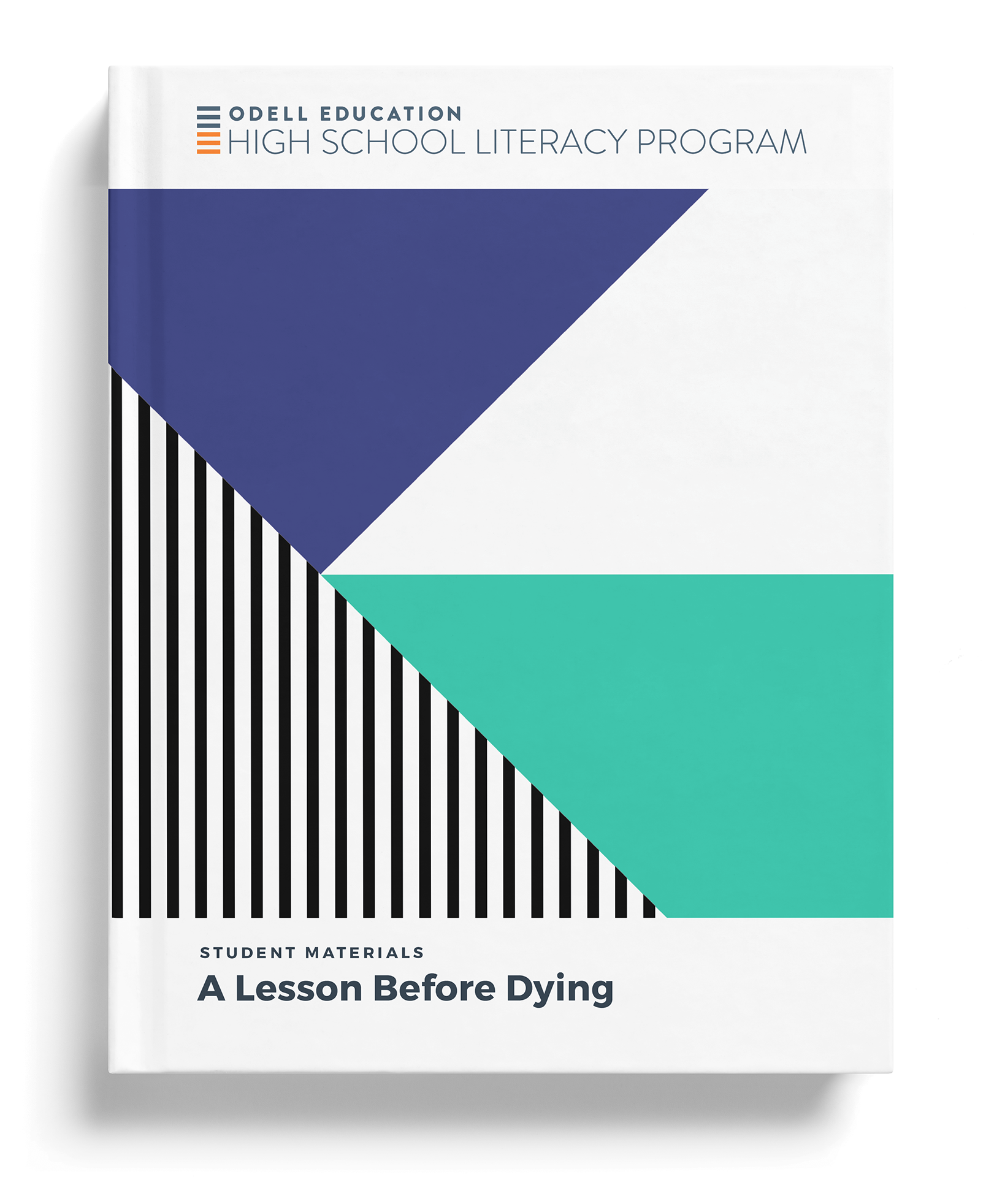
The literary units needed to feel like the books they are built around, from The Great Gatsby to Things Fall Apart. A brighter, more expressive palette gives each text its own cover while the shape system keeps them inside the program. Stylescapes set the mood for the whole range before any cover was final. 文学のユニットには、それぞれの題材の本らしさが要る。『グレート・ギャツビー』から『崩れゆく絆』まで。より明るく表情のある配色で作品ごとに表紙を変え、図形の仕組みがそれを同じプログラムの中にとどめる。表紙を決める前に、スタイルスケープで全体の空気を先に決めた。
The structure first, then the website 先に構造、それからウェブサイト
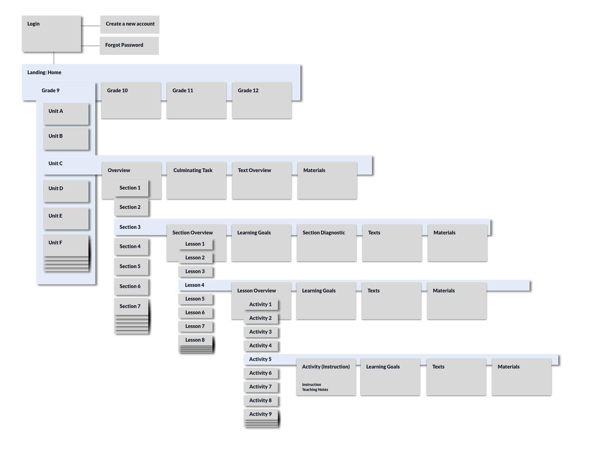
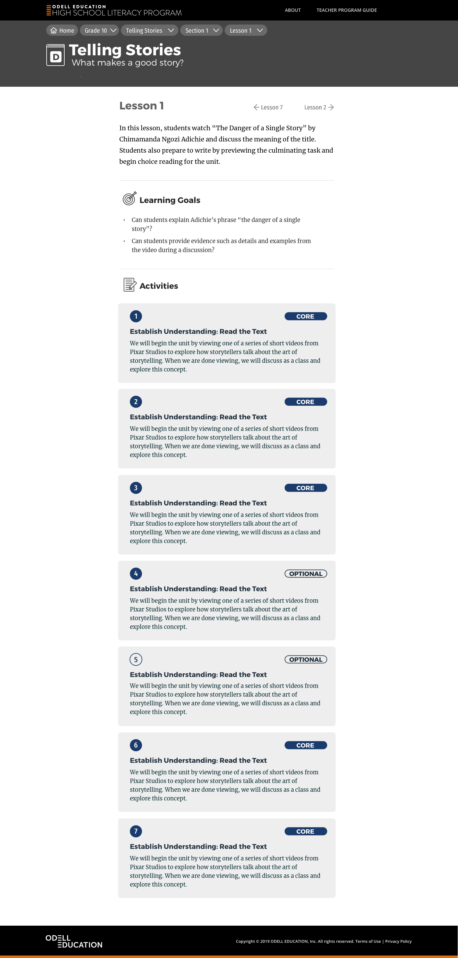
Before designing screens I mapped the information architecture and wrote teacher user stories, then wireframed the deepest pages — sections and lessons — where a teacher actually works. The program website at ela.odelleducation.com follows that structure: grade landing pages, unit overviews, sections, lessons and activities, all on the same visual system as the printed covers. 画面をつくる前に、情報の構造を描き、教師のユーザーストーリーを書いた。そのうえで、教師が実際に作業するいちばん奥のページ、セクションと授業の画面から線画を起こした。ela.odelleducation.com のサイトは、その構造のままだ。学年のトップ、ユニットの概要、セクション、授業、活動。すべてが印刷の表紙と同じ見た目の仕組みでできている。