To respect client confidentiality, the visuals in this case study were re-created from scratch for portfolio purposes — the screens were rebuilt with an AI-assisted design system based on the publicly visible product. Specific data and internal details are anonymized. The core UX challenges, logic, and design processes remain authentic to my contribution.
The Challenge
Wireless plan pricing is inherently confusing. Customers adding multiple phone lines face compounding complexity: per-line costs shift based on plan tier, device selection, and discount combinations like AutoPay or BYOD. The existing purchase flow made it nearly impossible for customers to understand what they would actually pay each month — especially when configuring 2, 3, or 4 lines simultaneously.
The cart was a black box. Customers couldn't see a per-line breakdown, couldn't understand how discounts were applied, and often abandoned the flow out of confusion rather than cost. The core problem wasn't the price itself — it was the lack of price transparency at the moment of decision.
My Approach
Rather than designing static mockups in Figma, I live-coded functional HTML prototypes to explore the problem space. Complex interactive states — responsive cart panels that transform from side drawers to bottom sheets, multi-line plan configurations with real-time price updates, accordion behaviors with progressive disclosure — these are nearly impossible to communicate in static frames. Code was the design tool.
Through six prototypes, I systematically explored plan comparison layouts, cart panel architectures, and pricing display patterns. The breakthrough came with the "line item box" pattern — compact mini-cards within the cart that gave each phone line its own visual identity, showing plan, device, and cost at a glance. This pattern made multi-line pricing finally legible.
Process
Rapid Prototyping in Code
This came first — before any coded design system existed. Each prototype below is a fully functional HTML application I live-coded to test a different bet on the same pricing problem, so they deliberately look different from one another: this was divergent exploration, not a finished visual language. Toggle between desktop and mobile to see the responsive behaviors. Every one was shared directly with stakeholders and engineering as a living specification.
Additional Prototypes
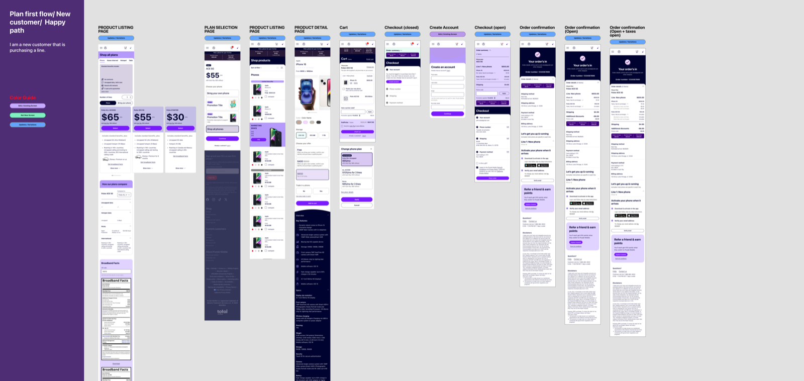
Interaction Flow Maps — Figma Documentation
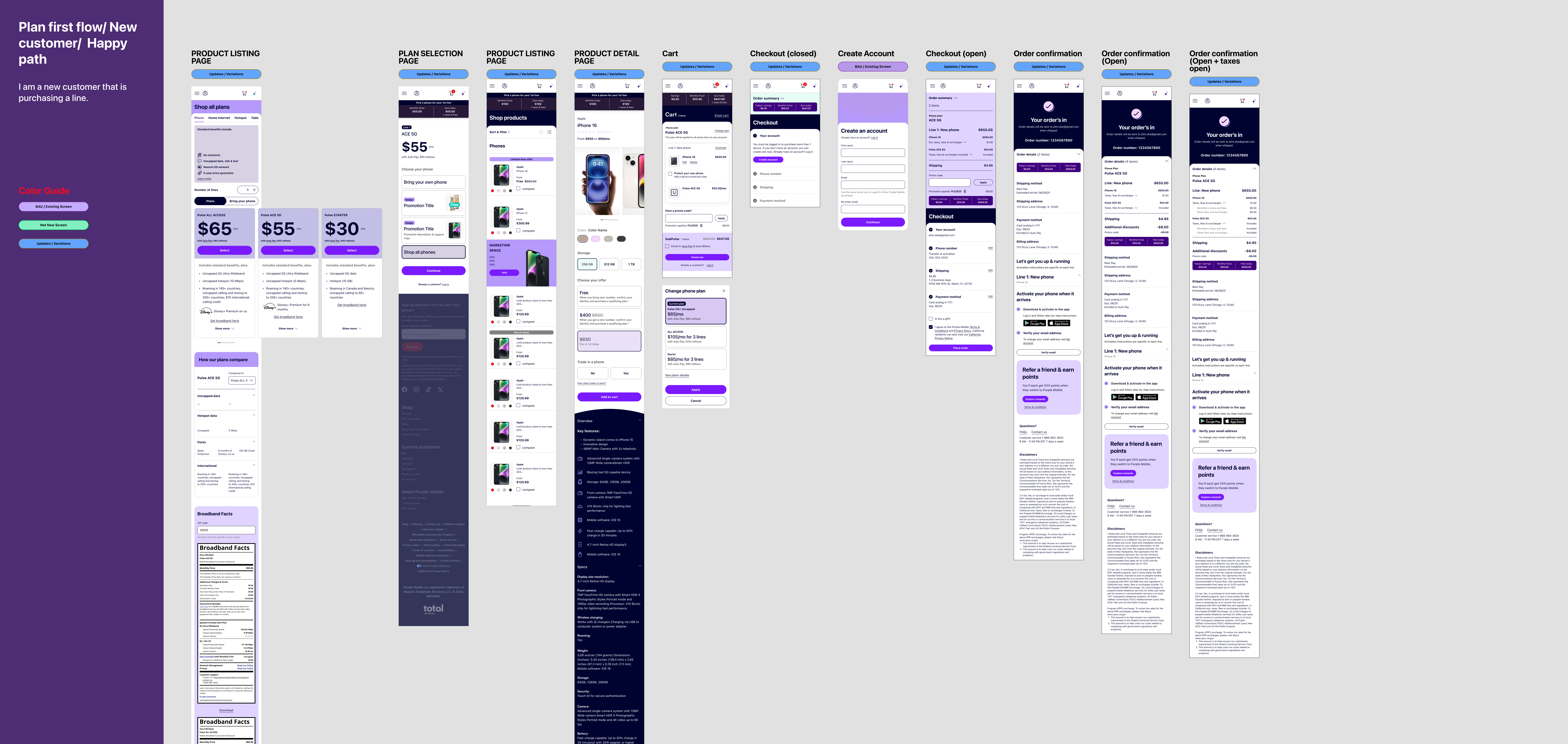
1-Line Purchase Flow: Plan selection → device → cart → checkout → confirmation
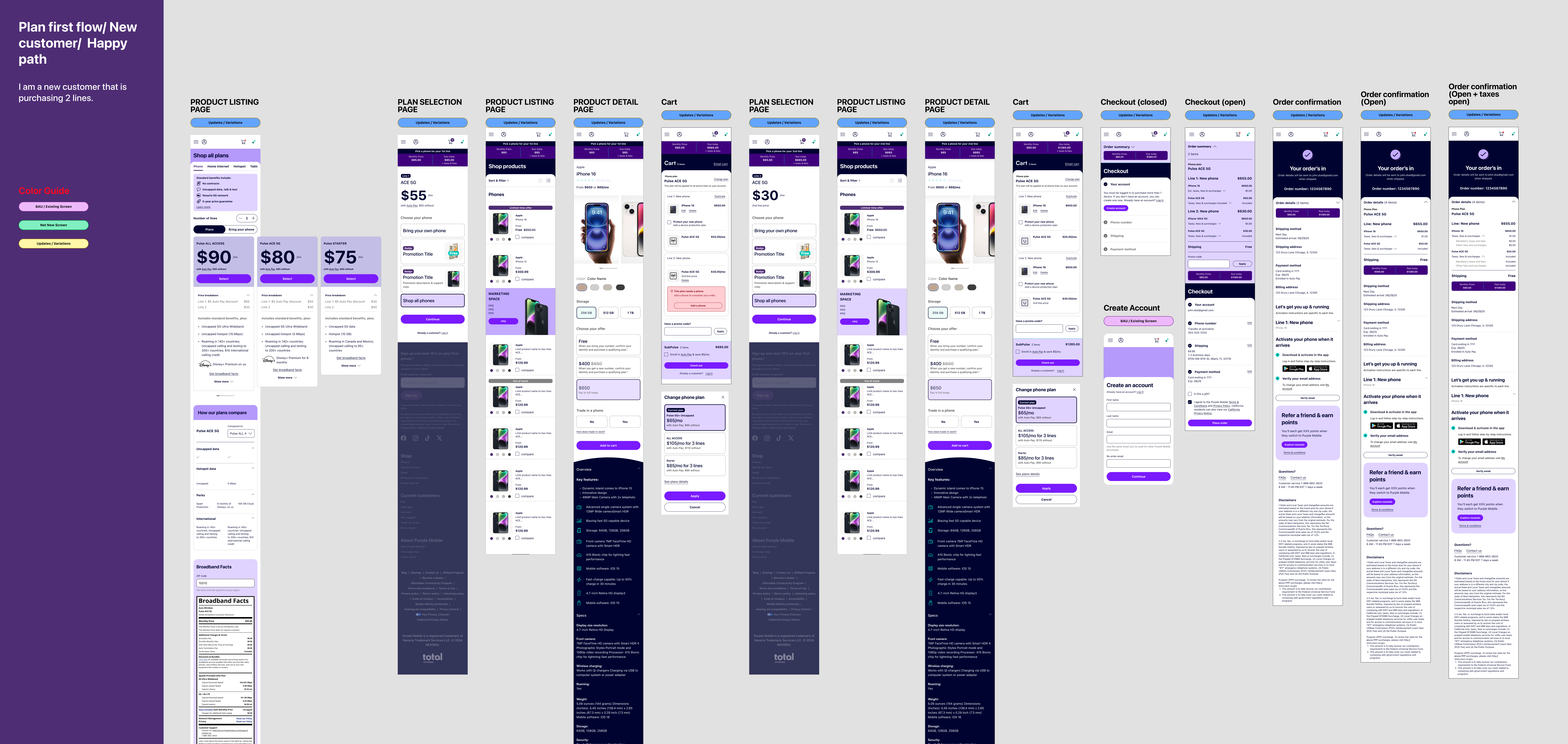
2-Line Purchase Flow: Shows how per-line pricing complexity scales with additional lines
The Brand, Reverse-Engineered into Code
Total Wireless is one of several brands under one roof, so its design system was built in Figma as a tight, white-label architecture — a single set of nested components, re-skinned per brand. Powerful and rigorous, but locked inside Figma. It was never handed to designers as code, so as the AI era arrived there was no way to prototype with the real brand in running code.
So I reverse-engineered it. Working from the publicly visible product, I rebuilt the brand as code: design tokens for color, type, radius, and spacing, wired into a typed shadcn/ui component registry on Next.js. Now an AI — or any engineer — can assemble a new screen and it comes out on-brand by construction: the right navy, teal, and red; the right radii, type, and spacing.
The early live-coded prototypes proved the UX fast, but each was a one-off throwaway. This was the opposite: one reusable system, faithful to the brand and close enough to production to ship — the definitive version of the same idea, and the bridge between the brand and AI-coded prototypes.
@theme inline {
  /* Brand — from the Figma source of truth */
  --font-heading: "Galano Grotesque", "Inter";

  --color-tw-navy-900: #000330;  /* primary text  */
  --color-tw-navy-500: #26358B;  /* brand blue    */
  --color-tw-teal-400: #00C8B7;  /* savings/promo */
  --color-tw-red-600 : #EE0000;  /* Add to Cart   */
  --color-tw-gray-100: #F2F2F2;  /* page surface  */
}
const buttonVariants = cva(
  "rounded-full font-bold transition-all",
  { variants: {
      variant: {
        default: "bg-tw-navy-900 text-white",      // primary
        cta    : "bg-tw-red-600 text-white",        // Add to Cart
        teal   : "bg-tw-teal-400 text-tw-navy-900",  // savings
      },
  } }
)
Every brand value lives in code. Colors, type, and radii come from tokens extracted from Figma (left); each component maps a Figma variant onto those tokens (right) — so “Add to Cart” is always tw-red-600, never a guess. That constraint is exactly what lets an AI build a prototype that stays on-brand.
Rendered from the Registry — Plan Listing
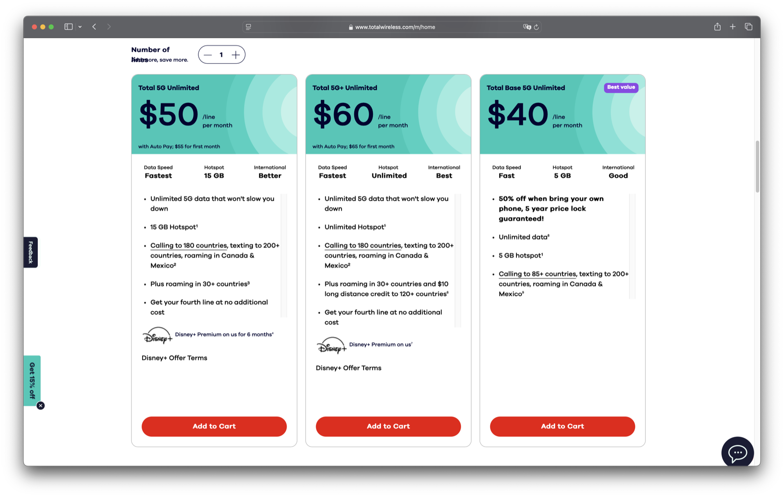
The live page — assembled entirely from registry components (PlanCard, SavingsBar, SegmentedControl, Badge), every value driven by the tokens above.
Responsive Component & Figma Source
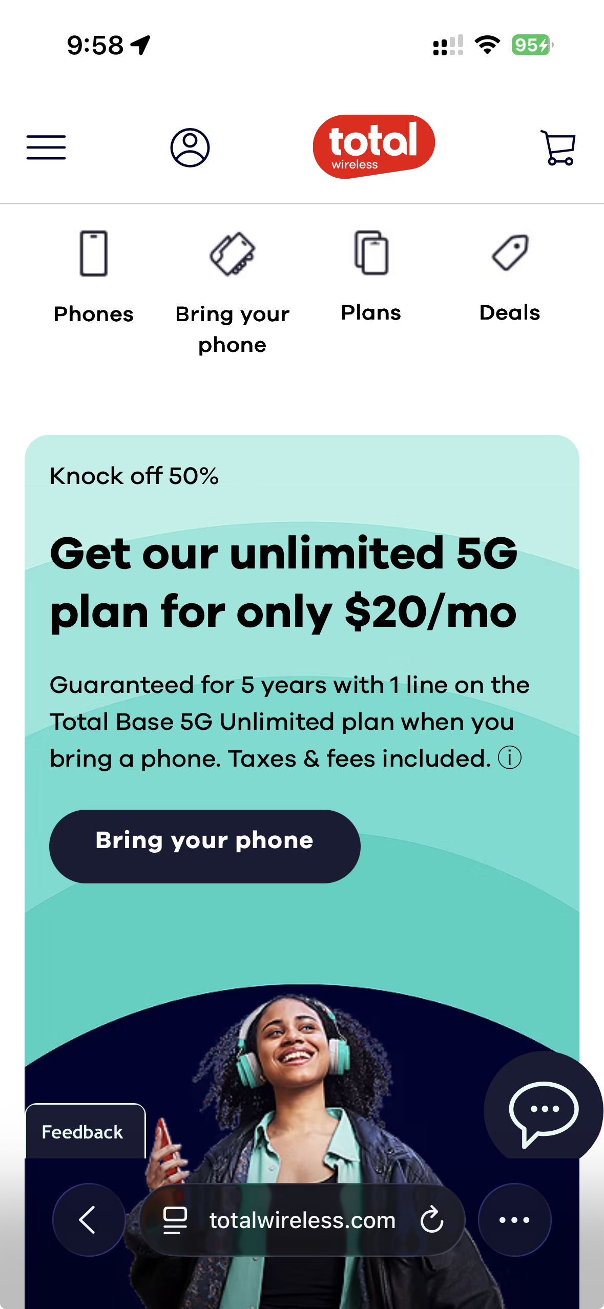
The same coded components reflow to mobile (left); each traces back to a token-driven Figma source of truth (right).
12 Production Components
The Storybook — Live Component Catalog
This is where the reverse-engineered system becomes something a team can actually use. The whole thing ships as a browsable styleguide, running live in the page: brand tokens, every component with its variants and states, and guides for pulling components from the registry and tracing each one back to its Figma origin. Open Brand, Components, or Guides and click around — this is the catalog a teammate, or an AI agent, pulls from to build on-brand, every time.
Shipped Product
Team OutputThe shopping flow shipped across desktop and mobile. My prototypes and the design-system patterns informed the cart architecture, the per-line pricing display, and the responsive behavior. Here is the journey end to end — each desktop screen beside its mobile counterpart.
01 — Home & Plan Selection
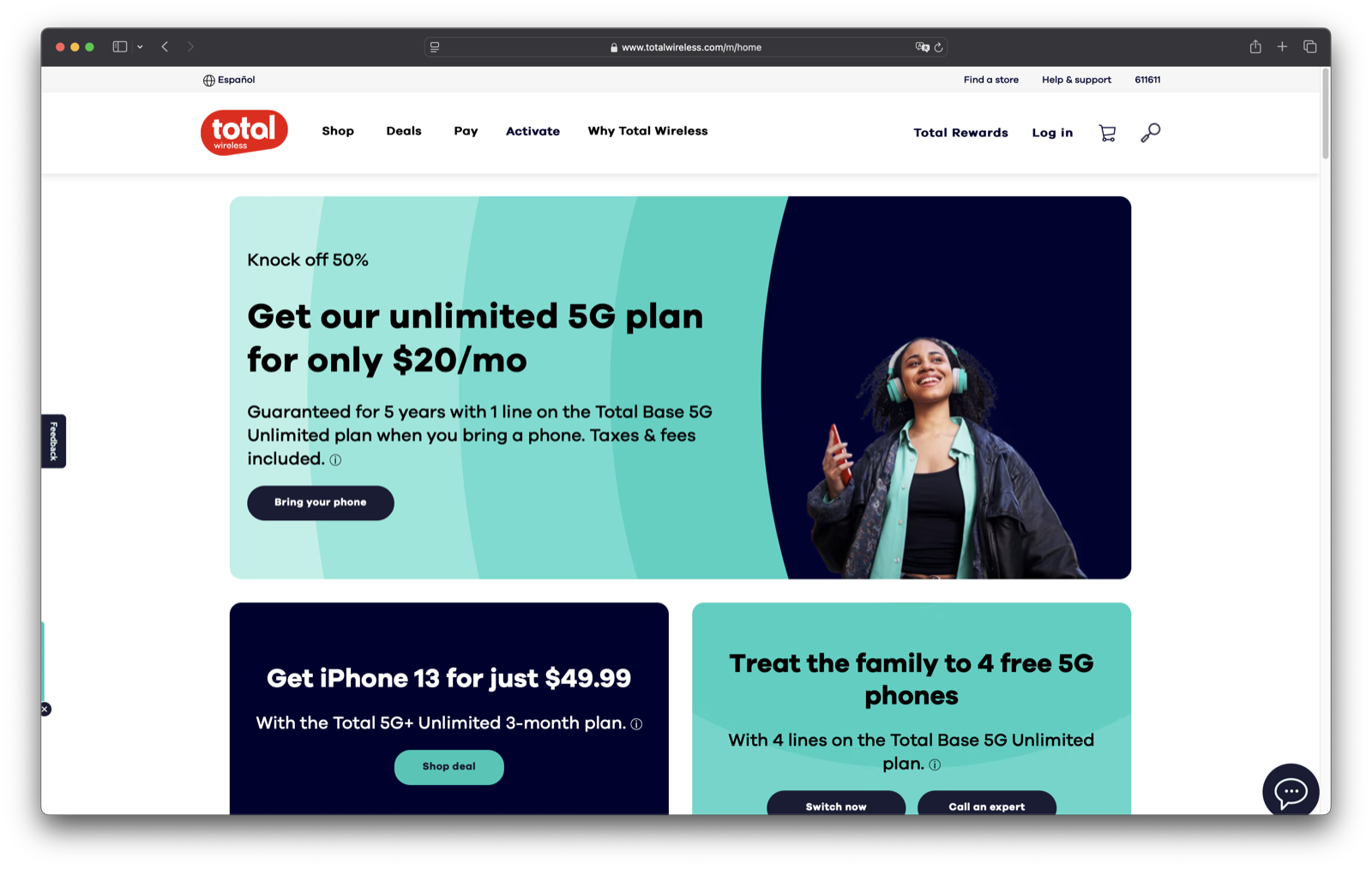
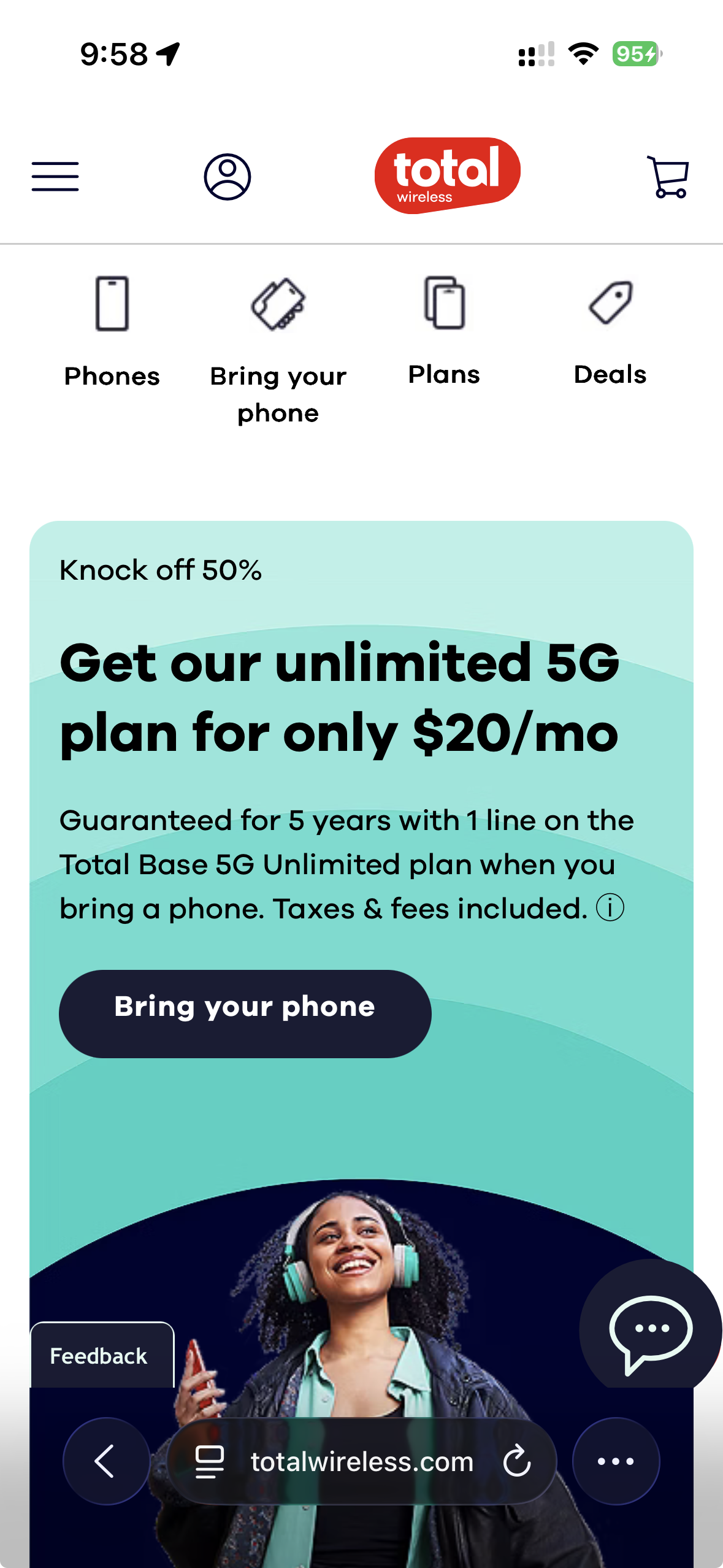
Home — plan promo and the entry points into the shopping flow.
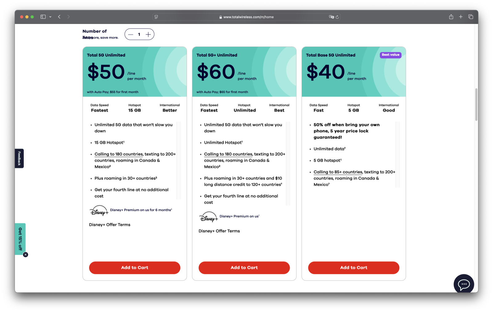
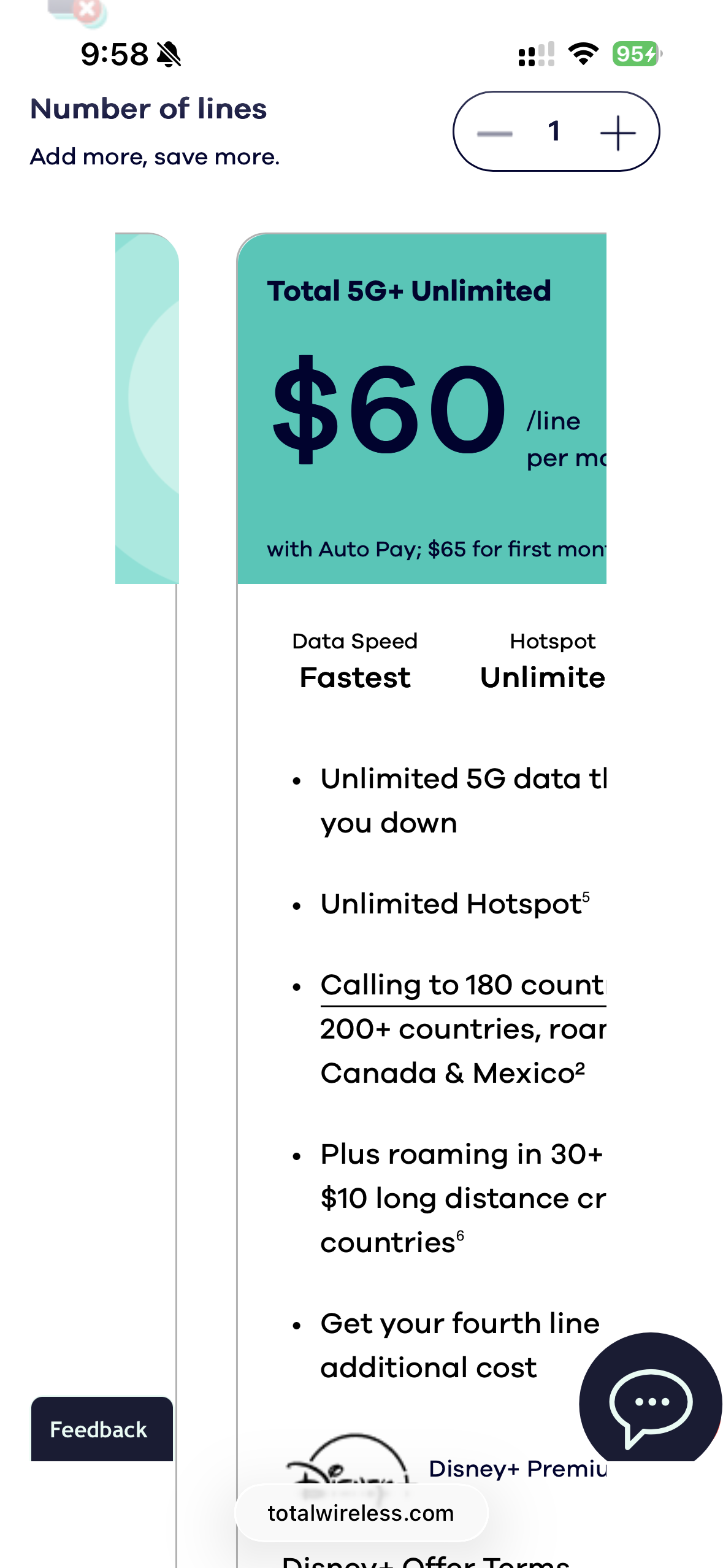
Plan selection — three unlimited tiers compared side by side, price-first.
02 — Choose Your Phone & Plan
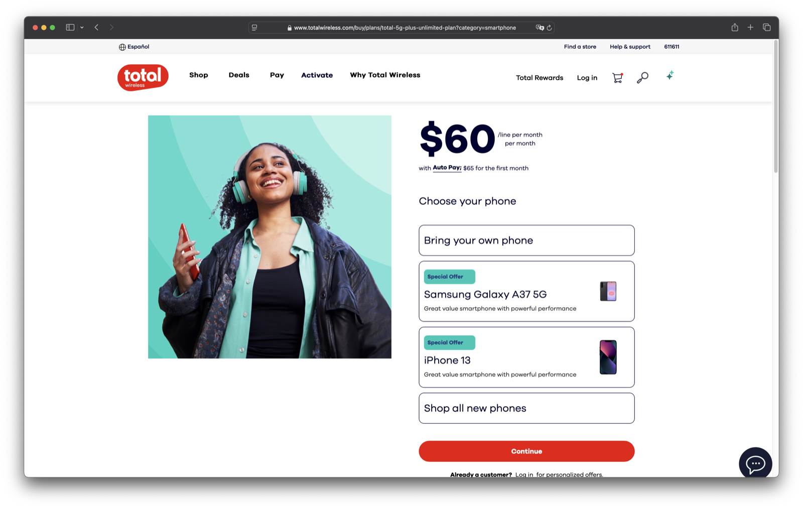
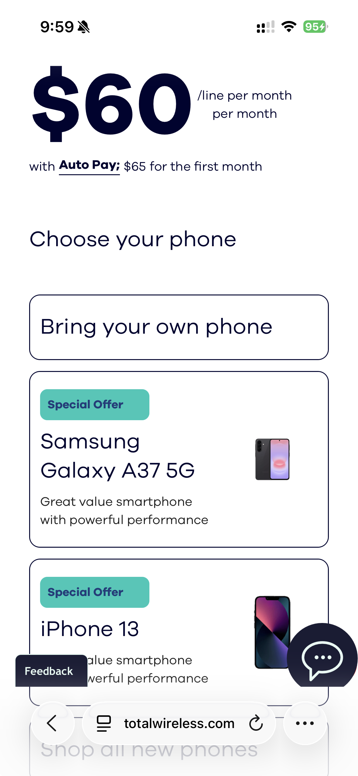
Plan detail — bring your own phone, or pick a device to pair with the plan.
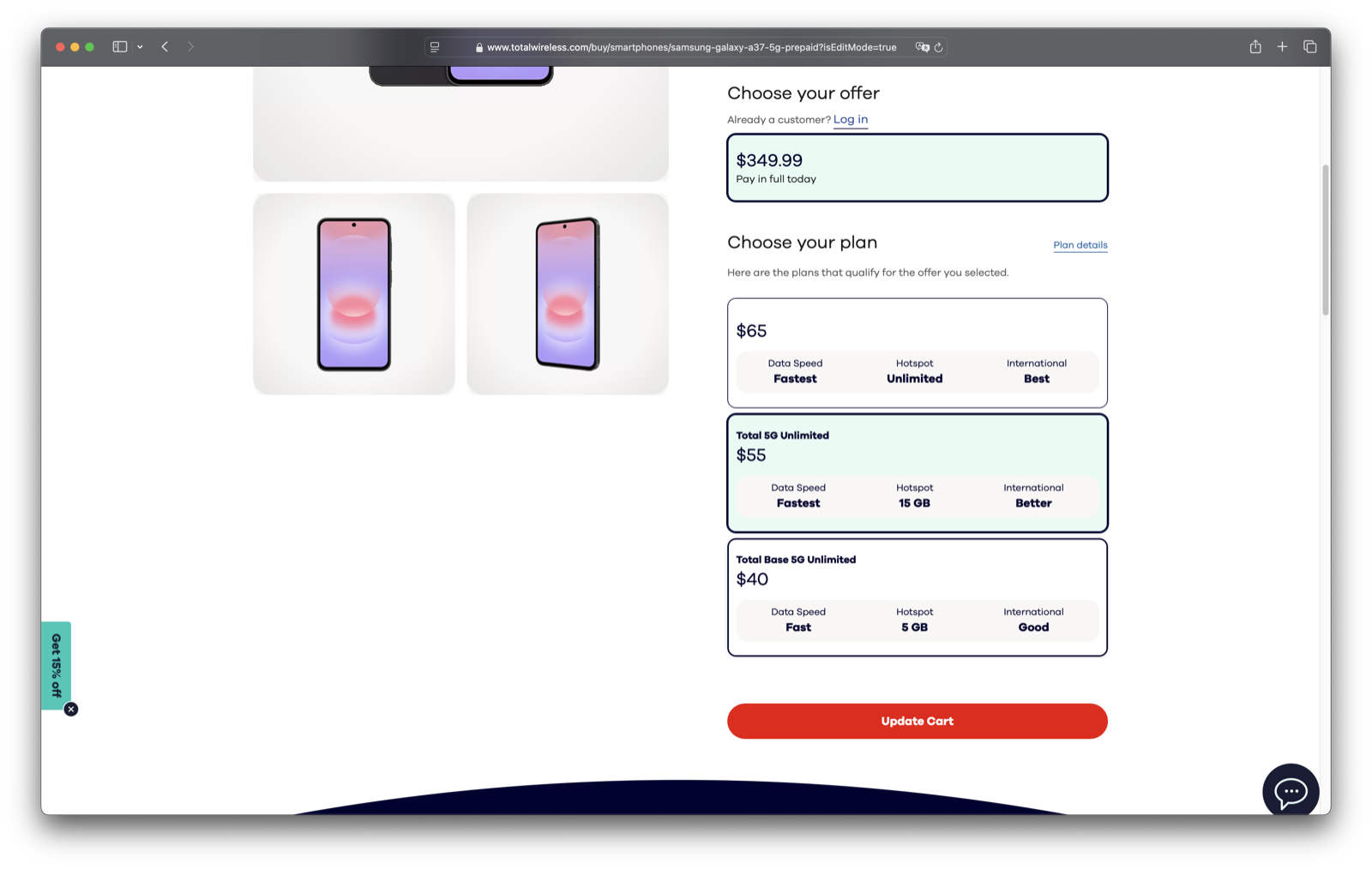
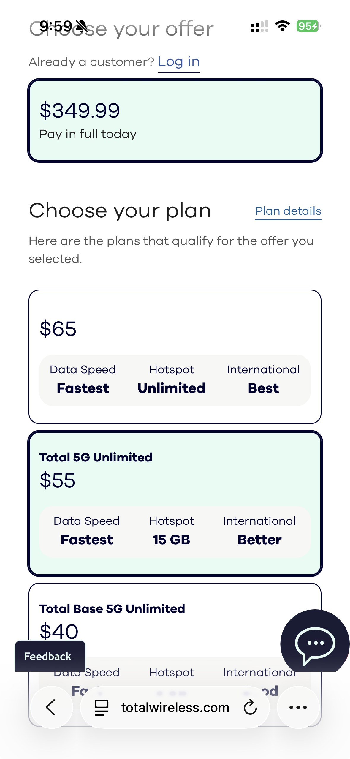
Device detail — choose the offer, then the matching plan, in one place.
03 — Cart: Line-Item Pricing
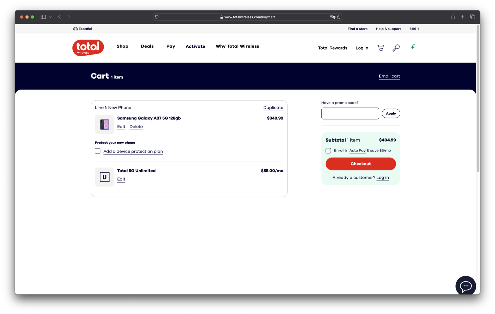
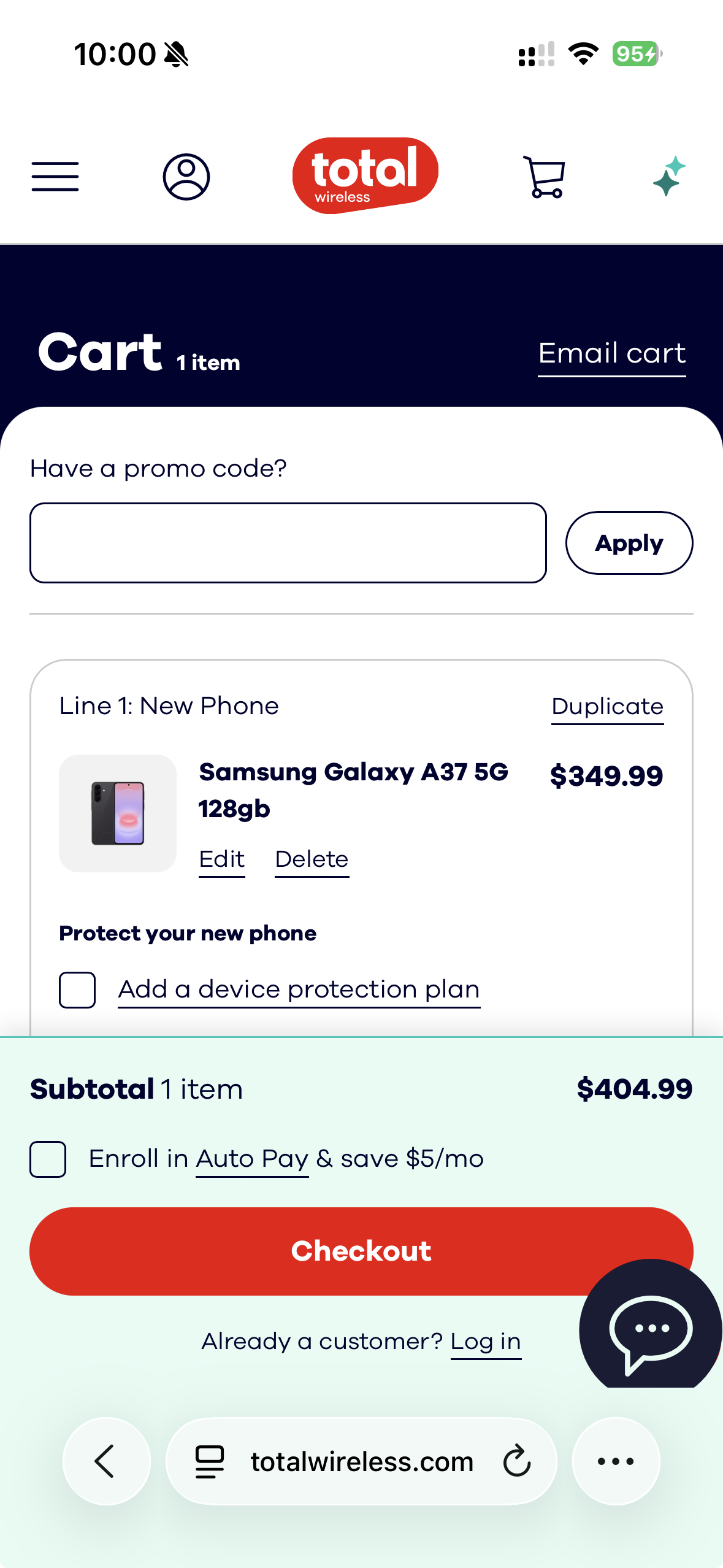
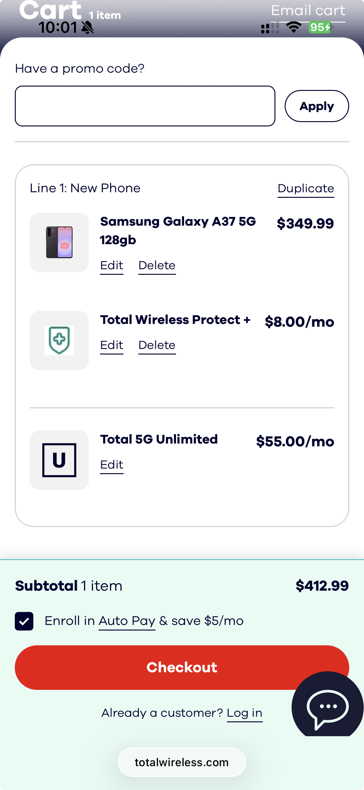
Cart — device and plan broken out per line, with a persistent Subtotal & Auto Pay summary. This is the “line-item box” pattern in the shipped product.
04 — Checkout
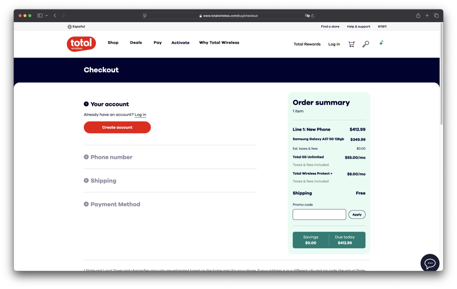
Checkout — account, number, shipping, and payment, with the running Order Summary always in view.
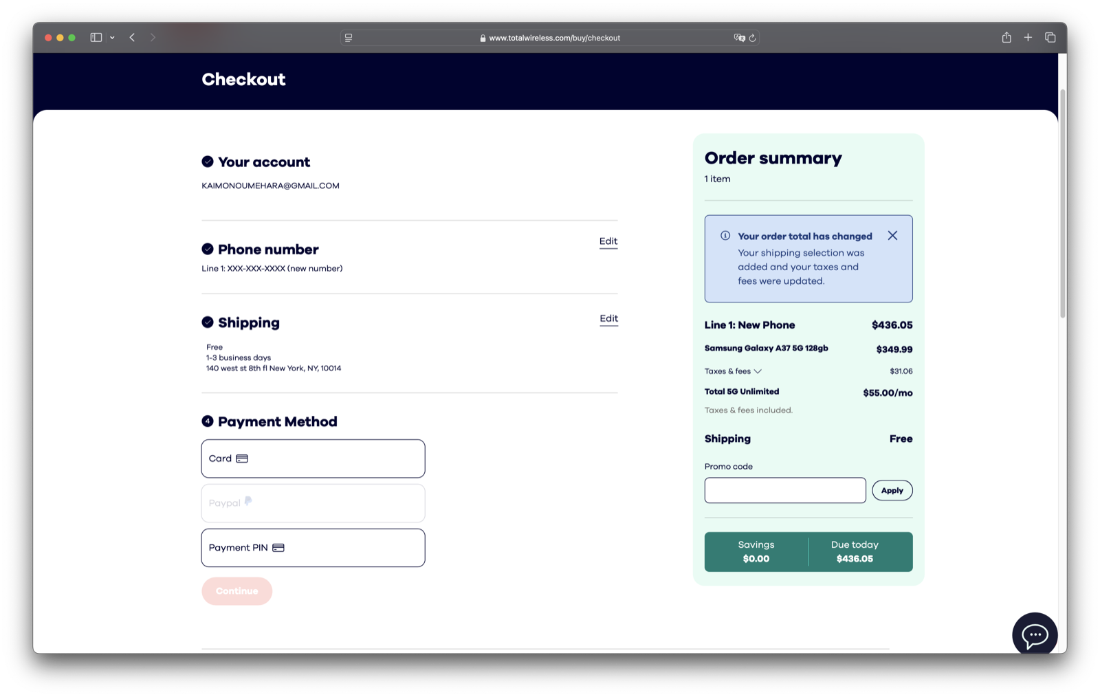
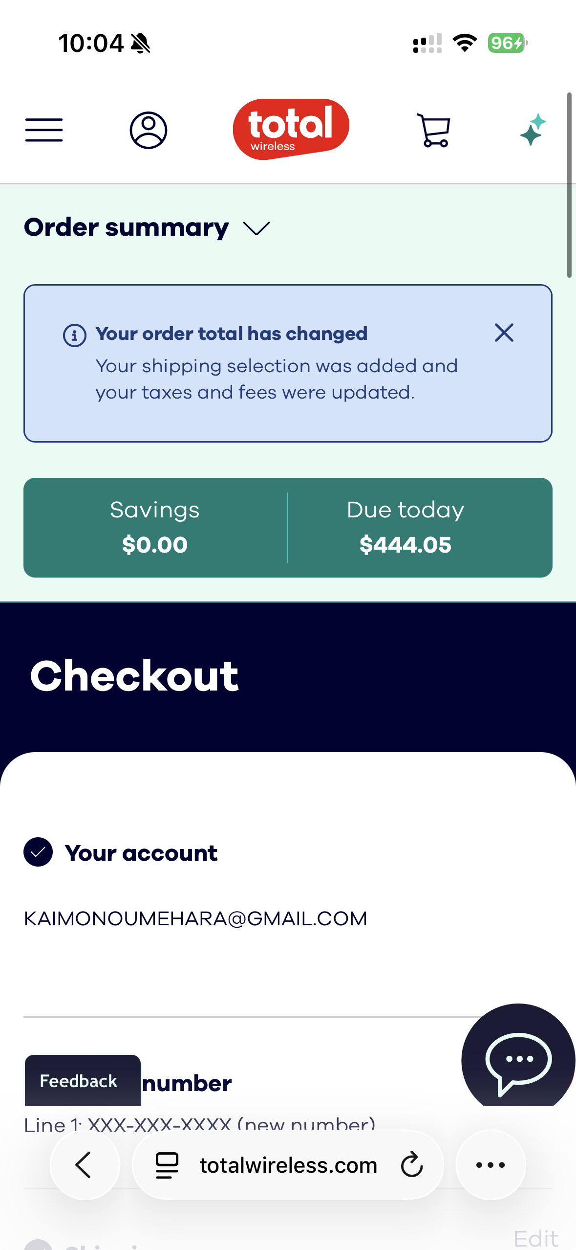
Payment — card, PayPal, or PIN, with the Savings & Due Today total confirmed before purchase.
Deliverables
- 6 Live HTML Prototypes
- Figma Flow Documentation
- Cart Component Patterns
- Pricing Display System
- Responsive Specifications
Methods
- Live-Coded Prototyping
- Competitive Analysis
- Interaction Flow Mapping
- Stakeholder Reviews
Tech Stack
- HTML / CSS / JavaScript
- Tailwind CSS
- React (configurator)
- Firebase (data persistence)
- Figma